

Play asset pack
Japanese Lake Restaurant's itch.io pageResults
| Criteria | Rank | Score* | Raw Score |
| Research & Development | #60 | 2.236 | 2.500 |
| Technical | #64 | 2.012 | 2.250 |
| Creative | #72 | 2.012 | 2.250 |
| Documentation | #75 | 2.012 | 2.250 |
| Overall | #75 | 2.012 | 2.250 |
| Presentation | #79 | 1.789 | 2.000 |
Ranked from 4 ratings. Score is adjusted from raw score by the median number of ratings per game in the jam.
Judge feedback
Judge feedback is anonymous and shown in a random order.
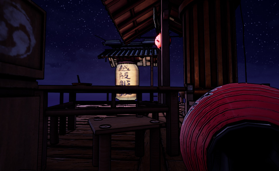
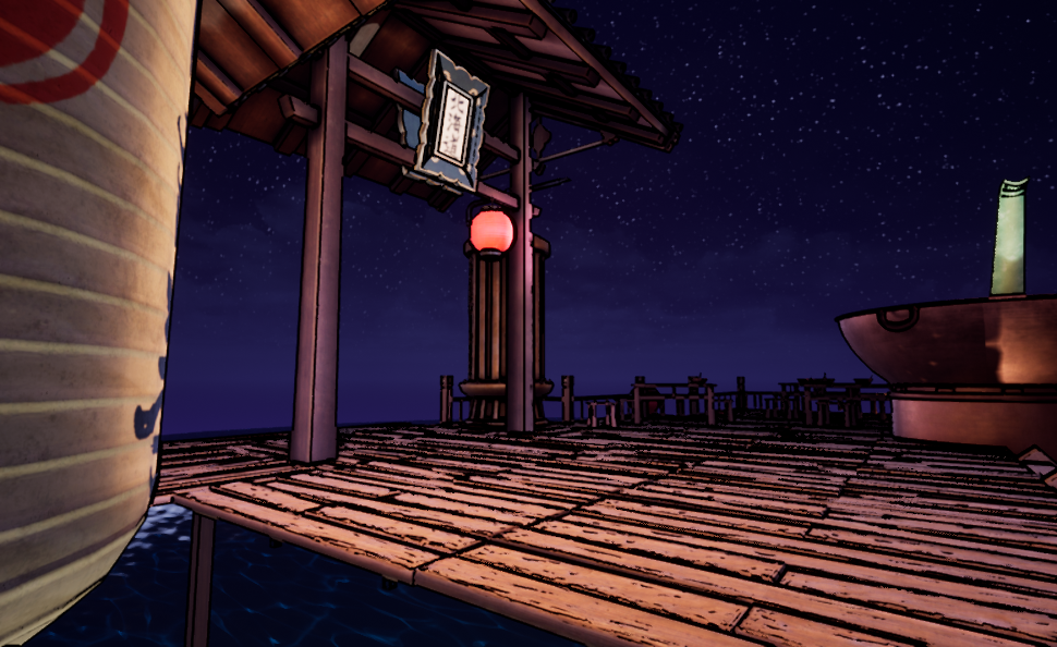
- It would have been good to see some annotated reference (things you liked from what you found) and a small art test of the look you were going for. I can see your block out progress over time and it’s good that you got some base colours in there from the beginning. You’ve said that you’re not matching the concept art 1:1 but there is a busyness to the concept that is missing in your creation. Unfortunately you haven’t added any of your model, texture, shader or lighting progress to the pdf so I can’t judge how well you’ve used industry workflows. The scene is probably a bit too dark and that inked edges are a bit too thick. It makes the environment difficult to read from a distance. It would have been good to see differences in model colours and subtle material breakup to add more detail to the scene.
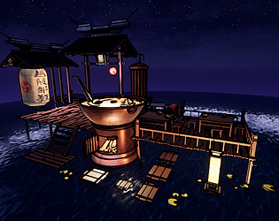
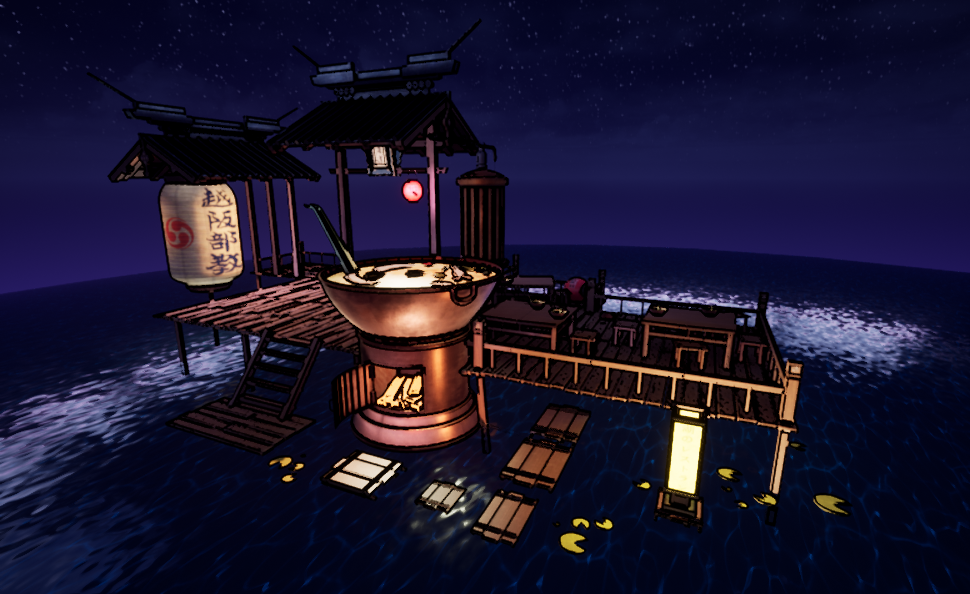
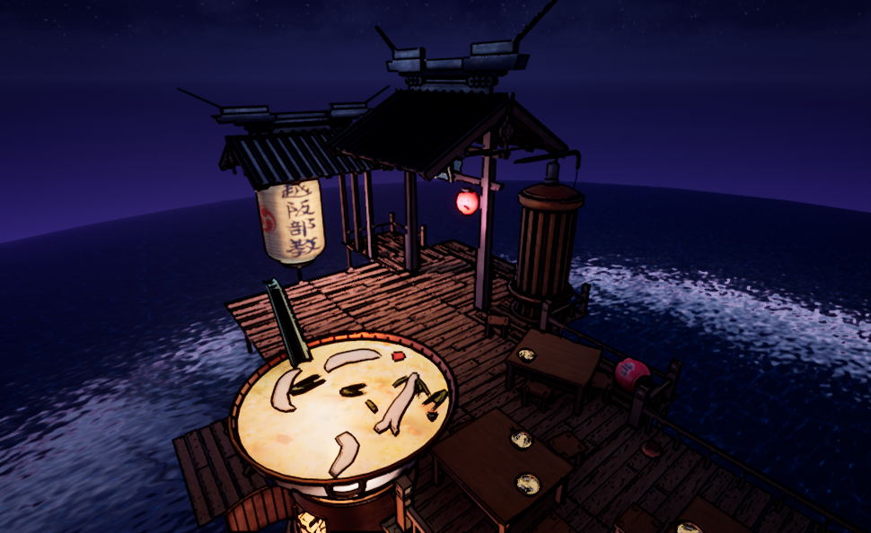
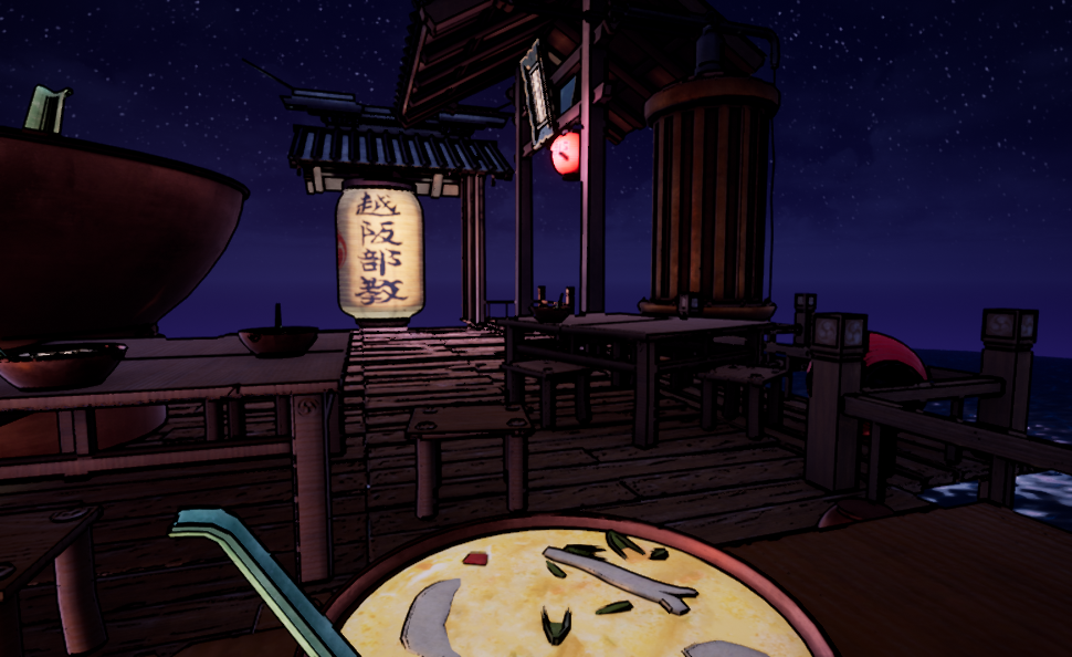
- The concept you chose is really nice but you've missed a few key reasons why it's a nice concept. The proportion and scale of everything is important, you've got too much space around the key items making them feel less significant. Look at the size of the roof and cooking dish, they are massive but in your layout they feel small. If you have time have another pass on adjusting scales and proportions to get the cartoon/stylised look of the concept.
- This feels like a promising start. The original concept is a good choice, with lots of opportunity for modelling and set dressing a detailed environment. However, my primary criticism would be the use of an outline shader - the thick black outlines are hurting what otherwise look like well modelled assets, and the style is falling between two approaches here. It feels as if the artist is mixing toon shading and realism, which are very difficult styles to combine. My advice would be to either try and mimic the original concept style more closely - much thinner outlines, hand paint all textures, reduce high and even medium frequency texture detail to an absolute minimum and let the lighting do the work - or just aim for realism, using the original concept as reference for props and set dressing only, rather than style.
- Research & Development There a specific main reference to follow, which is good. Prop references look nice. Scene development is showcased in a nice manner. Creative Art Materials and shapes look interesting. Toon shader gives the scene an interesting read. Scene is a bit dark. I like a bit more how the planks read if I disable the normal based outlines from the post process. I'm not the biggest fan of how the outlines also scale in the distance, it makes the reading of the scene a bit noisy. Technical Art Cool post process. Lighting looks okay. Materials look nice also without the post process. The scales might need some extra tweaks. The handrail/safety railing planks are cut to bit too small pieces, which might make building levels in editor a bit tedious. Documentation Short and sweet. Nice images. Final Presentation Sharp images. Scene is shown well.
Challenge Tier
Search For A Star
Leave a comment
Log in with itch.io to leave a comment.
Comments
No one has posted a comment yet