


Play UE4 Environment
The Office's itch.io pageResults
| Criteria | Rank | Score* | Raw Score |
| Technical | #52 | 2.324 | 3.000 |
| Documentation | #53 | 2.582 | 3.333 |
| Presentation | #58 | 2.324 | 3.000 |
| Creative | #61 | 2.324 | 3.000 |
| Overall | #65 | 2.272 | 2.933 |
| Research & Development | #81 | 1.807 | 2.333 |
Ranked from 3 ratings. Score is adjusted from raw score by the median number of ratings per game in the jam.
Judge feedback
Judge feedback is anonymous and shown in a random order.
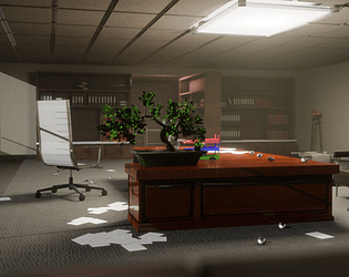
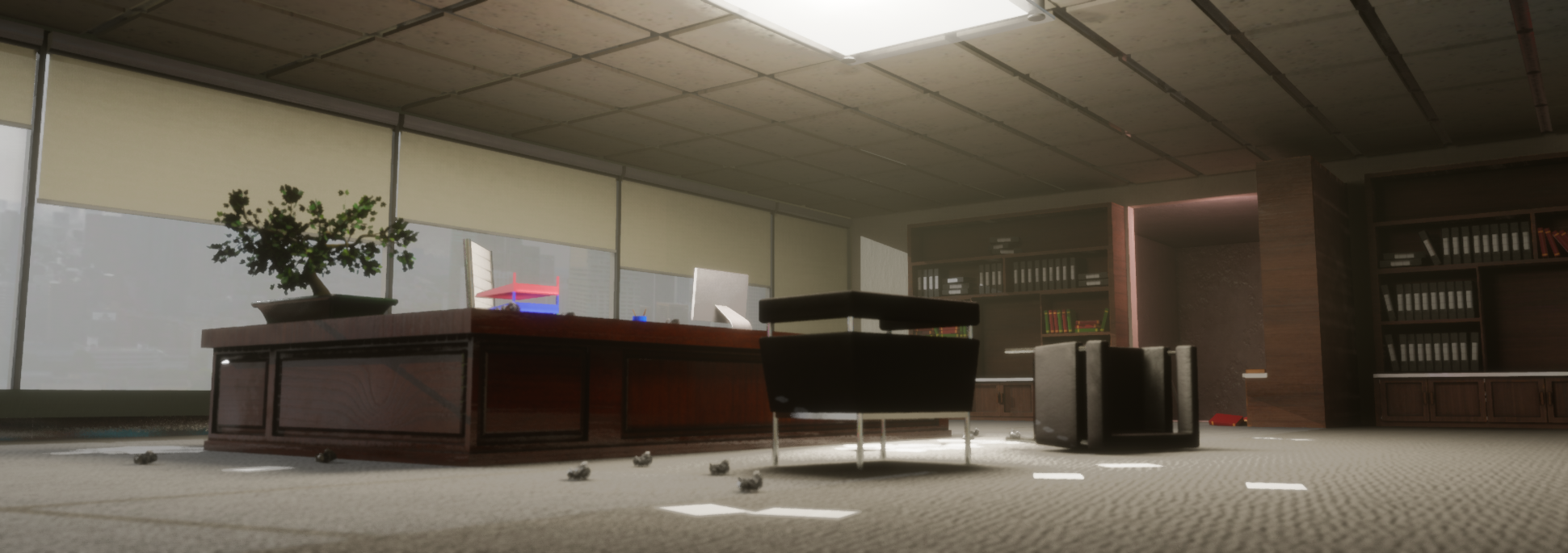
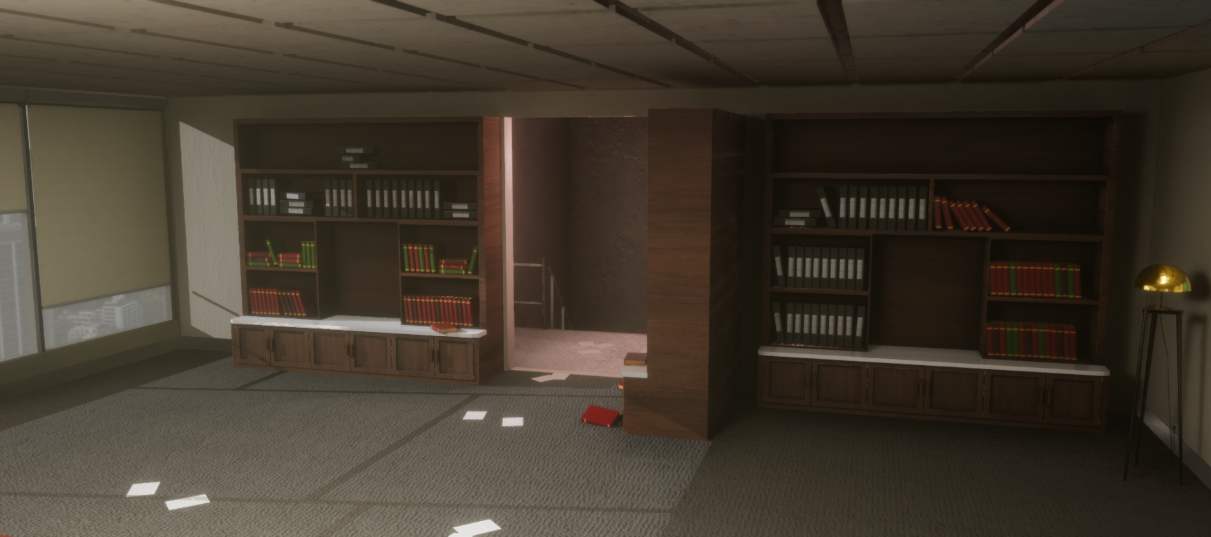
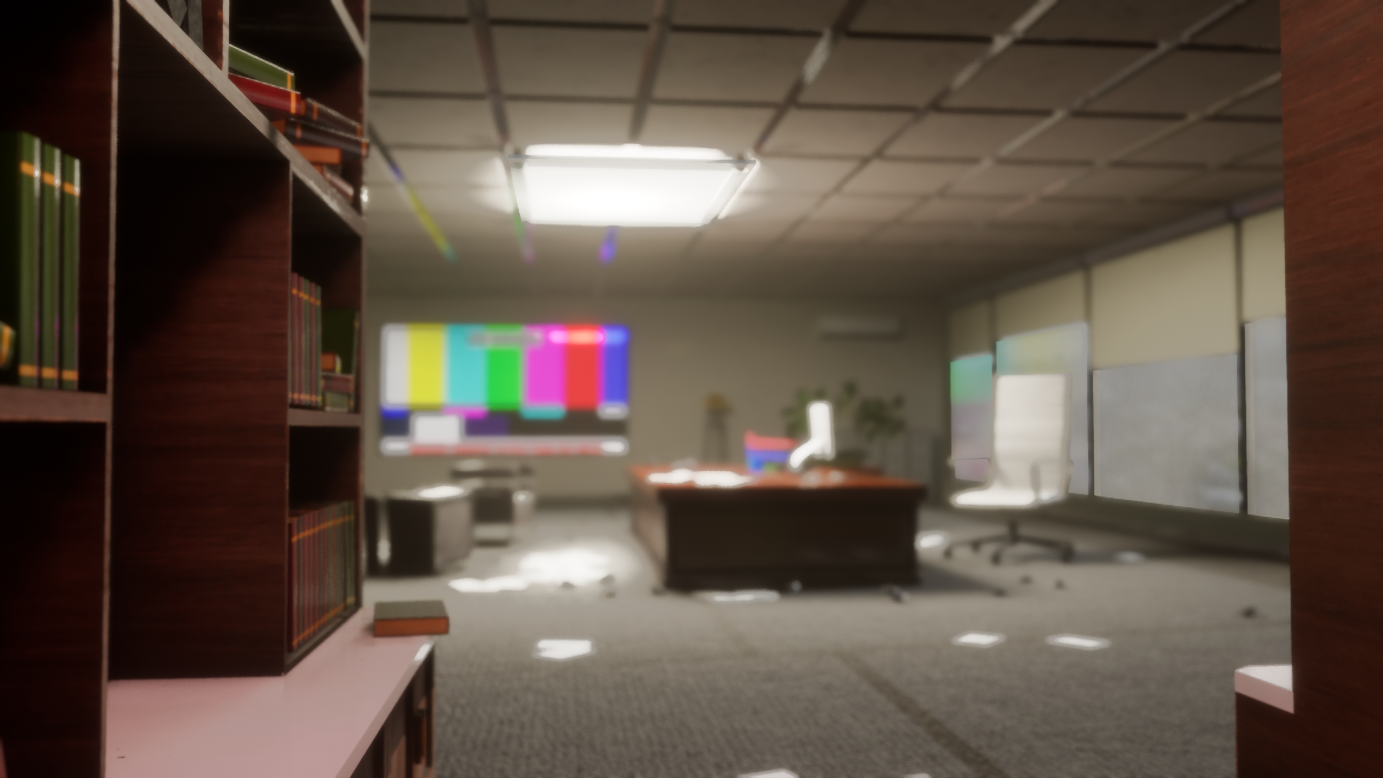
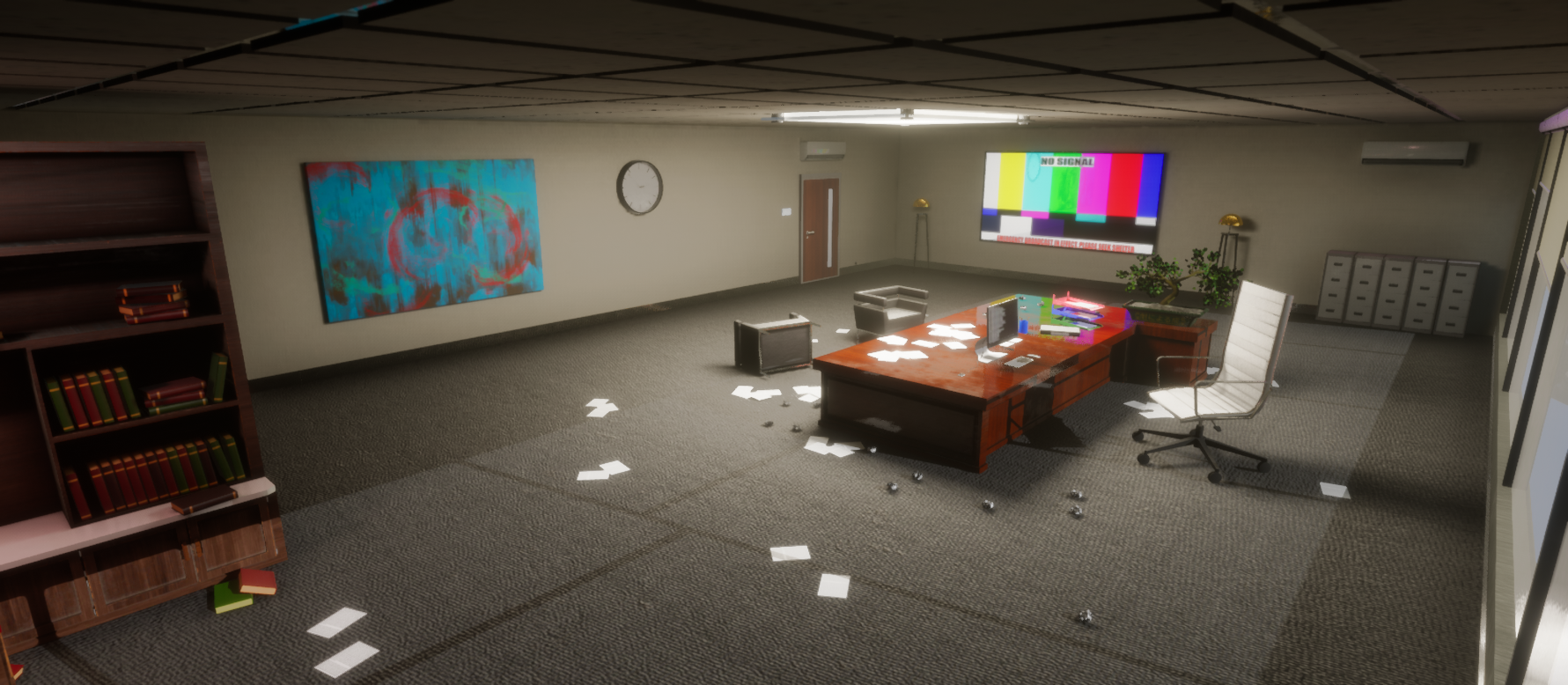
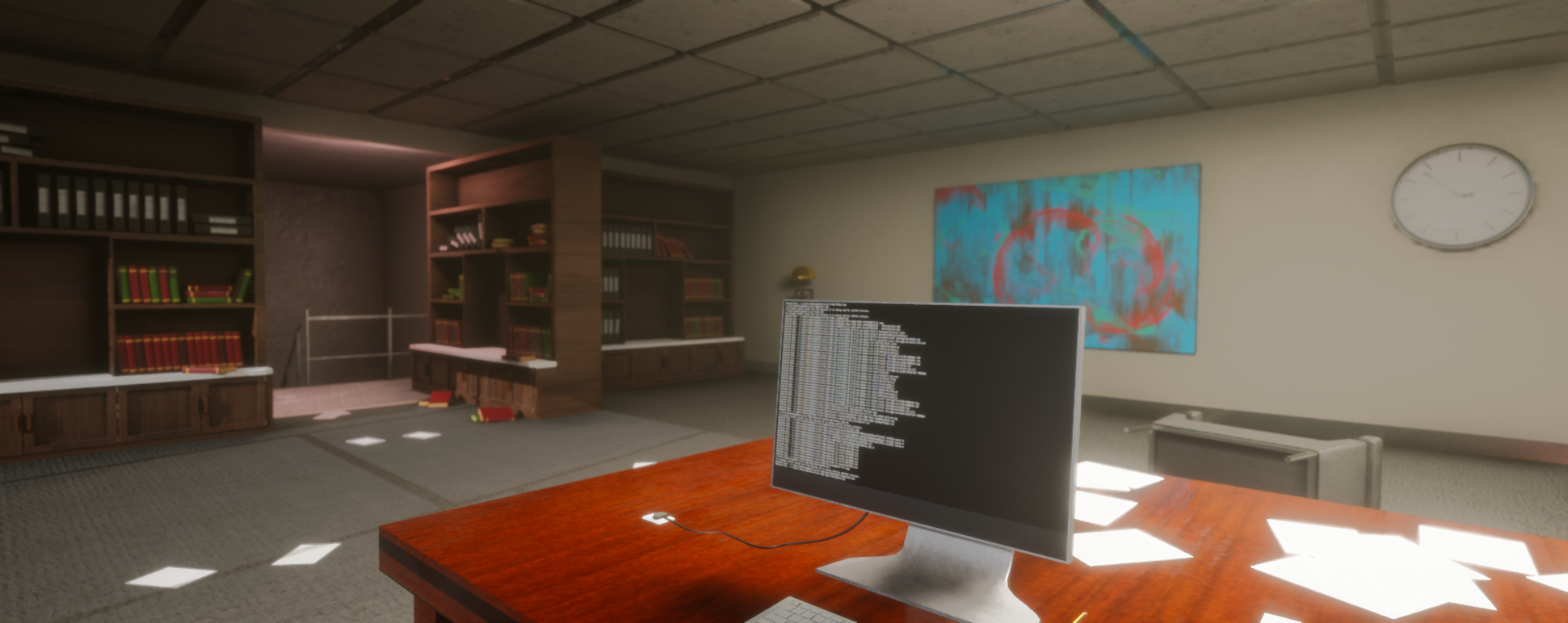
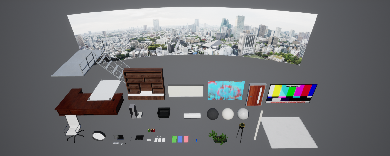
- Research & Development References showcase clearly offices with similar modern aesthetics, materials and fresh color usage. Critical thinking is used for picking up the references that showcase the specific idea the most. Props references look good and of high quality, but could benefit from a bit of wear and use to add interest. Lighting could use its own reference exploration. Creative Art Scene is a nice presentation of an office. You can feel the frustration in the works with crunched papers, screen and flat screen TV. Mix of soft and hard edged shadows add interest to the scene. Technical Art Lighting looks great, meshes seem optimized, learning speedtree is great, rounded background adds to the feeling, superwide format of images seems interesting. Post process is setup well. Some searchwords for further investigations; SpeedTree Color Variation node, trims, tileable textures, texel density (512 or 1024), transferred normals for vegetation, master material and using it to instance basically all of the material instances, material attributes, advanced glass material pack, lighting function pack, amplify Lut pack. To me, books and chairs could do with fewer chamfered polygons. Documentation Documentation is short and sweet. Images are showed well. Grouped images work well to showcase the assets. Final Presentation Final images appear a bit blurry in the browser, but you can clearly make out what's going on.
- If you'd like some pointers on areas to improve in the future, make sure scales and proportions work together. The office chair and bonsai plant are too big compared to all other objects. The room also feels a little too big. The view through the windows might work better as being over-exposed (full white). Also, check the light/shadow settings of the blinds - at the moment the blinds are not changing the light so the shadows on the floor don't match.
- - Good clean modelling - Asset list was a good idea for managing production assets at various stages of development to ensure not steps were missed - Recommend adding more ceiling lights to get a closer look in lighting to the reference images. - The design of the space was quite large for the type of office it was and content on display, would recommend making to overall space about 50% of the size to work better with the assets. - To further refine the space in the future suggest adding different areas to the office (desk area, sofa area) some additional plants would be a nice addition to further demonstrate the speed tree skills and help soften the scene a bit. - Nice variation in the materials - Opportunities for further lighting interest by adding LED light strips to shelves or modelling part of ceiling to incorporate them. - The documentation describing the steps taken to produce the content was excellent
- It would have been good to see some annotated reference (things you liked from what you found) and a small art test of the look you were going for. It’s good to see an asset list but it might contain a few too many unique props. I find separating my lists out into different groups helps considerably as not every asset needs the same amount of work eg. props, kits, textures. Good to see a block out and it in UE4 with a lighting setup from an early stage. I would say that the office space you’ve created is far too big, even for an executive suite. Offices are quite modular in construction so you would have benefitted from creating a few tiling textures rather than large meshes eg. the ceiling tiles, filing cabinet, wooden desk. The modelling on the plug socket could be more efficient (reduce edge loops). Remember that you can have intersecting geometry instead of extruded geometry. Also, it doesn’t look like any baked information is coming through on your assets (everything has sharp edges). Always have a bevelled mesh to bake. This will help when lighting as the light will bend around the corners. Lighting looks good and your shot angles work. Try and get these in at the block out stage as this will inform which assets you need to concentrate on eg. I was you made a pencil but I can’t see it in any of the shots. Have a play about with the AO settings as you’d expect more AO to appear between objects that are next to each other eg. bookcases and floor. Good work and good progression. Well done!
Challenge Tier
Search For A Star
Leave a comment
Log in with itch.io to leave a comment.
Comments
No one has posted a comment yet