Play asset pack
Crossroads Inn's itch.io pageResults
| Criteria | Rank | Score* | Raw Score |
| Technical | #1 | 4.125 | 4.125 |
| Creative | #7 | 4.000 | 4.000 |
| Presentation | #8 | 4.125 | 4.125 |
| Overall | #8 | 3.900 | 3.900 |
| Documentation | #16 | 3.875 | 3.875 |
| Research & Development | #23 | 3.375 | 3.375 |
Ranked from 8 ratings. Score is adjusted from raw score by the median number of ratings per game in the jam.
Judge feedback
Judge feedback is anonymous and shown in a random order.
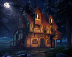
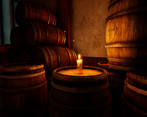
- Research & Development: It’s good that you chose your main reference (the concept art) and used that to drive the decisions for the scene, however it is always a good idea to also gather real life references and have seperate mood boards for materials, lighting, close up assets & details etc with a main reference for each category. This will be of great help in situations when you’re not quite sure on what to do for an area or an asset for example, as it’s there to help give you inspiration and prevent you from getting stuck. Creative: I like the overall composition of the shot, the path leading to the front with the rocks in the foreground pointing towards the door is a nice subtlety. You could probably exaggerate it further by angling the camera up and to the right slightly (to fit more with the rule of thirds), then really push the winding path from the left side, to the right, then back to the middle to get more of an ‘S’ shape and help guide the eye around. The warm-cold contrast looks great, and I love the decision to purposefully darken the surroundings to really put the focus on the building whilst giving the overall image a lot of depth in values. The textures work well together and I really like the texturing on the barrel & the yellowy wall texture, though it’s always a good idea to check your albedo in the viewport under ‘Buffer Visualisation’>’Base color’ to make sure things don’t stick out or look to bright/too dark. I also saw that the landscape textures look a little washed out which will impact the final look of the ground quite drastically. It’s good to hear that you made the decision to only do the ground floor as doing the exterior & interior can take a long time, though maybe it’d have been better to choose just one or the other to focus on and really push the quality on that. Technical: Your workflow for asset creation is good, it’s great to see you delve into designer to create some materials, and it’s really good that you took the time to make the pine tree branches. I noticed that the tree bark does have tessellation on which you might light to do where the bark is photorealistic/scanned, but for this instance it doesn’t add much visually but carries a cost. Usually with trees you’d add some variation to the silhouette of the trunk with some extra polys at the base where the player will be and then get less and less as you go up the tree where the player won’t see. The overall final shot looks great lighting-wise, however you can notice the areas where the light baking hasn’t gone so well, causing dark/black lightmaps to show on the foliage for example. To tackle these things it’s a good idea to look into lightmaps and how to appropriately set them up to prevent these from cropping up in the future. Presentation: The final presentation is really good, it has a nice vibe, you have a great establishing shot with some of the interior and close up of assets. The additional showcase video is always a good way to show a bit more and see things in motion. Documentation: Everything in the process to create the scene is well documented, you’ve shown your workflows for creating the assets and added some nice commentary to each step making for an enjoyable read through.
- Submission Title: Crossroads Inn Submission Tier: Rising Star Assessor: Dominic Shaw Artist @ Firesprite Research & Development You have done a really good job on this project; you’ve challenged yourself to learn new workflows as stated in the documentation and it has really paid off for you. There is a good breakdown of your full pipeline and it’s very insightful to the workflow you used. You have worked from a good concept and played around with variations of lighting and colour palettes quite well. The only thing I would have liked to see more of is real world reference of assets and a proper time management plans as these are important when making environments. Creative Art The final artwork matches some of the concepts pretty well and overall this is a good quality project. The mood and colours are really nice and this is a solid attempt at making this environment. There are a few changes that I would personally make to help push the overall visual quality of this piece. The main one is to help explain the lighting of the scene. In the documentation you stated that you made the background darker and the front of the building lighter so that this is the focal point which clearly shows that you understand how values work. However, in a night-time scene like this the only lighting would be from the moon and the interior lights which wouldn’t explain why the front of the building is fully lit. I would add some lanterns on the walls to solve this. I would also completely remove the moon from the main image as it is still competing with the focal point. It isn’t the brightest part of the image so I’m not looking there first but my eye is still drawn to it which you don’t want it to be as I should be looking at the building. I would also love some more story telling elements in the environment, in one the concepts, they have a hanging washing line going across the front of the building, this would be a really nice element to get in there. I would have also increased the amount of fog in the scene too so that the trees disappear in to the background nicer. Technical Art You have a good knowledge of the pipeline you need and the workflows that you have used would fit well into a studio environment. The use of trims sheets was a really nice way of working and you understand how to keep things optimized. I noticed that you sculpted a lot of the tile-able textures inside Zbrush which I personally wouldn’t have done. This is not a wrong workflow but if you used Substance Designer for this it would be a lot more procedural and you would have a lot more variation of this texture which is much more beneficial in a studio. Creating tiling materials in Zbrush does give you more control but these days, games are so big that procedural workflows are the way forward. The wall material, I would have added a third paint layer to this which would be a dirt texture and then vertex painted this in the corners and around edges where the beams meets the walls to create a nice ambient occlusion dirt effect. The master material that was created for this was actually really good and to have the option of displacement was nice. However, I felt that on the materials, the displacement really didn’t do that much and this is expensive so I think the environment would be totally fine without it, but it’s still a good workflow to know. Documentation The documentation shows good insight to your workflows and it shows good breakdowns of all the parts of the project. It’s presented pretty nicely and the only thing I would have liked to see a bit more off is reference and time plans but other than that, it’s decent work. Final Presentation The final images are nice and appealing, they are eye catching and shows of the focal point quite well. The overall quality of this project was pretty good, and I think that you are well on your way to working at a studio. There were a few small changes that I would have made as explained above but the overall colour palate and mood worked well. The environment is lacking some story telling elements but the workflows that you have used makes up for it as I know that you could easily add more props if you were required too.
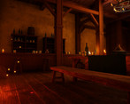
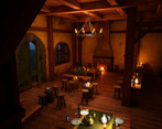
- So far so good but it's not done yet :D. I can see where you are getting with the atmosphere, having a bit of a fantasy direction for this environment. Some things, as you also said, could be improved, like more propsing around the building. Some parts around the building could have less vegetation, being areas where you could build a player path to guide him to the building. The orange lighting on the front of the building looks nice and powerful, contrasting with the background but it lacks a light source :) . You could add a light emitting object like a camp fire or some kind of light on a pole. On the interior, some of the table candles are emitting a much too powerful light, resulting in burned highlights and sharp shadows, both that are not realistic for a candle light. There should be a light hierarchy, small candles, bigger candles from the sealing and the main light in the fire place, for example. Another thing you should be aware of would be mesh optimization. One particular object is the stair case. It has too much unnecessary geometry on the flat surfaces and even more geometry on the hand rail. The vertex or polygon density should be more or less an average over the entire scene, and at the moment it looks like a very big percent of your geometry resources are used on one staircase. There are some finer things that could be improved, like adding more life in the scene with, debris, wear, dirt, marks in the interior but overall it seams you have the handle on the process making props, materials, textures and presenting them in a nice and cinematic way. Keep at it!
- It would have been good to see more reference and it annotated. Block out looks good and how the scene progressed over time. It’s also good to see that you got some lighting in at an early stage too. It’s good to see that you managed to create an interior and exterior to the piece. Good use of tiling textures and modular kits. The style is consistent from asset to asset. I like how natural your trees look. I like that you have some colour contrast in your lighting. Nice scene.
Challenge Tier
Sumo Digital Rising Star
Leave a comment
Log in with itch.io to leave a comment.


Comments
Research & Development
Research seems to be based a bit too much around concept art instead of real life references. From what I know, concept art is mostly based on real world and built on top of that. The documentation is also a bit short on different prop and material research. I'd suggest doing a bit more research and searching for high quality reference to help with pushing the feeling a bit more towards real-life and realism.
Creative Art
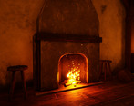
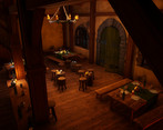
The exterior of the house looks and reads beautifuly in the blue an orange lighting. Interior is lit well to showcase the warm inn and a cosy fireplace.
To help push the scene a bit further, I would have a couple of things to note. The house looks great and interesting, but is a bit grounded in the realm of 3D with the silhouette reading a bit too much like straight shapes. On the interior, it would be nice to see a bit more of planks being modeled as 3 dimensional objects maybe, and having some material blending. The orange light on the exterior, as nice as it looks and reads, seems to be coming a bit out of nowhere, especially with the color that the scene is showcasing.
Having made the call of doing both interior and exterior in there might have been also maybe a bit of a not-so-good call; I believe the quality could have been pushed a bit further had you cut down either interior or exterior of the scene and concentrated on making higher quality content for just one or the other.
Technical Art
Use of blueprint for the candles seems clever. There's nice usage of tileable and unique materials.
Some rounded objects are a bit on the low end to get a closer look at them, and some of the normal maps might have a flipped channel (for example on the wooden floor) Also the scales of tables, chairs, doors and windows leave a bit of an unsettling and a toy-world like feeling. Also, please take away the extra tesselation out of the exterior modules, it's mostly used for landscape/terrain; the subdivisions you're showcasing is already good for vertex painting, and then you can take the modules further by giving it some love through modeling some indents for breakage and such, as was used also for Uncharted 4; https://www.artstation.com/artwork/r0466
Documentation
The document shows development steps throughtout the development with great, short descriptive texts and illustrative images. It was very enjoyable to read through, and gave a great sense of knowledge.
Final Presentation
Images are of high quality and showcase the results in a clear manner while not trying to hide anything. Kudos! :)
Thanks for the feedback, extremely helpful.