


Play asset pack
Palace of the Brotherhood's itch.io pageResults
| Criteria | Rank | Score* | Raw Score |
| Technical | #10 | 3.714 | 3.714 |
| Research & Development | #19 | 3.429 | 3.429 |
| Overall | #21 | 3.457 | 3.457 |
| Documentation | #24 | 3.571 | 3.571 |
| Presentation | #27 | 3.286 | 3.286 |
| Creative | #28 | 3.286 | 3.286 |
Ranked from 7 ratings. Score is adjusted from raw score by the median number of ratings per game in the jam.
Judge feedback
Judge feedback is anonymous and shown in a random order.
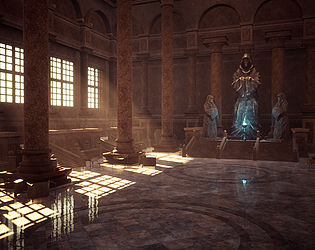
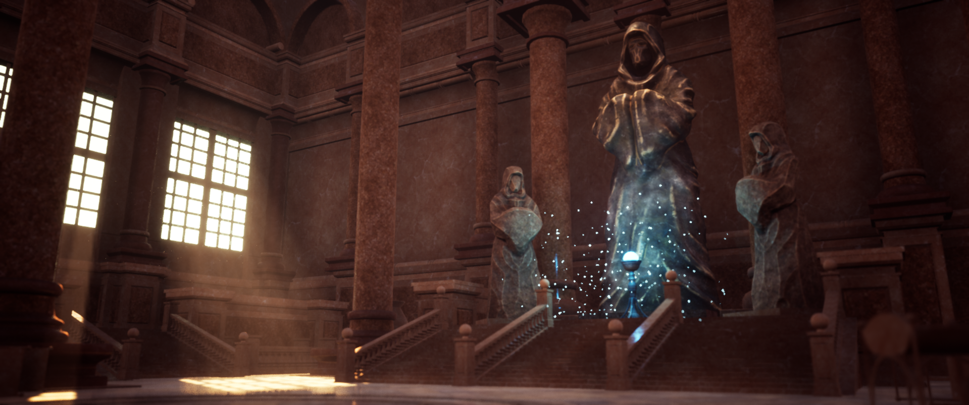
- Research & Development Research is done to a good extent. The inspiration is shown, and looked into what was the inspiration for it originally. Other concept work support the ideas. There's a good sense of that making a scene more intricate and high detail with story elements would take quite some more time. Creative Art End result shows nice scene with beautiful lighting where time was of the essence. Pulling such scene in 7 days is a remarkable feat. Architecture looks nice and well made with sense of grandeur and scale. I like the material separation with walls being a more rough and floor shining in a polished fashion. Given more time was there to support it, I'd expect pushing the material work a bit more with good material references, and maybe support the fancy feeling to with ornamental trims. Statues work for the purpose, but feel like they could also be pushed a bit with additional layer of care and detail. Exploring a bit more with color might also be beneficial. The sense of scale is a bit lost, like you mentioned as well, and some hard edges give the scene a 3D feeling rather than real world location. I'd like to see some irregularities in the meshes, and maybe some decay. Window structure could maybe be pushed with further research. I'd suggest looking into reconstruction of Zeus statue, and maybe pulling the praying monks together, removing the pillars leading to the smaller monks as well as the center pillar directly in the middle to add a bit of breathing space for the main attraction, align the risen plateau with the pillar line and give it a bit more space for player to go around and inspect the focal attraction. Also, intersecting the pillar line with the stairs looks interesting with some quick fiddling around in your scene. Sometimes it's good to step back, do something else maybe, and step back in where you don't feel like you're losing something you were previously building, and give it a go with fresh set of eyes. (PS; I uploaded an image of my quick test to imgur; https://imgur.com/a/ZwnyaCC I hope it's still up on the servers when/if you get to read this) Technical Art Meshes look well optimized for performance. You've used grouping well to populate the architecture. The dust FX adds a nice touch. Post process works, and the lighting setup looks simple and efficient. Documentation Day by day progress is very impressive. Texts are easy to read. Images are presented well and with descriptive texts. Final Presentation Renders show end results well. Work is presented very nicely and nothing is being hidden.
- Great presentation and detailed documentation! I only have some pointers for you that might help you level up the quality of what you already have. - The sense of scale is somehow lost. You have these huge statutes but you only know how big they are once you see the size of the stairs on the left hand side of the picture. In your documentation you tested this by putting a normal size character by them. I would say placing either a character kneeling somewhere or something more relatable will bring the scale visually to the right place. - The use of the generic material is clever as is mostly hidden by the lighting however I would expect some dirt or wear in general, especially in the corners and at the top of the columns. - The rock/stone material on the statues looks foo to me. I think there are better ways to represent wear especially on a big shape like that. Try don’t to do the same curvature wear that everyone is doing on rocks. A bit of it it’s great. Too much of it cheapens your art I hope this helps
- Good to see reference from different sources and a break down of them (things you liked and wanted to include). Good to see a block out with lighting and a shot composition in mind. It looks like you had a firm idea of what you wanted to create and it’s good to see it evolve over time. Great to see that you experimented with other camera angles throughout development. Really good to see you used a modular kit of parts and heavy use of tiling textures. Although the sculpt of your statue looks a little soft it does hold up well in the scene. With the lamp you might have found it easier to use a trim sheet and tiling textures to create it rather than sculpt it. It’s a shame that you haven’t baked any of the lighting but, as you say, it will be quite straightforward to do so in the future. I like that there’s a colour contrast in the lighting and that you have interesting shadows but the scene does look quite red/brown. Having some darker areas would really make the scene pop. I really like the reflections you have across the surface. Great work!
- Submission Title: Palace of the Brotherhood Submission Tier: Search for a Star Assessor: Dominic Shaw Artist @ Firesprite Research & Development I think that there was some good research done for this project and it was nice to see some real world reference of the environment that you wanted to create and not just other people art works and games. Even though you only spent a week on the project it would have been nice to see some asset lists and time plans in the documentation. You had a good approach to making this environment with the use of modular kits and tile-able materials. Creative Art The main thing I noticed is that the lighting is distracting you from the focal point but after reading your documentation, you noticed this too which is good, and I would recommend sorting this before using the environment in your portfolio. Overall the image is appealing and you’ve done a good job of making this in such a short amount of time. I think some of the materials are used a bit too much and it could have benefited with some material variation as there is a lot of marble in the scene. I really liked the floor material that you made but I wasn’t a massive fan of the marble material on the pillars as they just don’t feel like marble. I don’t have any good reference to compare what these should actually look like but it could be worth just giving that texture another pass. It could be worth breaking up the environment with more concrete. You are also lacking shadows in the corners which is causing the image to be quite flat, I increased the AO in the post process and this seemed to help a bit but when you come to do your actual light baking, I would try to get some shadows in the environment. Technical Art The workflows that you have used in this environment is pretty solid with the use of tile-able materials and modular kits whilst also keeping all the textures channel packed. I would have chamfered some of the edges of the modular pieces but this is just a minor improvement. I think that the main thing that is needed in this environment now is more material separation and variety, you could look into vertex painting some dirt in areas. Most of the issues I found in the environment such as some modular pieces not snapping together right, you picked up in on your documentation so you clearly know the workflows and what’s needed to be done to improve this environment which is a good skill to have as not everyone is good at critiquing their own work. Documentation I think that you broke the documentation down well and the workflows that you used was a good way to approach making this environment. Final Presentation The composition of the level is pretty good but it’s just lighting that throwing it off now, you could rotate your directional light so that it’s point mainly towards to focus point and highlights that area more. I think for a week’s worth of work, you have done pretty good and I would now just focus on improving the materials and getting more material variation. I would also recommend getting some more smaller props in there to help fill out the scene as it’s a bit large and empty at the moment. Overall, not a bad piece of work and I think with some improvement this will be a really nice environment on your portfolio.
- After reading your conclusion, there aren't many things left for me to tell you. Having the ability to critique your work in an objective way, is a big plus. It would have helped if you would have realized how the size of the scene will affect your work load. And you could have focused on one part of the room or detail the area with the statues. I understand how the skylight, god rays and windows messed with your focus. But it overpowers the entire room and not least your main focus of the room, the statues and blue light. For that to be more eye catching for the player you should have brought down the outside light to at least 1/4 of it's actual power. The materials are ok, but being the size of the assets and architecture elements, the tiling is really visible and it's starting to look noisy. Another thing that could be improved would be the ground reflections that at the moment are only screen rendered and having also shadows ...they don't look realistic. On the detail side, as you said, the statues could need more detail, at the moment they look really soft. Overall you should check the scale of the materials between them so they have more or less the same scale and density of detail, backed up with geometry detail. Like you said, with a bit more time this could be better, on the other side you should be able to tell how much time something will take for a particular level of quality. You will learn this in time and with experience. Keep it up and good luck !
- I'm also a big fan of Theed architecture! I really like the theme and colour scheme you chose, but I feel the final presentation didn't show it off as well as it could have. The concept art works because of contrast: the pillars are absolutely massive but there are tiny details on the floor too. Your scene has a much smaller scale, and the windows feel a bit square. I'd recommend going boldly bigger, really exaggerating the scale and majestic feel of the construction, while keeping the chairs and stairs very small (human-size) in comparison. A big problem that I noticed was the general brownness. The tiling textures you have are very similar, which makes the whole scene feel monotone. Addind simple white marble trims or black tiles here and there would add a lot of visual interest. The modular pieces you have are quite simple. It would really improve the scene to have more ornamental textures and more detailed modelling in them. Looking at the reference images, there is a lot of small detail that makes the spaces so interesting. Your pieces are efficiently built and well thought-out, and considering they only use tiling textures, this should be an easy thing to fix. In terms of the final presentation, I'd suggest using some stronger lighting contrast to add interest to the flat surfaces. The fov makes the front extremely blurred, which is distracting. I feel that I'd like to see the items in the front properly, but at the moment I can't. The statues feel like they are a very different style from the rest of the palace. The stone is gray and rough, making them look more like ancient artifacts than palace decorations. I think that could really work to add interest to the scene, if you made them even more ancient-looking, implying that the palace was maybe built around them instead of the other way around, or making it feel more like a museum. If you think of the scene you have now as a whitebox for your final scene, and rework the assets a bit, this will make an amazing portfolio piece!
Challenge Tier
Search For A Star
Leave a comment
Log in with itch.io to leave a comment.
Comments
No one has posted a comment yet