

Play asset pack
Cemetery's itch.io pageResults
| Criteria | Rank | Score* | Raw Score |
| Documentation | #49 | 2.667 | 2.667 |
| Research & Development | #67 | 2.167 | 2.167 |
| Presentation | #73 | 1.833 | 1.833 |
| Overall | #74 | 2.033 | 2.033 |
| Creative | #79 | 1.833 | 1.833 |
| Technical | #79 | 1.667 | 1.667 |
Ranked from 6 ratings. Score is adjusted from raw score by the median number of ratings per game in the jam.
Judge feedback
Judge feedback is anonymous and shown in a random order.
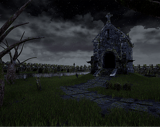
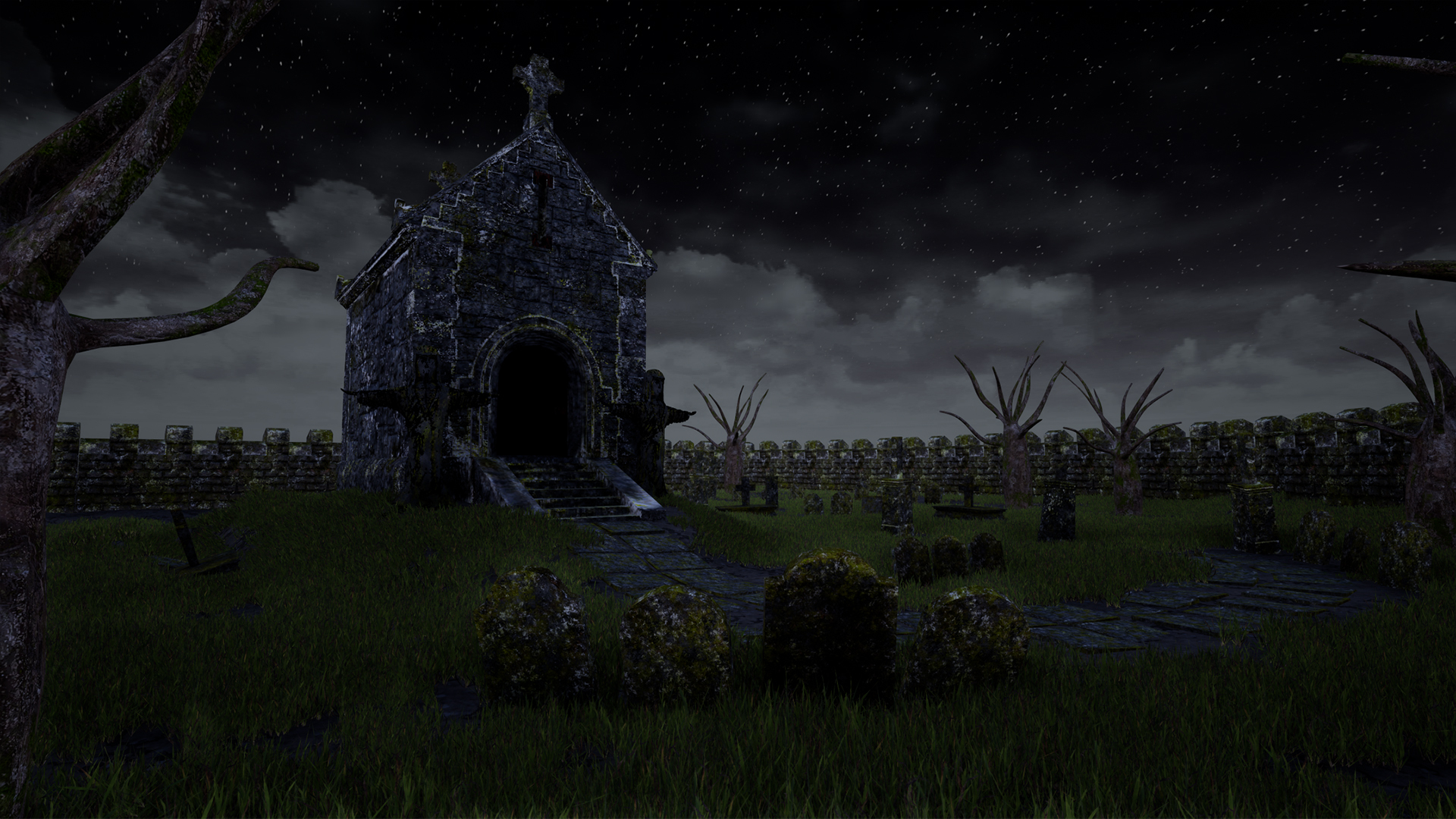
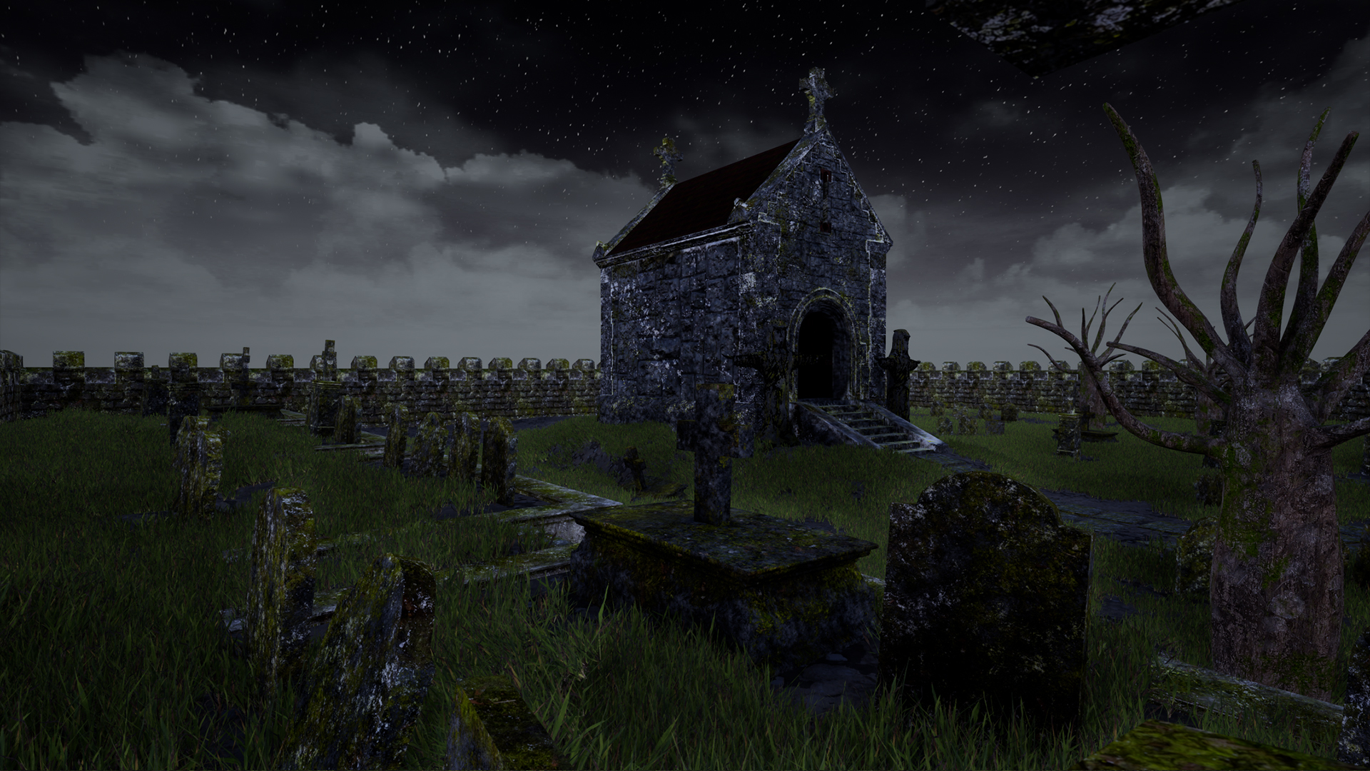
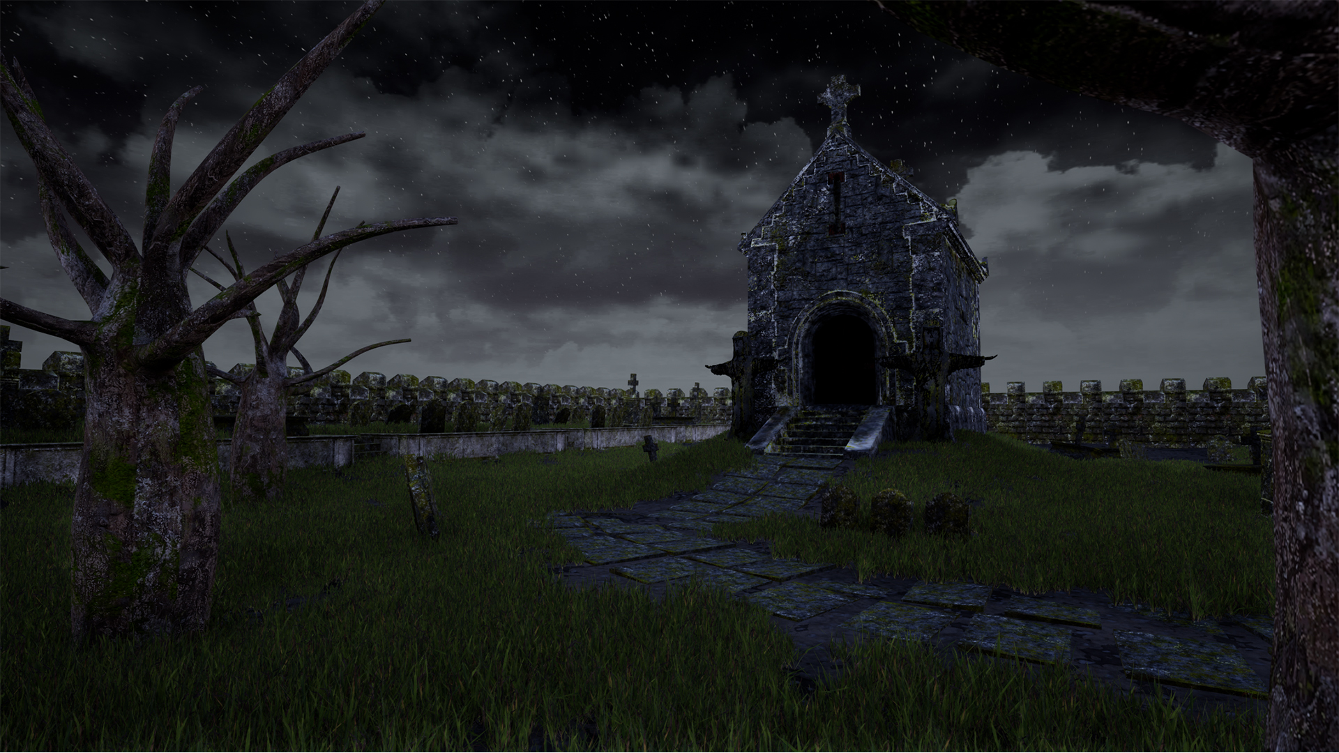
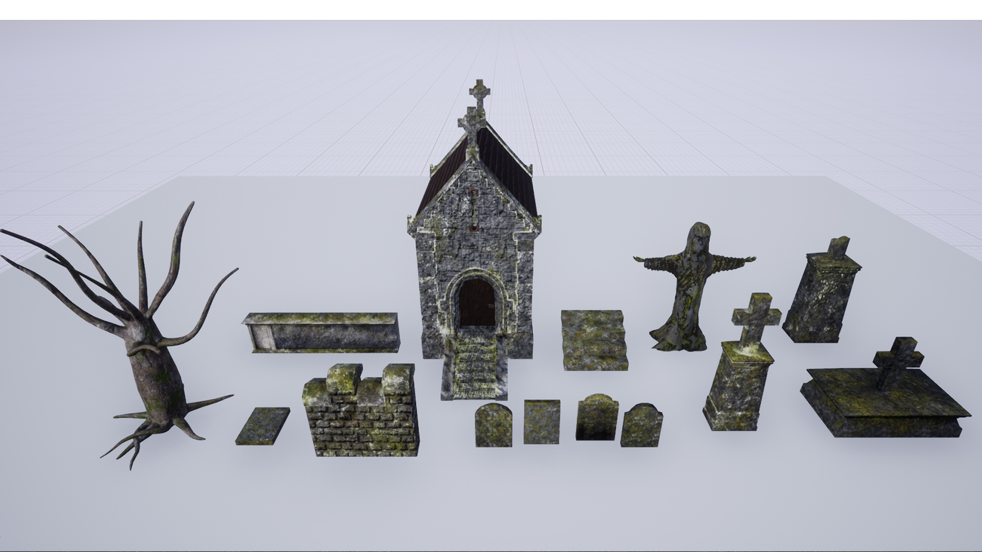
- Would have been good to see annotation of reference and some early tests of art style on smaller assets. Block out looks good though I would say to not lock the placement of assets down at this stage. Instead, modify the arrangement/composition based on your camera positions. Baking has been used but I’d recommend using tiling textures for any larger or repeating assets eg. buildings, walls, trees. This will give you better texture resolution. Statue UVs could do with massaging. All gravestones could be placed on one texture sheet and detail could have been added eg. whose grave it was, when they died, any sentiments. This could have been used to add story to the scene. The grave textures could have more difference between them and less noise. The trees don’t look natural and would have benefitted from having leaves. The grass looks good. The scene/path would have benefitted from having grass at different heights and clump sizes. The nighttime look for the reference can be seen in the final images but the lighting is quite flat. A directional moon light could have been used to introduce a cool blue and create interesting shadows. A stronger fog would have also helped with layering in the final images.
- Hi Daniel, A cemetery is a location that is done over and over. However, every single time it can be special! You found some really cool concept images. Just go for it and make one! The combination of many might not be helping you. See below my few noted about it. -You are very lucky to live near a cemetery as you can visit your reference anytime you need to. -The proportions of the statute aren’t right. Neither is the shape of the tree. But hey!! You live near a cemetery. This is the perfect opportunity to learn photogrammetry and scan some tree trunks and combine methods by creating some cool branches using Zpheres or SpeedTree based on a real life reference. You can also do some photogrammetry for the statute and then give it your twist after. -textures are too noisy. I recommend blocking out the environment first and do some AB tests with different looks. Take a screenshot of your block out into Photoshop and try different stone textures. If you achieve a none noisy look in the mid distance, then you are off to a good start. Again photogrammetry can be of great help here. -Human eye is very good to spot repetition/patterns. If the layout of your scene is locked down the you got to dress the environment to avoid this problem - Night lighting is one of the most difficult things to achieve especially when you are only lighting your scene my penumbra. Play by your strengths and perhaps add other sources of light so that your scene isn’t as dark. -choose a different sky and make it work to affect the reflection of your assets. This will help you understand a bit more lighting. -choose one hero shot and work on it. Play with the camera settings and composition of your shot. I hope this helps here and/or in the future. All the best L
Challenge Tier
Search For A Star
Leave a comment
Log in with itch.io to leave a comment.
Comments
Research & Development
There are cool moody concepts in the subject matter, and the photos from a trip are a great addition.
Creative Art
The main focal point sticks out very well as a dark silhouette rising in contrast to the lighter gray sky.
Technical Art
It's nice to see there's not a lot of wasted texture space.
The light could get a bit of intensity, make it look for example like a moonlight lighting. Putting also some subtle spotlights to draw attention to key assets would also help to draw attention to details.
I'd recommend looking a bit into tileable textures and trims in the future. Getting certain texel density was the key for me to start thinking more about using tileable, trim and unique textures. For 3rd person games, it's most common to target for 512, while 1024 is more common for 1st person perspective games.
Documentation
The documentation covers steps taken to produce the results and showcases progress very nicely.
Final Presentation
Squinting at the images, you can clearly make out the main attraction. Screenshots are of high quality which makes it easy to read what's going on.