

Play game
Abandoned Asylum Corridor's itch.io pageResults
| Criteria | Rank | Score* | Raw Score |
| Presentation | #41 | 2.683 | 3.000 |
| Creative | #45 | 2.683 | 3.000 |
| Research & Development | #51 | 2.460 | 2.750 |
| Overall | #55 | 2.415 | 2.700 |
| Technical | #64 | 2.012 | 2.250 |
| Documentation | #67 | 2.236 | 2.500 |
Ranked from 4 ratings. Score is adjusted from raw score by the median number of ratings per game in the jam.
Judge feedback
Judge feedback is anonymous and shown in a random order.
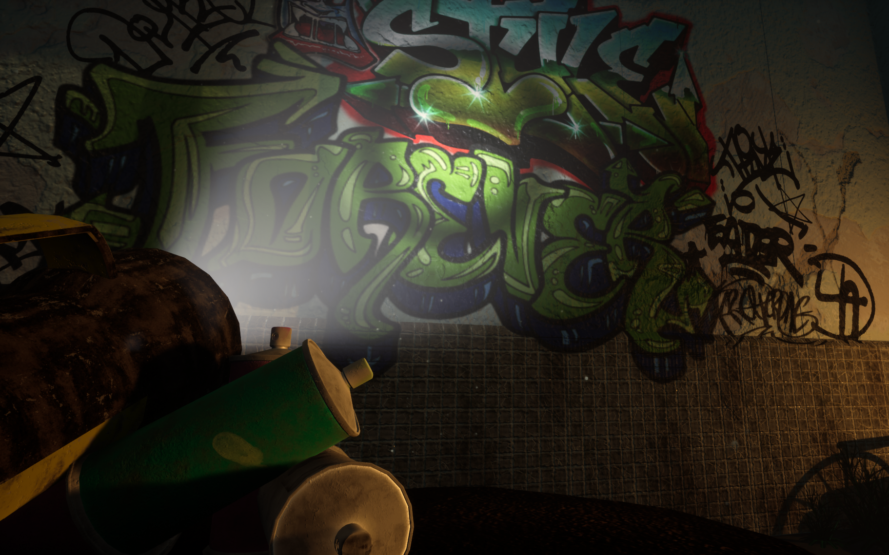
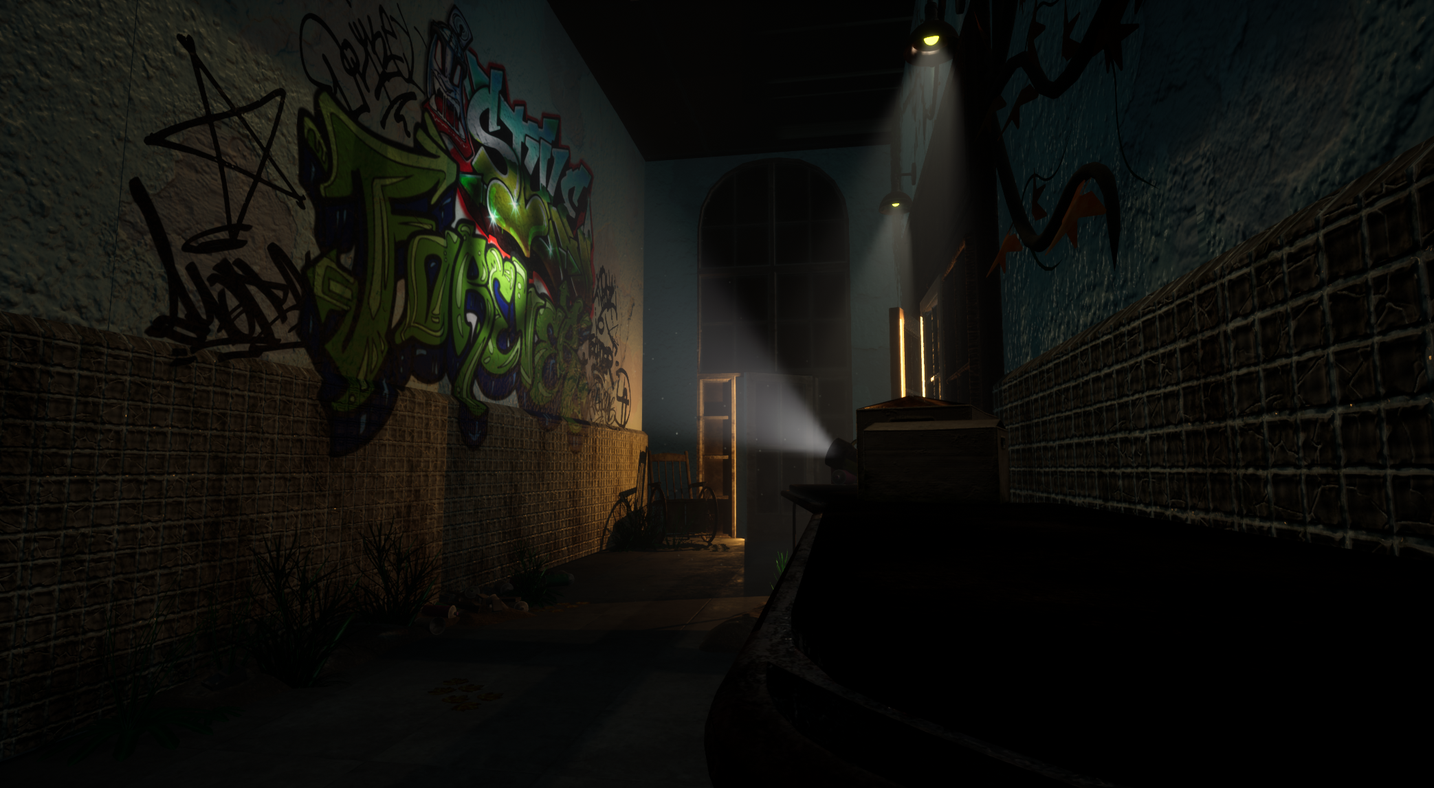
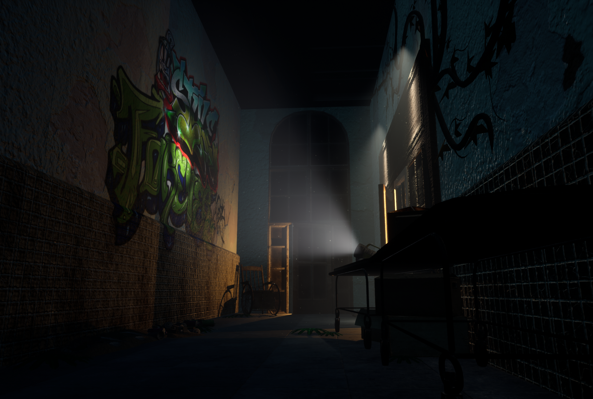
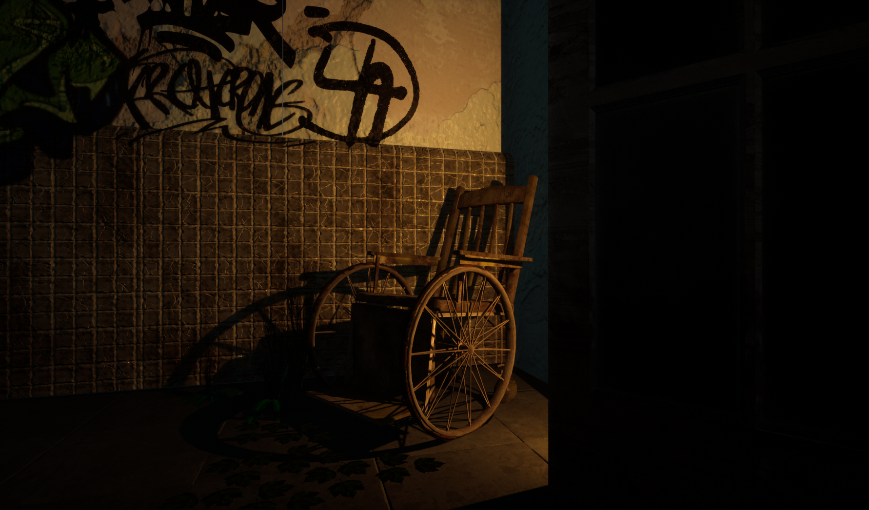
- It would have been good to see some annotated reference and a small art test of the direction/style you wanted to take the piece in. I like that you’ve created a block out and that you have moved the assets around to find more interesting compositions. Duplicating assets and having them on their sides (discarded) would have worked with your theme too. Models and textures look good though it would have been better to use a modular kit and tiling textures on the door frame and window. The scale of the wall UVs could be bigger to make the plaster texture smaller (the amount of normal bump you can see is unrealistic). I can see you’ve tried to make the scene lighting look “moody” by having distinct cones and volumetric fog. I feel that it’s a bit forced though. I really like the strong orange light in your Detail Lighting image and that you can’t see the light source from the camera (makes it look light an abandoned torch). If you made this more intense and had a larger cone instead of the additional lights/projector then this would have worked really well. I like that there’s a colour contrast in the lighting. Good work!
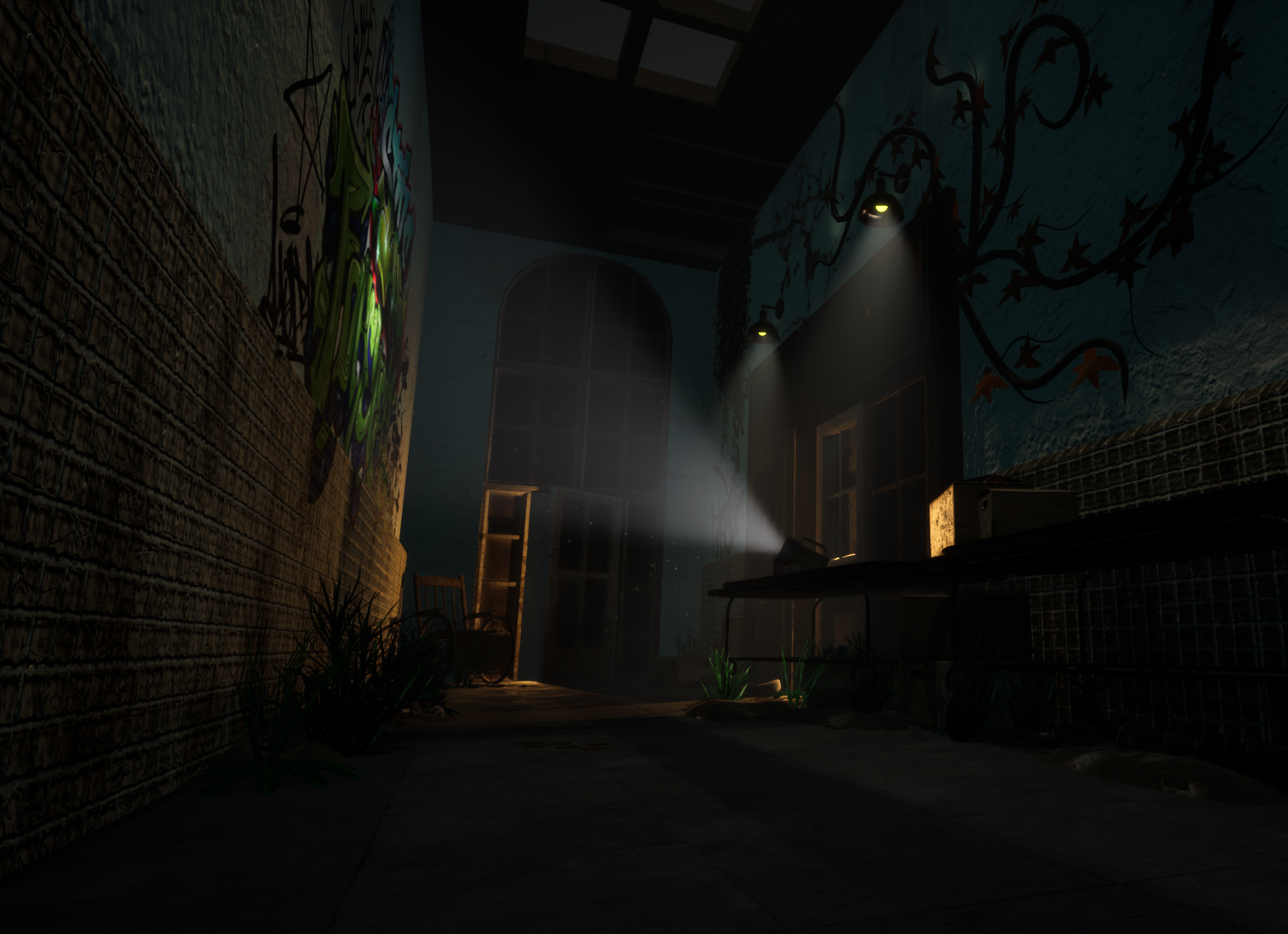
- Research: Good research conducted through film. Would have been awesome to see more examples from in game environments such as Thief (2014) or Outlast. Not much of a narrative present despite the abandoned theme. Try to think of the purpose of the environment in a game. Who is there, what purpose does the Asylum serve for the story. More research into that will help immensely in the future when planning environments. Creative: Overall the scene is quite basic with a limited amount of props. It could do with a lot more prop love. It’s good that you used decals and added some graffiti, things like this will help sell your scene more. There are some consistency issues with your wear and tear, keep an eye on this, your graffiti looks brand spanking fresh and saturated as if painted minutes ago and doesn’t really fit with the abandoned narrative you are going for. Your plants are also very saturated. There’s also no indication of where they are coming from as your scene is indoors with no windows or sunlight to reach them. You’ve started to build a small scene with some decent props, but it needs to be taken further, more props and more narrative. It’s a good start, you just need more of what you’ve already got but with more thought towards the narrative elements. Try to experiment with using a prop as a focal point rather than the wall. The shot with the wheelchair with the light cast on it is much more interesting. Also try to introduce different light elements, maybe some light blue moonlight from outside somewhere. Technical: Right now the assets you’ve provided are very high poly. The doorway is not so bad. The wheelchair and gurney have a lot of NGONS and heavy polygon usage in areas that can be reduced a hell of a lot. Try to reduce the polygon count in areas that are further away from the player view or not seen as well. For example the support beams for the wheels on the wheelchair. These are super high and a big waste of polygons. Prop textures are a decent start. It’s quite hard to see what is going on because of how dark the scene is. Would be nice to see some prop presentation separate to see what is going on. Wall textures are good. Texel density for the main wall texture seems a little too large. I’d reduce this. It also looks quite noisy, maybe reduce the normal detail to be less intense. Not much evidence provided on your material setups in UE4 so not much to say about that, but it runs well. Try to push your lighting and post process some more next time. The scene is overall very dark and could use some lighting love. Presentation: Overall it looks decent, however your lighting is currently killing your scene. All your texture detail is being lost because the scene is super dark. Try experimenting with some moonlight and adding more power into your skylight. Although it is pretty dark, games will almost never have it this dark. So have a play around. Like I said before I’d try to focus on a different area like the wheelchair or something else. Cool examples of the quality you should aim for: https://www.artstation.com/artwork/XBLB4a https://www.artstation.com/artwork/XBOgPR https://www.artstation.com/artwork/WnOX Documentation: The Documentation you provided is good, but needs to cover more. After the initial blockout the information drops off, it’s good you included some texture flats but only for the base colour. Its important to also show the material setups in engine and more development on the modelling, UV’ing and lighting elements. Conclusion: You have a solid foundation here, but you need to be making comparisons to industry members in your field and compare your quality to theirs. Keep cracking on at it and don’t underestimate the planning process, it will help you no end. Good luck. Resources for you to check out: Polygon Academy: https://www.youtube.com/channel/UCGXr6E_g91ue1rfhA9j4TLA Article on Texel Density: https://www.artstation.com/artwork/qbOqP
Challenge Tier
Search For A Star
Leave a comment
Log in with itch.io to leave a comment.
Comments
Research & Development
Research shows different world locations of similar places. I'd suggest picking a main reference and sticking a bit more to it for the time being. The structural correctness of modules shows, but might benefit from looking a bit closer at reference to get the things to read with better scales (how much things are sticking out)
Creative Art
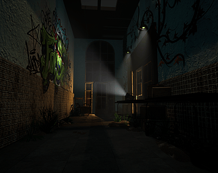
The corridor reads as a abandoned asylum where spray artists have been exploring their artistic capabilities, with the main focal point being the bigger tag on the wall.
Technical Art
I'd suggest to look into texel density (512 for 3rd person, 1024 for 1st person), and check dimensions of real world objects such as tiles and doorways. Use this to your advantage when planning your texture, and try to reuse same texture space as much as you can without sacrificing quality. 2k maps are somewhat the biggest texture size you could be covering for individual assets, but you can also divide bigger assets into several materials (eg. tileable 1k material set, decals 256 material set, uniques 512 set, .. )
Lighting works well to present the main attraction.
In terms of polycount, round connections of gurney might have too high roundedness, while the module with rounded top might have it too low. In general, it would be a good idea in today's games to model separate elements of windows as separate elements, instead of extrusions and insets of a plane. Wheel chair has polygons that don't seem to add a lot to the model itself (eg.the laurels of wheel).
Playing the build, the character is either half the size of common 2m, or the objects might be double in scale. Maybe there was a conversion issue?
There's probably something slightly funky with the packed file, too, as it seems to be almost 2Gb of size while the project unpacked out of it is something around 500 megs.
Documentation
The documentation presents images well. Text is by most parts easy to read. Progression and thoughts behind decision making could maybe be more present.
Final Presentation
Presentation, although being a bit dark, shows the scene and doesn't try to hide anything. Delivering build instead of uproject was a nice touch, even if it meant judging models I needed to import models to Marmoset Toolbag. All in all, nice delivery.