Play game
Giants Rest's itch.io pageResults
| Criteria | Rank | Score* | Raw Score |
| Technical | #75 | 1.807 | 2.333 |
| Creative | #81 | 1.807 | 2.333 |
| Documentation | #87 | 1.291 | 1.667 |
| Presentation | #87 | 1.291 | 1.667 |
| Overall | #88 | 1.446 | 1.867 |
| Research & Development | #89 | 1.033 | 1.333 |
Ranked from 3 ratings. Score is adjusted from raw score by the median number of ratings per game in the jam.
Judge feedback
Judge feedback is anonymous and shown in a random order.
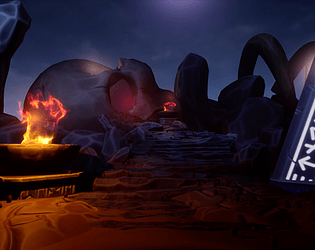
- There’s not enough reference to see what inspired you to make this piece. It would have been good to see an art test to see which direction you wanted to take the piece in. I can see you built up the scene over time but it would have been good to see a white box block out of the scene before making the assets. This would help you choose shot compositions, check lighting from an early stage. The style you’ve chosen to create is consistent from asset to asset. I like that you have colour contrast in your lighting but it does look a little cut off. It would have been good to have a few static spotlights casting orange light onto other areas of the scene. It would have been good to see the scene from other camera angles too.
- Research & Development The research shows interest towards the subject. Mythology is something I find interesting, and implementing such into your work, or pushing it to another era/art style (take, say, greek mythology and reimagine it in today's era, or WW2 or brutalistic approach or..). It's common policy to look for real world reference, too, to get material that showcases how stuff is made, how they look, how materials should look and what sort of feeling would you like to add to your scene. Creative Art The end result is a solid pathway to gigantic skull. There's a nice gradient. Pathway leads to the skull, and runes give the idea of the location/place/mythology. There's nice stylized aspect to the scene. I like the sense of mythology and fantasy of the scene. Referencing and implementing real world elements and feeling to materials and lighting would add to the scene. Runes are a nice thing; I'd like to see more support of the mythology. The image could showcase objects of huge, big, medium and small shapes. Use of color comes mostly from lights, but could be pushed further with a bit more research into materials and props. Technical Art I can't say much about polycount, optimization, good policies used or shader effectiveness without editor content. Scales could maybe be revisited. Documentation Text is easy to read. Images look nice. Final Presentation Images are of high resolution and showcase the scene well.
- Artist – Alex Keates Category: Search for A Star Assessor: Anthony O Donnell – Lead Artist at Firesprite Work name: Giants Rest Research and Development /Documentation The document was simple and gave some insight into the creative choices made and workflows used. Technical Art Texture channel packing was utilized but not input correctly. An RGB float 3 value was input into the AO instead of just the Red channel only. Roughness and metallic were left unplugged. These data textures were set to sRGB they need to be Linear , the best option for this in UE4 is "masks(no sRGB). Atmospheric effects were used to create separation in the scene to good effect. Materials / Textures The rocks look too soft. Edge highlighting suits the style. Some variation in sculpting would improve the scene in terms of sharper clearer areas contrasted against noisy softer areas across the stone surfaces. Creative Art The idea for the piece is cool. Lighting does help guide the eye to the skulls orbital cavity. As per some of the reference pieces the lighting and colours could have gone a more vibrant route. More could have been added behind the skull to create more interest. Final Presentation The final image works ok. All the basic narrative elements are in there. The scene does feel like it's lacking details to both further the narrative and add visual interest. Some questions worth asking to drive the story are : Is the skull now used as a place of worship ? A home ? A "cave" of safe passage ? What can adorn the orbital cavity to guide travelers or if it's used as something else ? What was the giant fighting ? How did the giant die ?
Challenge Tier
Search For A Star
Leave a comment
Log in with itch.io to leave a comment.


Comments
No one has posted a comment yet