Play game
Post-apocalyptic Library's itch.io pageResults
| Criteria | Rank | Score* | Raw Score |
| Creative | #31 | 3.098 | 4.000 |
| Presentation | #33 | 3.098 | 4.000 |
| Technical | #37 | 2.840 | 3.667 |
| Overall | #40 | 2.737 | 3.533 |
| Documentation | #53 | 2.582 | 3.333 |
| Research & Development | #70 | 2.066 | 2.667 |
Ranked from 3 ratings. Score is adjusted from raw score by the median number of ratings per game in the jam.
Judge feedback
Judge feedback is anonymous.
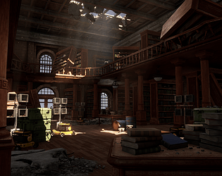
- I can see you’ve heavily referenced Uncharted for the environment. Make sure to find other real-world references to compliment what you’re looking to achieve. I like that you’ve analysed the concept composition and the other reference you found. Block out looks good and scale looks to be correct. Remember to fill out the space outside of the building itself whether that’s adding another part of the building or landscape and foliage. This will help solidify the compositions and give you a better representation of the lighting. Models and texel density looks good. Good use of modular kits. The broken banister could look more realistic by having split/damaged wooden parts and splinters. It looks very soft at the moment. Prop texturing looks good but a little flat: it doesn’t look like the assets have any metallic/roughness information in the textures though the trim sheet wood texture does. Nice amount of debris and book clutter. Good to see that you created more advanced shaders for the scene. Lighting looks good. Nice amount of bounce. Fill up what is beyond the windows would have really helped even if it was a rough landscape and texture. Adding debris on the floor where the room caved it would have also added to the realism. Really good job! Miscellaneous note: the PDF is 220MB. In the future, if you’re using images of the final scene in the doc then make sure they’re small jpegs instead of full res images.
Challenge Tier
Search For A Star
Leave a comment
Log in with itch.io to leave a comment.


Comments
Research & Development
References include screenshots and a concept from one game with a couple of real world references. Captions show well the interest toward level design and using environments to guide the player and give the place a certain feeling. There's a bit of lack on the references and concepts of props.
Creative Art
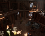
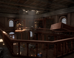
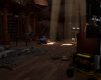
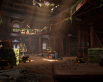
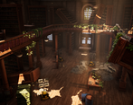
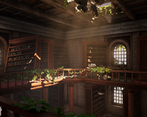
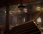
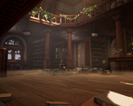
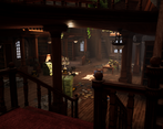
The scene feels warm and soft with dust, particles and bright light shining through building cracks along with wooden pillars, bookshelves and books taking the main stage. Use of tileables and trims make the scene look very cohesive. Books and props add nice smaller additions of color into well working color palette.
The end result rather close to the main concept so that it makes you compare those directly to each other, which makes me feel like the scene falls a bit short of the main concept, but shows promise and has many things that have been done well. Nature having taken the place over is one thing, but also the showing aspect of the organization's soldiers having been to the place are not super well present. Wood is a great element, but it contrasting so well with metal in the concept, I'd like to see a bit more of metallic items to the scene to strike the interesting balance a bit more.
All in all, it's a great scene that could use a bit more of polish and attention to detail for props and materials.
Technical Art
Masking approach for books works well in the scene. Made materials also showcase a great interest towards the subject and easy ways to develop scenes in rapid working environments.
Scales of things work pretty well in the scene, and polycounts are within game-ready budgets. Some things feel a bit out inaccurate with scale, such as the MLTs, and it might a have a bit high polycount. For bigger props, I'd like to see a bit more variation in the silhouettes with some well thought out geometry cuts. Pillars and shelves could maybe also use a few variations with different levels of breakage.
Documentation
The techniques and props are documented very well along with material graphs. There are nice captions within images and the text is nice and easy to read.
Final Presentation
Renders are nice and sharp and showcase well the subject matter. Lighting works and thumbnails look great.