Play asset pack
Chicken and gravy's itch.io pageResults
| Criteria | Rank | Score* | Raw Score |
| Research & Development | #80 | 1.833 | 1.833 |
| Documentation | #80 | 1.833 | 1.833 |
| Presentation | #86 | 1.333 | 1.333 |
| Overall | #86 | 1.567 | 1.567 |
| Creative | #86 | 1.667 | 1.667 |
| Technical | #87 | 1.167 | 1.167 |
Ranked from 6 ratings. Score is adjusted from raw score by the median number of ratings per game in the jam.
Judge feedback
Judge feedback is anonymous and shown in a random order.
- Lots of room for improvement. Definitely need to work on overall presentation of the project and the work. Lack of textures, lighting and any thought of technical implementation. Definitely invest in better tools and resources next time!
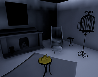
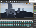
- Research & Development Narrative idea is great, as well as exploring with sketches. Development of the ideas is presented well. Reference material is a key to succesful scene; please gather some for the next one. References can showcase and steer you towards better end result with shots of objects, structure, lighting and colors. Creative Art The yellow chicken stands out as the center of attention in an otherwise unsettling scene. You've completed a basic scene, congrats! Now, go do some more, and have more fun, if you feel like it's something you'd like to do. :) Technical Art There are some cool aspects to the scene. Rounded surfaces could use a few more polygons. I'd suggest researching smoothing a bit more. In terms of eye adaptation, I'd add basic post process volume with Max and Min Brightness set to same value. Documentation Documentation is written well and tells about development of the scene. Thought processes and decisions are mentioned in the text. Final Presentation Final presentation shows the scene well with sharp screenshots.
- Hey, so, I'm sorry this piece so clearly didn't work out for you. I think you have to begin to be real with yourself and see that maybe some of the fundamentals of Unreal were missing when you embarked upon this project - you maybe also didn't give the time it deserved or needed. If you care about 3D and want to do better next time, I'd say you need to go to youTube and watch the basics of Unreal. https://www.youtube.com/user/UnrealDevelopmentKit/playlists?view=50&sort=dd&shelf_id=17 There's a lot of really great stuff here, you gotta go through the boring stuff before you can create the cool stuff. Don't give up if this is really something you want to do. You can do it. Find someone who's willing to help you and put in the time, you might be on your own for a while until people see you're serious. But find some peers you can work with. Best of luck, Chris Harper Snr Tech Artist @ Splash Damage.
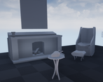
- Always gather reference of what you want to create at the beginning of the project and don’t feel like you can’t add more as you move into production. What we think something looks like is always different to what it actually looks like in real life. Good to see a block out. Try and add in some lighting and camera angles at this stage so you can improve scene compositions. All the models look a bit too low-res. Don’t be afraid to add more geometry into them especially for curved or cylindrical surfaces. There’s no texture progress in the document so I can't judge this effectively. The scene doesn’t look like it’s been lit. Think about where the light would be coming from (eg. lamp or sunlight from a window). Creating contrast with light and shadow adds a lot to any scene.
- Submission Title: Chicken and Gravy Submission Tier: Search for a star Assessor: Dominic Shaw Artist @ Firesprite There was a lot of different and unique ideas being played around with at the start before finally choosing to make a low poly stylized living room. There was a lot of sketches for each idea that you made which were some cool ideas but I think where this project suffered was from a lack of knowledge of the pipeline as you stated this is the first time you have made her own assets. At the start of any project it’s really useful to gather as much references as possible so that you know what you are making. In this project, there is cool assets, such as the birdcage but It would have been nice to see a lot of google images of bird cages so that you know what you are modelling. The layout and idea of the environment isn’t bad and it’s a good base to start from. Moving forward I would recommend really learning all the programs and pipelines. Focus on just one prop and take it from start to finish, starting with a modelling package such as 3ds max or Maya, unwrap your assets in the same package and then texturing inside of Substance Painter. There is a lot of great tutorials out there on each stage, a few examples can be found below: 3ds Max Modelling: https://www.youtube.com/watch?v=9i8xbaIcU9w 3ds Max Unwrapping: https://www.youtube.com/watch?v=BbZ7ip-eCcI Substance Painter Texturing: https://www.youtube.com/watch?v=RQ-hRk0WHJ8 Unreal engine 4: https://www.youtube.com/watch?v=a0qNO6_xPx0 In the documentation you stated that you struggled with the lighting inside of unreal, here are some good tutorial to help you out with this: https://www.youtube.com/watch?v=pZJwaoWA0-s https://www.youtube.com/watch?v=2UowdJetXwA I think that you do have the creative mind to create environments as all your project ideas was really cool and now it’s all about really learning the pipeline and programs.
Challenge Tier
Search For A Star
Leave a comment
Log in with itch.io to leave a comment.


Comments
No one has posted a comment yet