

Play asset pack
Junkyard's itch.io pageResults
| Criteria | Rank | Score* | Raw Score |
| Creative | #32 | 3.000 | 3.000 |
| Presentation | #46 | 2.600 | 2.600 |
| Overall | #64 | 2.280 | 2.280 |
| Research & Development | #65 | 2.200 | 2.200 |
| Technical | #78 | 1.800 | 1.800 |
| Documentation | #82 | 1.800 | 1.800 |
Ranked from 5 ratings. Score is adjusted from raw score by the median number of ratings per game in the jam.
Judge feedback
Judge feedback is anonymous and shown in a random order.
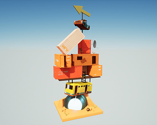
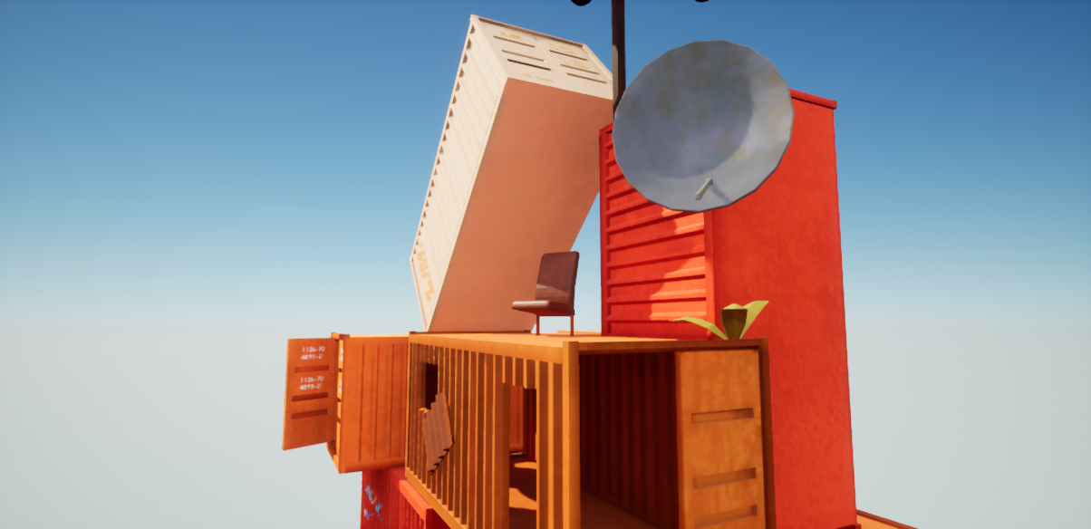
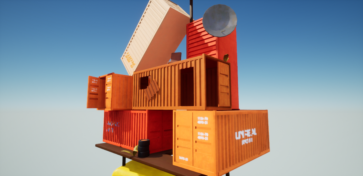
- Research & Development Images show interesting stacked up formations. Having real world reference of objects, materials and detail might help with pushing the end result to the next level. Creative Art End result is an interesting piece of modern art with analogous color palette. To push it to the next level, I'd like to see some material blends, decals, maybe sun burn on the paint etc. Also, as a style choice, leaving roughness at .5 for all might not be the best idea; I think it would bring more interest to the scene to have some roughness variations as well. You've established the main palette, but maybe also adding smaller props of different colours could add interest. Technical Art There's a good use of Master Material. The scene looks fairly optimized. Documentation Short and sweet. Final Presentation Images showcase the subject matter. The master piece is in the center of the scene. Images are of good quality.
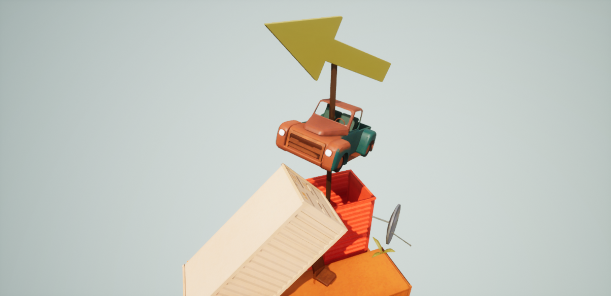
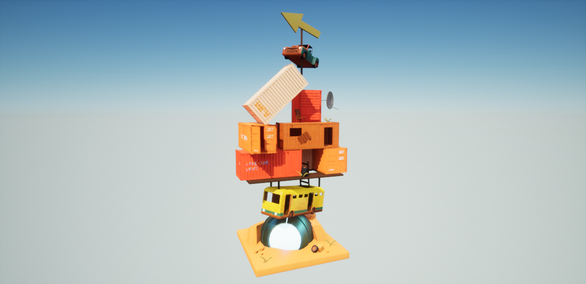
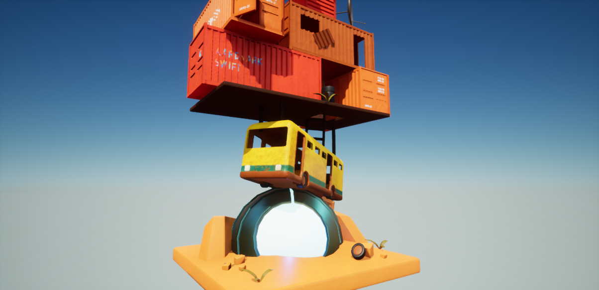
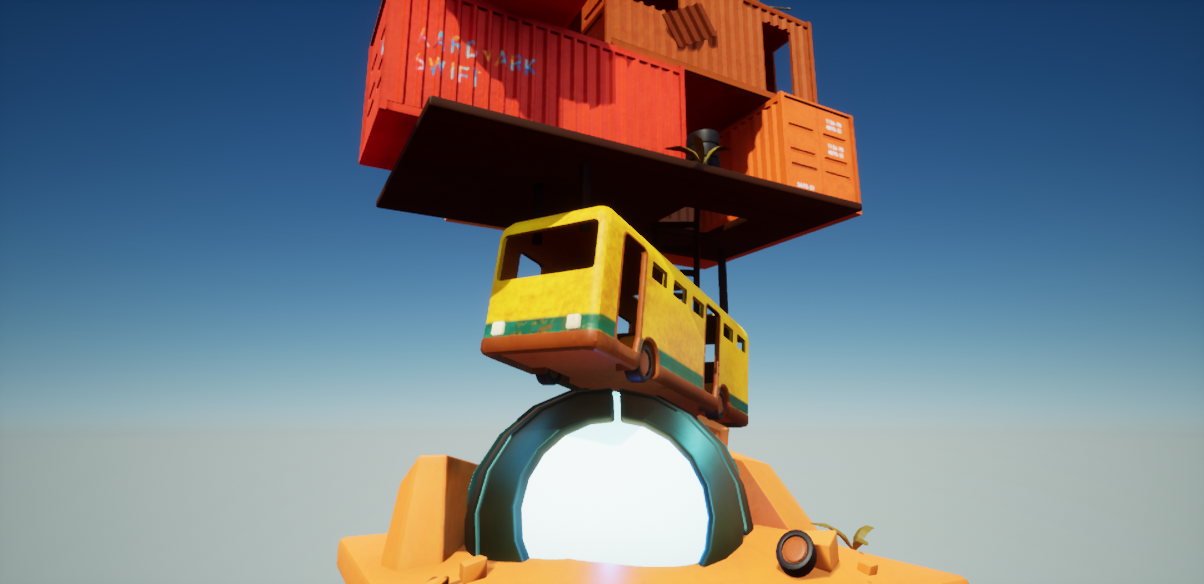
- This is quite a nice idea. Reminds me alot of The Stacks from the movie Ready Player One. I can not find any ue4 map of scene . You have some nice images with in your moodboards/ reference images. The big thing with those images is that they are solid structures and look like they are all balanced. I think you could have spent abit more time working on the position of the different elements with in the scene to make it look and feel balanced and grounded. Your scene starts off with a sphere at the bottom and then a bus at an angle on top of that then huge cargo containers on top. It might have been better to have the larger stable pieces at the bottom like the cargo containers and then work your way up to the bus, cars and spaceships etc, otherwise the weight of the items on top would crush the ones below. Currently it looks like it would fall over, unless you built some kind of scaffolding/support structures around the spaceship to add stability to the structures above. It would be nice to see what the main purpose is for this? Is it a place where people live? If so, make it look like people live there. Add stairs/ladders/pulley systems etc so it looks like people can get up and down to there accommodation. Maybe a home made water tower? Gardens for growing etc. Have a look at images from Ready Player One. The large sphere at the bottom doesnt shout that it is an alien ship. In the documentation you have a typical saucer alien ship which might have stood out better as an obvious alien ship. If your going to have a large poll intersect other models, try and make it look like it have punched through the models and not just sticking through. Especially since we can see it. Also since this is a “Junkyard” all of the models are in perfect condition. The car should be smashed up, the containers dented and damaged etc. Overall a very nice idea, i think it might have been best to try and base the scene in reality abit to sell the idea that what your creating is some what feasible. Then look at what can sit ontop of what with out crushing the items below etc and not fallover, and then work from there. Getting different types of reference images from other concepts, real life of cargo containers, junkyard items and large scrap metal. Also think of how was this huge thing constructed :) With a bit of work this would be a nice portfolio piece. Best of luck.
- I like the reference you’ve gathered but it would have been good to see annotation of things you liked in each piece. The block out looks a little simple. It would have been good to see more elements from the reference come through at this stage (lots of different shapes and sizes, aerials, fencing, height variation) as well as base colour materials and a block out of the lighting. I do like that you created a piece of concept art of what you were aiming for. Unfortunately you haven’t included a breakdown of what you created in your documentation so I can’t judge this effectively. I can see from your comparison that you have lost some of the quality that you had in your concept piece: the arrangement and lighting is different. I think having the 3D piece on a grey background would have helped and making the UFO much clearer (through silhouette and texturing) would have added a lot.
- Artist – Agnieszka Michalska Category: Search for A Star Assessor: Anthony O Donnell – Lead Artist at Firesprite Work name: Junkyard This is an interesting idea worth finishing. What's there currently is a strong base to continue from. Research and Development /Documentation The document is short but evidence of how the research informed the piece can be seen. Early explorations in the blockout phase are good to see. The concept paint over looks good. Technical Art Interestingly textures were a non standard power of two. Polycounts are a bit higher than expected. Modelling wise there some nice detailing. The use of roughness variation as the scene progresses would add a lot given the mix of materials and the requirement for them to have a lot of visual interest via rust and dirt etc. Creative Art Some of the character from the concept which comes due to the shapes and forms of the components don't fully translate to the final models. The dirty textures and worn look of the scene is needed to truly sell the junkyard vibe this is evident on the moodboards but needs to be brought across in the final piece. This should be a fun thing to produce. Final Presentation It's on the way to capturing the idea initially intended. What's missing currently are the smaller details apparent in the mood boards such as secondary / tertiary details like props to depict the "lived in" nature of the piece.
Challenge Tier
Search For A Star
Leave a comment
Log in with itch.io to leave a comment.
Comments
No one has posted a comment yet