

Play asset pack
Bombed Out's itch.io pageResults
| Criteria | Rank | Score* | Raw Score |
| Creative | #32 | 3.000 | 3.000 |
| Presentation | #44 | 2.667 | 2.667 |
| Technical | #51 | 2.333 | 2.333 |
| Overall | #52 | 2.467 | 2.467 |
| Research & Development | #53 | 2.333 | 2.333 |
| Documentation | #77 | 2.000 | 2.000 |
Ranked from 6 ratings. Score is adjusted from raw score by the median number of ratings per game in the jam.
Judge feedback
Judge feedback is anonymous and shown in a random order.
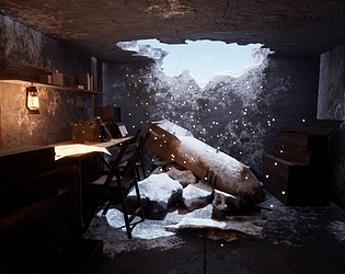
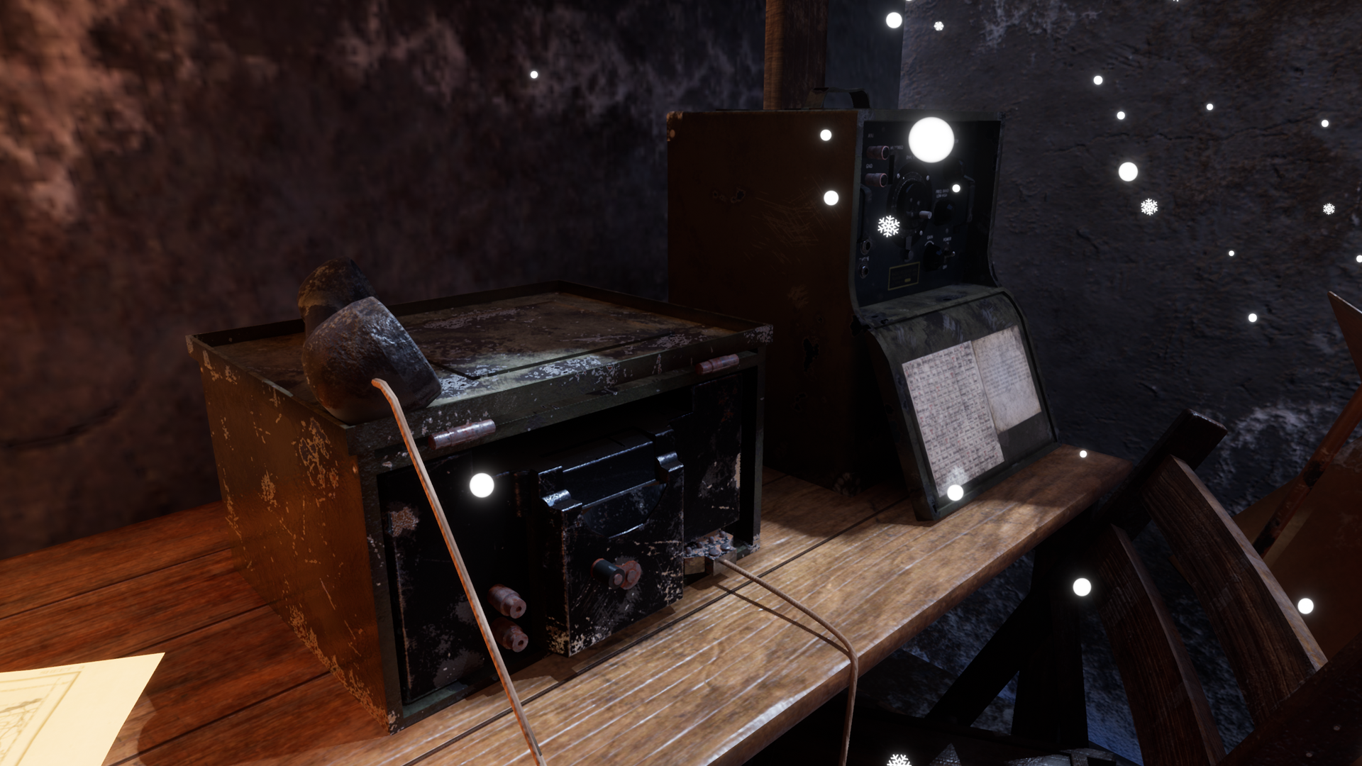
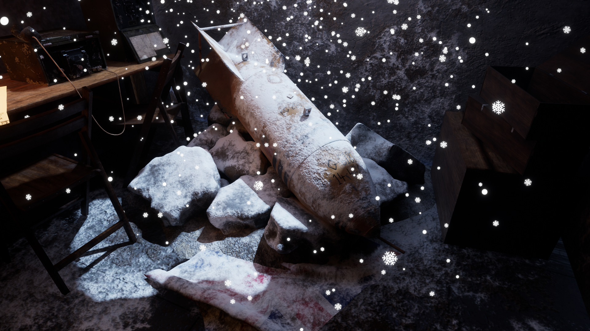
- Research & Development There's some nice research into props, materials and bunker quarters. Creative Art The scene reads well. Main attraction is obvious. Lighting works very well and adding season as an element is a nice touch. Props give cohesive idea about the props and elements that you can really well connect to WW. Technical Art Polygon usage looks great on the bomb. Lantern seems to be high poly model, I believe, and when baked, could use a combined mesh as the end result. Some common policies from the industry to dive a bit more maybe into; tiling materials, trim sheet, texel density, material blending, master materials & material instances. After that, adding a bit more interest and irregularities to meshes to break the 3d feeeling of boxes. Documentation Text is good to read. Images show progress. A bit cut down in size due to time constraints, but it's a good one still. Scheduling in the beginning is a good policy if given time constraints. Final Presentation Final high resolution images look pretty with composition being very strongly present.
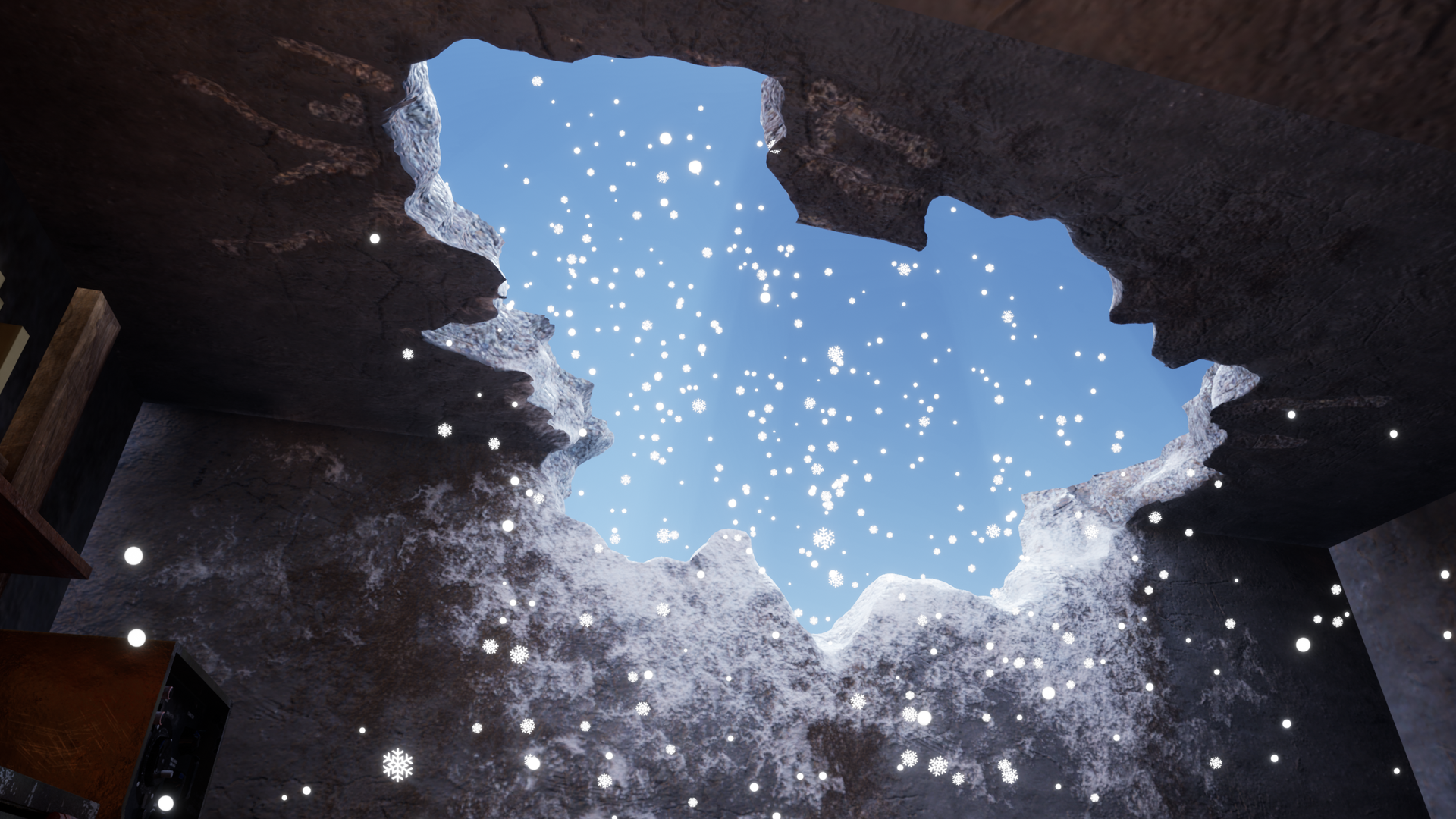
- Documentation: Its good that you had a few different ideas in mind for the project, and picked the one that was a better fit for the time line. And then make adjustments with in that project to make sure you hit deadline. Its also good to see that you wrote out a planner for day to day jobs towards deadline. Research: It would have been good to see some more reference images and a small line or two saying what you like about what etc. Production: I see that you have a bunk bed in the documentation, but im guessing you ran out of time to finish it and get it in. A shame. You have some light bleed coming in between the walls of the hole in ceiling piece. (Left and right sides) You also have a harsh line at the top where it joins with the rest of the bunker model you made. Lightmap issue again i think. You seem to be missing supports for you shelf on the left :) I like the Radio receiver, however i noticed that this on your artstation and not made specially for this competition. Not sure if the competition rules allow that or not. Still a nice model tho. If you had the time it might have been nice to have piles of snow built up with in the bunker and on desk and machines, boxes etc. The snow/frost on the bomb/rocks etc looks quite nice, it massivly stands out against the falling snow tho, Some are snowflake shaped and some are dots, maybe tone down the emmisive look of the flake so they dont seem as bright. Really nice touch adding the images with in the pack, makes it easier to view them. Thank you. UE4: When i open your UE4 project it takes me to the default UE4 scene and i can not find your project at all. Your models and textures/materials are there. But not the map. For any of your models that are covered in ice/snow, you could have made a tileable material and used masks to place where you wanted them to go on the different models. OR you could have used a shader with in UE4 that will place the ice/snow for you on and up-facing polys on meshes. Looks good tho :) Try and keep your models and materials/textures in separate folders. You did it for some folders and others you threw them into the materials folder, meshes and all. I hope you get some time to go back over this and really fill it out and finish what you wanted to do. This could be a really nice scene! Best of Luck.
- Considering that this was a rushed project (by the artist's own admission) I think that the results aren't bad. From what I can see from the few screenshots provided, it's an interesting scene with a good sense of narrative provided by the central bomb asset. The composition also looks quite strong, with a decent counterpoint between natural and artificial lighting. The snow covering on the assets also looks good, although the completely jarring snowfall overlay on the screenshots was a mistake. However, I suspect this project has also gone some way to illustrating to the artist why planning is important to a project. A detailed plan for an environment, taking in technical considerations such as required asset lists and build times as well as artistic ones, such as considering why the environment will look like it does, is the equivalent of building the foundations for a house. It's the most important step, everything else rests on it. And yes, a rough block out of the scene using representative boxy objects is very important - it helps set scale, define composition, allows for quick iteration and lighting experiments and most importantly, stops unnecessary work being done early on in a project, such as creating finished assets that later turn out to be unsuitable or need modification. Bear all this in mind for your next project, as you clearly have ability!
- Research & Development: You’ve picked a cool subject matter and some good key references and assets to use for the project, though it would be nice to see a lot more, particularly some good real life reference of a damaged bunker as real life reference is a must no matter the subject/style (however I do like the shot you picked as game reference). It would also be cool to know why you chose to go with this project over the other ideas, and what influenced you to come up with it in the first place. I understand that you only had 15 days until submission which is a reason for not blocking things out first, however, it would have been great to give yourself just a couple hours trying some extremely quick/rough sketches (I’m not good at drawing but it would definitely help me), or rough blockouts to see if you can come up with one better than the first one you had in your head (generally speaking the first idea usually isn’t the best). This would also allow you to try some different compositions quite quickly. Also in terms of a studio workflow, you would always block something out first to get an idea as to whether or not it will work visually and for gameplay. Creative: The subject matter choice is great since it allows for a lot of opportunities of interest and emotion. The composition is pretty good, I get a good feeling of the personality, and the mood comes across nicely in the images. I would be interested to see what the other assets which didn’t make it through texturing are and how much they’d add to the scene as tertiary elements. The addition of the snow particles is great as they really help with the overall feeling of the piece, and I very much like the damaged structure with the supporting rubble underneath as it makes sense to be there and is placed quite nicely. The snow gathering on top of the bomb is a really good addition and makes it feel well grounded in the scene. I like the cool-warm lighting and is generally lit quite nicely too, there are a fews areas which look very dark though. There are some awesome tutorials on youtube for lighting in UE4, the UE4 Lighting Academy by 51Daedalus is a must watch to get into a good lighting mentality. Technical: Unfortunately I couldn’t find the umap in UE4 to have a look around in 3D and see how it was put together & lit, so have based this off of what I see in the screenshots. Considering you’ve never used substance painter before this is a great 1st attempt, and at least from a distance they read quite well. Apologies if I am assuming incorrectly, it doesn’t appear as though object such as the crates or rubble for example have been made from a high poly & baked down for texturing as the in-engine meshes are very high poly and normal details look as though they’re only from the materials rather than a high poly. This process can make simple assets like crates look super nice and high poly as you capture all the information from the high poly and bake it onto a much more game usable asset. Texel density is quite often overlooked but is an important thing to understand and know how to adhere to a texel density target. This will resolve any issues of 1 asset looking ‘higher res’ than another when paired next to it since everything is using a similar amount of pixels per meter to show material definition. This issue can be seen most in the close up screenshot of the radio on the table next to the wall. The scaling from the screenshots look generally good, but as mentioned before it’s always good to block things out first as this also helps with resolving any scaling issues early on. Pivot points in a game environment are extremely important. I noticed a few like the lantern & radio had pivots which were very far out from where I’d expect them to be, also, the lantern has been split into various parts which would add draw calls (not good for optimisation), and would make it harder to place - so this should just be a 1 mesh export. Presentation: The presentation of the scene is very nice, there’s a strong focal point being lit by the natural cool lighting from the outside with the secondary elements lit with the warm glow of the lamp causing the cool/warm contrast. In the main shot, I find that my eye first hits the bright sky of the outside, is led down towards the bomb, then attracted to the left by the lantern so it directs the eye very nicely across the main subjects. Documentation: I understand that the document is unfinished, but you’ve included a screenshot in zbrush of the damaged structure and the objects in Maya with some accompanying text to describe your workflow. As mentioned in the Research & Development, it would be nice to see initial blockouts and different ideas for layouts & iterations on those to show development of the idea. For the reflective commentary, it’s always nice to hear your thoughts about things you know to improve, things which went well, or didn’t go so well, and about the things you would do differently if you had more time to complete it. For example, you mentioned there were more models which didn’t make it through texturing, but would the extra time to make them have helped a lot, or would you have spent the time on developing other areas further.
- Hello Phillip Baker, First, good job to finish this project in a so short period of production for young student. The quality of the scene is really unequal : You've some asset like the radio station, they're okay but you have all the structure of your building which has low size texture, it obviously creating a gap in the quality between asset and provide a bad impression. The snow flakes are also too unlit, not natural (like a cartoon VFX). The snow in the corners of the room is breaking also the illusion of something natural, it seems to be like light bleeding. In term of composition, the scene is no bad, you should take care about pushing a little bit the chairs since you're creating noise in the main actor (the bomb). You are not so far from having a really good piece here by tweaking few factors : 1- Quality of your textures (Walls, close-up) and put snow only in the middle of your composition (on the bomb), everything around should be probably dark, you can add dirt but snow like this is disturbing the reading of your scene. 2- Use a more realistic snow flake / light shafts (soft) coming from outside 3- Setup a better light for the lamp, the map on the table is overburned. 4 - Working with more hard edges for your rocks/debris, it's a destruction, smoothed debris don't look natural. 5- Tweak your table material to be less glossy, more rough and less reflective. You should be able by a day or two of tweaks to improve massively the quality of your scene! Quentin Papleux, Sr. Lighting artist, Sumo Digital
- Great to see a breakdown of the time you gave yourself for the project. I’d go a step further and breakdown those days into hours (giving yourself time for breaks too) as you would be able to fit the work into time slots rather than having a blanket “Production” day. It would have been good to see more gathered references and annotations of what you liked and wanted to include in your scene. I can see you block out some assets but it would have been better to see these in the engine with some shot angled and lighting setup. This would help with finding good compositions too. The sculpt of the ceiling hole looks a little too soft and stylised (which doesn’t really fit with your reference). You may have found it easier (and simpler) to use rough geometry and tiling textures to get the same effect. You haven’t included any other model or texture information in the documentation so I can’t judge this effectively. I like that you have created colour contrast in the lighting. The snow creates a bit too much noise around the bomb (the focal point of the scene). It would have been good if there was less of it.
Challenge Tier
Sumo Digital Rising Star
Leave a comment
Log in with itch.io to leave a comment.
Comments
No one has posted a comment yet