

Play asset pack
Tokyo Suburb Backalley's itch.io pageResults
| Criteria | Rank | Score* | Raw Score |
| Research & Development | #53 | 2.333 | 2.333 |
| Presentation | #70 | 2.000 | 2.000 |
| Creative | #73 | 2.000 | 2.000 |
| Overall | #77 | 1.933 | 1.933 |
| Documentation | #80 | 1.833 | 1.833 |
| Technical | #86 | 1.500 | 1.500 |
Ranked from 6 ratings. Score is adjusted from raw score by the median number of ratings per game in the jam.
Judge feedback
Judge feedback is anonymous and shown in a random order.
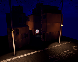
- Good amount of reference and annotation picking out features you want to replicate. Good to see a block out of the scene but I’d say the lighting isn’t working to your advantage at this stage: it’s a bit too dark. It would have been good to see some shot angles and composition tweaks at this stage too. Unfortunately you haven’t included a breakdown of what you created in your documentation so I can’t judge this effectively. From the final images it seems like the lighting wasn’t tweaked since the block out stage and because of this you lose a lot of your scene detail in the shadows. Your models look a little low-res and your tiling textures could do with more information in them (Normal/Roughness). PBR looks like it’s being used but everything good do with some break up.
- Submission Title: Tokyo Suburb Back Alley Submission Tier: Search for a Star Assessor: Dominic Shaw Artist @ Firesprite Research & Development The reference gathering that you have done is good but there is a lot of detail missing in the final environment that was provided to you in the reference images that you found which is a real shame. I would have liked to have seen some time plans and project management stuff has this may have helped with the development of the project. Creative Art The main thing that let’s this project down for me is that it feels quite empty compared to all the reference images provided. In the reference there was a lot of nice details such as ac units, wires, cables, telephone wires that was missing in the final image that made the environment seem quite empty. To help solve this in future projects, once you have done your reference gathering, I would make a breakdown of all the assets you want in the environment and then just copy these assets from your reference images. The other aspect that I think needs improving in this level is the lighting, the scene is way too dark currently which makes it hard to see the stuff that you have modeled. I would do another pass of the lighting and add more streetlamps and light sources in the alleyway to lighten the whole scene up. Technical Art You have used a master material which is good to see has this is a nice workflow to speed up the development of the project. The main issue that I noticed was that the buildings was unwrapped to one texture causing low resolution textures. In future projects, I would recommend breaking up the meshes more into modular pieces and look into vertex painting on your tile-able textures. Documentation Some good reference but it would have been nice to see more of a breakdown of the props and textures in the environment. Final Presentation In the final renders, it was quite hard to see the environment due to the lighting of the level, I recommend doing another lighting pass to help make the image more readable. Here is a good tutorial for lighting inside of unreal which might help. https://www.youtube.com/watch?v=MaUt1p3PQvo Overall, I think that you have some good ideas for projects and there is a lot of potential with this environment. Moving forward, I would try to practice each stage of the pipeline to really refine and improve your skills. A good project would be to do one nice prop that really focuses on material definition and high to low poly baking.
- Back alley in Tokyo is a great choice. For your choices i think the Vending Machine is a fine choice, however the Telegraph pole and Drinks with in the Vending Machine could be improved. The telegraph poll could still be used, but maybe make more of a feature of it? Have a circuit fuse box on the poll, or on the wall next to the poll, then cables running everywhere from the fuse box up the poll and along walls, connecting to other items in the scene. If your clever about it, you can use the cables to highlight areas and direct the players eye to where you want them to look. Have a search online for Kowloon Walled City alley. For the supporting props maybe have piles of rubbish/trash cans etc piled up in the scene near the vending machine etc, again they could help you set the scene and draw the players eye towards your main focal point. Japan/Tokyo is an amazing place and finding the correct references may be challenging, you have gotten some nice pieces to begin with. Pintrest can be a good place as well. For my personal projects i like to create folders and serach for anything i might find useful. Lights - Cables - Ground Props - Buildings etc. For all the research and references that you have shown you should also have loads more stored locally. As many different angles of buildings/alleys/props etc. High res images of stickers/posters or anything else that you think might be helpful. Front, back and sides etc of props so you can make the models accurately. Nice find of the youtube video of Japan at night. For you final submitted shots, it would have been nice to see these submitted and not just with in the PDF. You could have lowered the height of the telegraph polls so they were not as tall, or have a few shorter one and you could join the the cables to the buildings or similer to your reference images have a nest of cables and power boxes. Also look at reference image for the light sources and colour of the bulbs etc. You appear to have some issues with light maps on the buildings which is giving the muddy soft shadows on the walls. Looking at one of the house parts your wasting alot of UV light space on the top and bottom of the mesh when they are hidden underneath other models. Emmissive texture with in the vending machine is abit strong. Try and think of a purpose for the scene. Everything should have a purpose. It seems strange that you have a vending machine in a dead end off the main road. Maybe if there was a doorway leading to a NightClub or Bar next door, Fire Exit External stairwell maybe. Also since you want this to be the focal point it might want to have a street light mounted on a wall above the vending machine. Its very dark in the alley. Might be good to extend the amount of buildings down the street abit, also might be good to stick in a moon and use that as abit of light source on top of the streeet lights. Have a look at different tutorials on lighting in UE4, lighting is always a make or break with games. The alley where you have the vending machine is almost total black. Total black should be avoided as much as possible. Same goes for colours, shadows etc. Time magament is a very importent skill to learn. You need to be able to loot at a texture/model/concept/design and know roughly how long it will take you to complete it. But also you must try and keep to that time frame. Comprimises can and will always be done. But try and keep as close to your time estimate. Best of luck!
- Not sure what happened here, nothing you really mentioned in your documentation made it in. Please look at: https://www.artstation.com/artwork/5Zl8W https://www.artstation.com/artwork/nPb5X For inspiration on how do go about this. I understand the want, but I think you needed to spend more time planning and think about how you were going to go about this. Not really clear on the style you were going for either. Go back to the drawing board, take a month to think on what you want from this. Easier to find a piece that inspires you and try to go for that and work out how to do things. Sorry this didn't work out for you. Thanks Chris Harper Snr Technical Artist @ Splash Damage
Challenge Tier
Search For A Star
Leave a comment
Log in with itch.io to leave a comment.
Comments
Research & Development
There are nice high quality images of areas and props, as well as lighting and atmospheric feeling of the scene.
Creative Art
There's contrast and color in lighting of these, and the vending machine shines from the distance to snatch the focus.
Technical Art
I would suggest doing a bit more modeling first, get the shapes of objects to read as source materials and improve on ways to look at references. After that, start UVing your objects; test out a bit how the texture looks and have fun. Next step is to dig a bit deeper with the concept of texel density to plan out the scales of your UVs, and making high quality texturing work. Tileable textures, trim sheet and material blends come next. :) You already seem to have the basic post processing volume setting placed well, nice one!
Documentation
Texts are well written, especially in the moodboard section, and the thought process in decision making is captured well.
Final Presentation
The image is nice and crisp and showcases the work well.