Play game
Sci-Fi Air craft's itch.io pageResults
| Criteria | Rank | Score* | Raw Score |
| Creative | #20 | 3.400 | 3.400 |
| Presentation | #21 | 3.400 | 3.400 |
| Overall | #31 | 3.080 | 3.080 |
| Documentation | #36 | 3.000 | 3.000 |
| Technical | #38 | 2.800 | 2.800 |
| Research & Development | #41 | 2.800 | 2.800 |
Ranked from 5 ratings. Score is adjusted from raw score by the median number of ratings per game in the jam.
Judge feedback
Judge feedback is anonymous and shown in a random order.
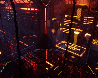
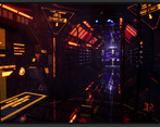
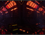
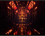
- Artist – Kevin Tammatat Sudtagon Category: Search for A Star Assessor: Anthony O Donnell – Lead Artist at Firesprite Work name: Airship Research and Development / Documentation. The document is presented well and gives good insight into the creative and production process. The initial goal set out by the artist to utilize tileable / trim sheet techniques is evident in the final piece. A sensible approach to producing the scene such as a whitebox phase is good to see especially since it was done with a kit bash / modular workflow. Technical Art Geometry Polycount is generally ok but has a few areas where it's a bit too high. Elements such as the railings could have every second one deleted which would reduce polycount and give more clarity to the environment. The chains are very dense in terms of polycount. Materials and Textures The use of trim sheets and decals is sensible for this type of environment. Channel packing was used but the textures had sRGB on this should be unticked as it is linear data another option is choose "Masks (no sRGB) compression settings. Creative Art Being a sci fi corridor it does suffer from having a lot of detail but the majority of which there's no clear purpose / function. There are some nice elements in here which are lit well. The majority of the surfaces are metallic, adding in some rubber or plastic composite materials could add some visual variety to the scene. Final Presentation The final images have a vibrant colour scheme that works well. If anything I find the images are too noisy all over in terms of repeating detail elements and the alpha mesh on the floor and walls. The eye does not really get much of a chance to rest. This would be effective in an environment where it was desired that the player is not to be relaxed.
- It would have been good to see more reference and it annotated with things you wanted to create in your environment. Your initial block out (top left) looks very basic but it’s good to see that you expanded on this with a kit of parts. Really good to see trim and decal sheets being utilised. You would have been able to get away with using tiling textures on all your assets (provided you used bevels in places) in stead of baking them down. I like the colour contrast (red/blue) in the lighting but the scene looks very noisy and busy. Try and create areas of rest for the viewer and use this to guide the viewer into the scene. The vertical chains and the yellow information boards don’t help with the amount of noise created either.
- If anything i say below comes across as harsh then i apologies, it is not my intent to cause offence only to try and throw some feedback your way. The good news is over all your work is very nice and with a few adjustments it could be better. Research and Dev: You have some nice pieces for the research, it would have been nice to see some lighting examples of the kind of effect that your trying to achieve. Same goes for how the light sources are to look and other functional items. The more info you get the easier it will be down the line. Get images, do sketches. Try and base everything as much as possible in the real world, that will help sell the idea to the human eye that this scifi world is real. PDF:: Keep it simple and clear. There is no need for a black background. I fully understand wanting to push yourself and work on things that you have never done before and i commend you for that, but also remember that it was advice to work to your strengths for this Jam. Great to hear you have learned about the importance of the grey/white box stage of the block out. It is very important to get scale of everything 100% correct and work out any possible problems before you go headlong into modeling or it might come back to bite you down the line. Trim sheets: Its a bit difficult to see from the imaged in the PDF but you might want to add a bit more space between the different parts so you dont get any bleed from trim to trim. Decal Sheets: Its good that you learned that when creating Normal Maps for decal stamps or any flat normal map detail that any hard angled parts of 90 Degrees should be angled a bit more for it to read better. Normally about 45 Degrees, but it depends on how close the player/camera can get to it. Alpha Channel : Floors - Depending on what platform your building for you may want to go the route of poly model floors and not all alpha, or maybe a bit of both. Most game engines can eat up polys but alphas still have a large effect on them. But visually it might be good practice of have areas of rest. So maybe break up the all alpha floor with solid floor panels. Glow decals have come out very nicely. Nice job. Supporting Props/Decorative Pieces. You could have saved alot of UV space by reusing models/UVs. Especially on the hexagon shaped door entrance, you could have just modelled/Uv'd the front hexagon and then reuse it for the back one, or if you wanted to go even more, just the front facing part of the front hexagon :) But it depends on your requirements and how you were to texture it. Same goes for the pipes, you could have modelled/UV'd just one or two of them and then just rotate the mesh in UE4, so you dont see the same texture repeating. ( So the front is now at the back, Facing Up etc) Lighting:: I get where your going with the lighting. I love the idea of trying to cross Alien with Tron and i can see it, but i feel that you may have gone a bit too far. Humans are a bit like moths, we are drawn to the brightest thing in a scene, and if nearly everything in the scene is bright and the same brightness it starts to get confusing and gets very busy. Try breaking up the lights/light sources. Not having as many ( for the corridors, turn them off or remove them from every 2nd corridor section?) Especially around the Door. There is too much going on. You have a "LED" floor mat, 2 control panels both left and right side facing forward, then 2 more left and right facing inwards, then all the other writing etc on the door itself. Best to pick a side to place the interactive front facing panels, normally the right side as most people are right handed, then get rid of the inward facing ones, or keep 1 set of these but get ride of the front facing ones. Then remove all the floating writing on the door, its hiding all the nice work you did. The floating writing and the door and the door mat might be cool if they were animated and the appeared after you interact with the door panels, but for this still image you want to have the the minimum. Less is More :). You want to draw the player to what is intractable. If you were playing a game and you walked down a corridor towards a door that had loads of glowing text, buttons, panels etc you wouldn't know what to click on. Because you have alot of the same orange lights everywhere along with some highly reflective surfaces its bouncing off them adding to the busyness of the over all scene. Maybe tone down the reflectiveness of some of the materials after adjusting the light issues, OR the materials may be fine after the lighting changes :). You will always find that you need to go back and forth. Some of the Shots in your final submitted pieces of work are very nice, but as mentioned above they are abit too busy because of the lighting and reflectiveness of some of the materials. Try and have a clear idea of where you want the player to be looking, and then direct them to that. You have some nice details on the models/textures from what i read on the PDF but then they get a bit lost in the scene. Its always difficult to find the right balance. Focus on a small section of all the final assists and get that to as close as you can, then construct the rest of the scene, however.. even doing that you might find that you will still have to go back and forth to balance everything. Over all a very nice job, considering you said that you miss-handled the time management of the project. I hope you learn and keep pushing forward! The orange grill on the upper part of the wall reminds me of an old electric heater. What is it meant to be? Everything should have a purpose, even scifi stuff, you should look at a thing and know what it is based of shape, location etc. Some lighting examples: Im not able to apply images to this, this link should help you understand Less can be more. A main light source directing the player. "One main light source to highlight where you are to go and interact with. Small light then above door. https://www.artstation.com/artwork/Vy605 And this as well, https://www.deviantart.com/stayinwonderland/art/Alien-Corridor-815471084 Main light source at end. Image is going from Light (back middle of image) to Dark (closer to camera) with a few hot colours left and right to break up the black. TIP: Always try and avoid going to solid black, try have a tint of colour in it. https://www.artstation.com/artwork/JQJPR Link above is a project I did a good few years ago now based on a TV series, but you'll see what i mean about directing the players eye. UE4 Scene: I got alot of errors in the scene: "static mesh actor has null staticmesh property" When i baked lighting: Please clean up project before handing it in. All work should be bug free before submission - either for this competition of with in the Industry :) With in your UE4 scene you should have a Meshes folder, Texture Folder, Materials Folder etc, try and avoid throwing them all in one or two folders and have them all labeled correctly. Anything with _Test should be removed as well as anything that is not used in the scene. Remember you want to try and make your work are bullet proof as possible, so that in a few weeks, months, years later anyone can come back to it and instantly know how it was put together and work on it. . Conclusion:: Over all very nice work. If you choose to keep working on this after words it could be a nice piece to have in your portfolio. Try and keep in mind the function of this scene, does it get a lot of foot traffic, has it been abandoned for years etc, whats the main focal point, and direct the eye to it. Best of luck in the future!
Challenge Tier
Search For A Star
Leave a comment
Log in with itch.io to leave a comment.


Comments
Research & Development
The research showcases lots of cool concept art. I'd like to see an extra added bit of real world structure, detail and material work.
Creative Art
This scene has qualities I don't actually pay attention to that often. There are lots of shiny emissive details, the contrast is very strong with dark values taking most of the screen, and the bright values taking the second largest portion, keeping the mid values as the lowest ratio of the tree. The color scheme induce interestingly warm and futuristic feeling. The corridors have been color coded to help with orientation of the scene. The floating texts give a nice sense of using some sort of HoloLens device, or holographic projectors. Perlin noised energy pattern also adds a nice flare to the scene. Shapes of the corridor and door look intriguing.
The dark value could maybe pushed a bit brighter to show a bit more of the details of meshes, trims, decals and such. Material work could be pushed to the next level with reused texture spaces and hitting certain texel densities.
Technical Art
There's a nice use of trims and shader effect. Lighting read well, but might be done in a more optimized matter with spots and rectangle lights. Meshes seem optimized, but for example the door could use some nice baking or mesh splits to reduce the 30k polycount. Materials could be pushed to be used in an instanced matter out of a master material.
Documentation
Texts read well and there are lots of pretty pictures to make the viewing a pleasure.
Final Presentation
The presented screenshots show very well the generic feel and mood of the scene. Closeups and how everything it made on a closer level is easier to see on the project file.