Play asset pack
Miko the Sword Slayer's itch.io pageResults
| Criteria | Rank | Score* | Raw Score |
| Creative | #7 | 2.858 | 3.500 |
| Research + Development | #9 | 2.449 | 3.000 |
| Documentation | #10 | 2.449 | 3.000 |
| Overall | #10 | 2.368 | 2.900 |
| Technical | #11 | 2.041 | 2.500 |
| Presentation | #11 | 2.041 | 2.500 |
Ranked from 2 ratings. Score is adjusted from raw score by the median number of ratings per game in the jam.
Judge feedback
Judge feedback is anonymous and shown in a random order.
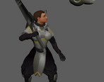
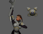
- Good to see the results paying off from the feedback provided. The flow of the attack feels more powerful and less floaty. Overall, the weighting of the sword is much more consistent and the believability of weight shifts is much more solid now. The main issues that stand out now, and I feel are not helped by the armor, are the elbows and knee's snapping or rotating in odd angles. Whereas with snappier combat, their animations can get away with some oddities with limbs and often even be enhanced by them, this more realist timing requires a greater level of focus for polish. A lot of time can be spent, noodling the pole vectors to create smooth transitions and eliminate any sharp snaps related to hyperextension of limbs. The main areas for this are the sword thrust into the air, the knees snap and arm/wrist looks to be in an unnatural position holding the sword. Then during the bot carrying Mika back, the legs snap a couple of times during the swing and finally the arms hyperextending when Mika is lifting the sword back into the idle position. Snapping limbs is something that the eye catches quite easily, but can also be remedied fairly quickly. Another pass to clean these areas up and smooth the transition from idle to power up would really go a long way to make this a nice polished animation. Look forward to seeing your next piece of animation.
- Hey, Overall nice idea and love the way the little robot carries her back to her idle pose very nice. It needs quite a bit of polish to get it working nicer. Ther are a lot of pops which are easy fixes that you could of done and would help the whole animation. Also some preview videos I have not been able to find? So much easier than opening a Maya file and not having textures etc. and been able to see it all working correctly. If you put this in a game engine as part of an animation set you would use the final animation as something else. Maybe a respawn or helper over a big jump etc. You can feel the weight of the sword when she is spinning/swinging but it all needs work to get more appealing poses and a nicer flow to the movements. Overall its a nice piece but I would work on one section at a time to get that polished then do the next etc. Also getting rid of all the pops as in an engine it would look even worse on-screen popping. The end animation looks like it had more work and polish, get the rest up to this standard and you will have a nice demo reel piece :) Kepp pushing!
Challenge Tier
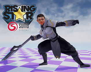
Sumo Digital Rising Star
Leave a comment
Log in with itch.io to leave a comment.


Comments
No one has posted a comment yet