Play asset pack
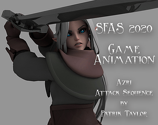
Azri Attack Sequence's itch.io pageResults
| Criteria | Rank | Score* | Raw Score |
| Presentation | #7 | 3.000 | 3.000 |
| Documentation | #7 | 2.750 | 2.750 |
| Technical | #7 | 3.250 | 3.250 |
| Research + Development | #8 | 2.500 | 2.500 |
| Overall | #8 | 2.850 | 2.850 |
| Creative | #9 | 2.750 | 2.750 |
Ranked from 4 ratings. Score is adjusted from raw score by the median number of ratings per game in the jam.
Judge feedback
Judge feedback is anonymous and shown in a random order.
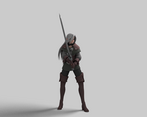
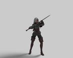
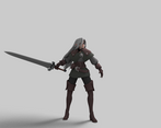
- Overall it's nice. But keep in mind that she's attacking with a heavy weapon and the sword feels light sometimes and heavy in some moments. It's important to control the weight coherence. Also in the idle is too evident the pose to pose animation, you should add some motion to break that feeling.
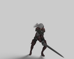
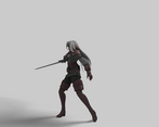
- Hey, overall nice work! There are a few areas I would improve on. Idle: This seems very slow, the breathing seems unnatural, try speeding this up and seeing how it looks. Also, the sword should be quite still it a big old sword and she is dropping and moving it quite easily. Try and keep it more steady if possible. I love the hair action when she turns, nice job! Just wtach out for the sword moving too much mainly. Power - Up: This needs a few more frames adding and not so snappy. also, track the sword arc, as it looks a bit clunky now how it moves. With that big old sword, she should really take a little step to help her balance, which would help the weight on the release also. Release: This is pretty sweet, on the lunge forward she would definitely step forward to catch that weight. Don't be too worried about keeping the feet static. Having a little step always works better and looks cooler, we did this a lot on the Lego games. Also track the arcs of the sword, you could easily get some nicer silhouettes and smoother action. Recovery: This is the weakest in my opinion, good idea cleaning the blade. But the weight is way off and feels robotic. Check your reference or film more to get the hips and feet working correctly then add the blade wipe once she is back in a nice pose afetr her weight shift. Also the hands pop back onto the sword, take more time, no need to rush back into it. Overall cool work, it just needs the sword to look heavier and track the arcs of the sword. Get the weight shift nicer on the recovery and it will be more solid across the board then :)
- A really nice set of animations! The movement flows well and is quite smooth! I can definitely see the 'samurai esc' personality in your character. Your documentation was excellent with references to your storyboard and in real life acting (however I would recommend using a more clearer font!) I am fond of your approach to how this was setup in Unreal as well as you respecting the boundaries of how far you can push your rig to suit the animation. However, I could add in a few improvement suggestions. I would give a bit more 'life' to the bottom half of the character, as I feel as if her feet are stuck in the mud! Perhaps adding some lunges to help exaggerate her sword swinging motion would help alot.
- Hey Patrik, Overall the animations were smooth and had been cleaned nicely, but the animations were lacking some dynamic key poses that would have taken them to the next level. A good piece of advice I got early on was to look at each of your key poses and evaluate whether you would want them as a figurine on your desk. Pushing each pose to be dynamic and interesting will drive your animation and make it far more appealing throughout to the viewer. I wouldn't be afraid of moving the root of the character around and shifting their weight in the attacks. The movement of a character is generally driven by their root and without this driving the motion, you can lose their sense of weight. Something that also helps the weighting of the character and their root motion feel solid, is to cover/hide their upper half. It should be somewhat clear what they're doing by their root/lower half alone. Generally, I believe the timing of the attacks would work well with a greater range of motion between each attack. Swipe and step wide to the left with the initial strike, then really extenuate the horizontal strike across with the sword leading from the settle into a powerful overhead strike. Then have the character pull right back and drive the sword forward as the character also lunges forward. It wouldn't be too much to adapt this animation and push some of those key poses. A handy exercise I was given early on that really helped focus on the key poses was to try and recreate a dynamic pose from a reference image with the character in full FK. The idea behind this, is it really forces you to touch every controller on a character and therefore craft a pose more thoughtfully.
Challenge Tier
Search For A Star
Leave a comment
Log in with itch.io to leave a comment.




Comments
No one has posted a comment yet