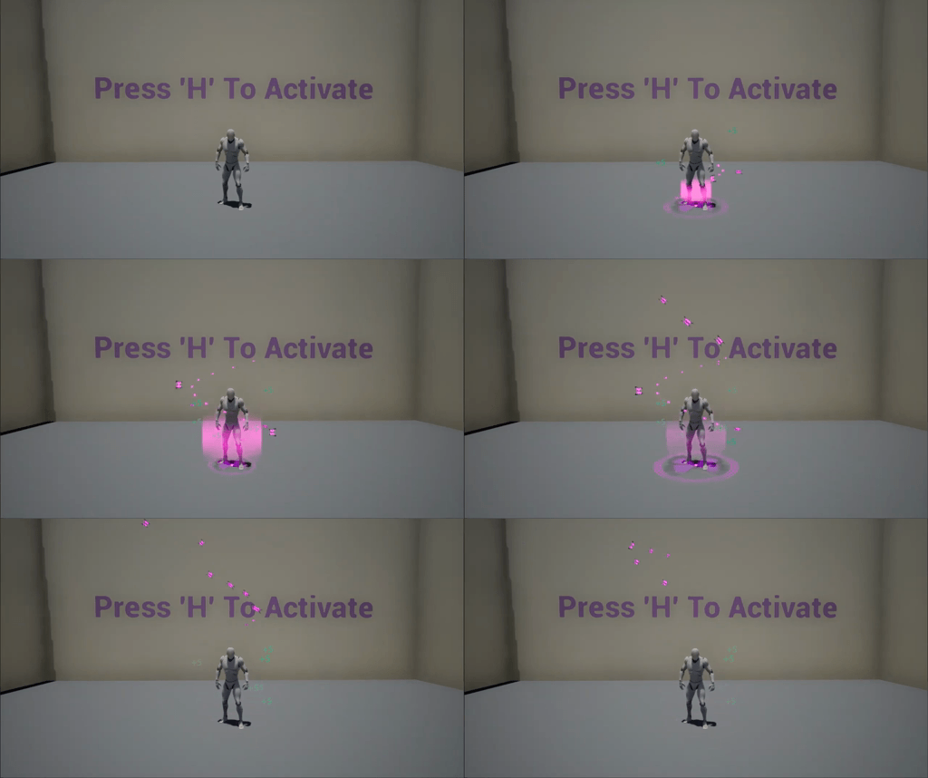
Play Particle System
Fairy Magic Heal VFX's itch.io pageResults
| Criteria | Rank | Score* | Raw Score |
| Research + Development | #12 | 3.111 | 3.111 |
| Documentation | #12 | 3.333 | 3.333 |
| Creative | #12 | 2.444 | 2.444 |
| Overall | #12 | 2.756 | 2.756 |
| Technical | #13 | 2.222 | 2.222 |
| Presentation | #13 | 2.667 | 2.667 |
Ranked from 9 ratings. Score is adjusted from raw score by the median number of ratings per game in the jam.
Judge feedback
Judge feedback is anonymous and shown in a random order.
- Healing effects are hard to pull off without just being derivative. Nice approach with the pink overload! Though Butterflies flutter by! Try make them more organic by jittering their path. You could also vary their size and colour (a bit). More visual richness is always a good thing! Also always a good idea to good settle the effect into the surroundings by adding a bit of faint mist. Your colour gradient is from pink/transparent to pink. That makes it very monochrome. If you introduce a bit of brightness in there towards the hot end, you will achieve higher visual fidelity and polish.
- Hey! So, I can give you some notes regarding the effect: I like the butterfly fly curve, the motion is quite interesting. I also like used meshes, it's close to what is being used in production. However, there's a number of improvements that can be made to the effect: first of all, animation-wise: movement/scaling of mesh parts of the effect feels very linear, no overshoots in curves or such. It's much better to use animation principles for fx to make them feel more enjoyable. Timing-wise some adjustments can be made, depending on the use case of the effect. If it's a burst healing effect, i'd make it faster and more "explody" so you would really feel that the character got healed. If it's a heal-over-time effect then i'd add some stripe particles on the character to make it feel as he's being healed for longer period of time. Also, it is important for FX to come and go as they are needed, right now it feels like the butterflies linger on for a bit too long. Also you could add some material property animation to the character (highlighted fresnel inline should work just fine) to show that something happened to the character. And of course, it is really important not to mix up the purpose of fx. It should be really obvious that this is a HEAL effect (not any kind of buff or even damaging effect). So as long as it is fairy healing - it's ok, otherwise i would use different colors to show that it is a heal. Presentation/documentation wise - got to be honest, amount of pink on background is very distracting and hard to read big amounts of text in. For studio applies i recommend to keep info minimal and readable. You are being judged on the effect itself, no need to design backgrounds and such to it. Still, thanks a lot for participating! Keep on grinding those FX skills and stay awesome~
- Hello, i would say more planification in order to represent abstract fantays healing, like more draws and concept art before start crafting the VFX.
- Hey, It is a good effort for a first try so don't get too worked on the ratings, feedback is great and shows us where we need to improve, VFX is a time consuming art that involves a lot of technical skills too. The tools are hard to master so it will take a while but its worth it keep up as none of us were experts from the first time either. Feedback: A bit more variation on the butterflies. They all moved the same way and looked the same way for the most part, The effect felt disconnected between its 3 pieces. I would work on the timings of the effects to make it feel more interesting. Better shader work is key too for selling your effects. Work on your naming conventions, Most of your assets had none or they had a mix, For example Materials were M_ prefix and in some cases even Mat_ or post fix instead _mat. Also be careful not to use overly large textures when its not needed. Take into account the size on screen of the effects. Overall i would say you did great and put a good amount of research and documentation into it. It takes time and practice keep it up though.
- Hi Cleagler, You can improve your effect by add more color, use the same color for one entire effect is often bad idea, for lisibility purpose... Your scale over lifetime are pretty big and they don't fall off correctly. Keep working, fx art is awesome ! Lowys Clément, VFX artist ubisoft MONTREAL
Challenge Tier
Search For A Star
Leave a comment
Log in with itch.io to leave a comment.


Comments
Thanks for the amazing feedback from the judges, I can't wait to get back into it and try to make it better!!
what a magical spiral of booterflies :)
Looks great Cleagler, love the colours! x