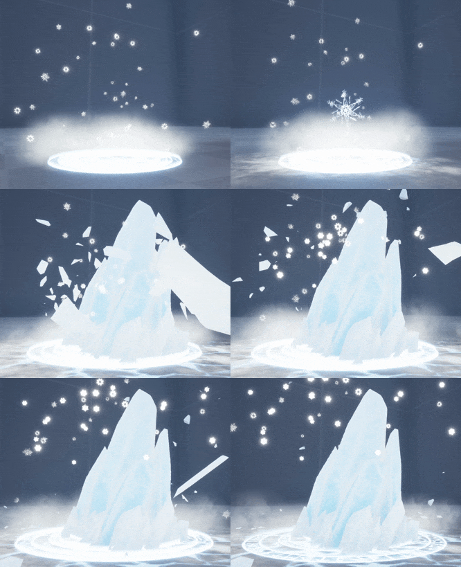
Play asset pack
Magic Spikes's itch.io pageResults
| Criteria | Rank | Score* | Raw Score |
| Documentation | #4 | 4.308 | 4.308 |
| Research + Development | #5 | 4.077 | 4.077 |
| Overall | #6 | 3.862 | 3.862 |
| Technical | #6 | 3.923 | 3.923 |
| Presentation | #7 | 3.615 | 3.615 |
| Creative | #9 | 3.385 | 3.385 |
Ranked from 13 ratings. Score is adjusted from raw score by the median number of ratings per game in the jam.
Judge feedback
Judge feedback is anonymous and shown in a random order.
- This is a well-thought out & thoroughly referenced event, from a gameplay standpoint. You have several different points of visual and contextual input, and make it clear what the intent is, as an ability attack for the player. Your method in exploring different processes and systems is valid, though it seems there was quite a bit of work you did which you had to abandon. The use of procedural modeling and animation in Houdini is impressive. The sheer amount of work and elements was ambitious, and you did manage to get all your parts in as planned. As a whole, though, the piece doesn't hold a high degree of quality or detail, and the result seems a bit overscoped. The two key components - the rune rings and the ice shard - do not stand out, and all of the elements look pretty simplistic. The sequence of events feels somewhat disconnected. The snowflakes are too large and literal, and their motion should anticipate the ice burst with more much energy. The smoke in the Power Up is too opaque, and the sprites are too large and puffy. The sim of the rock burst & debris in the Impact stage is very good, but the ancillary elements don't convey the same force. The start of the frost has a believable crawling reveal, but then pops & is not really timed to the rock burst. The material on the shards could have more translucency, to look like ice. It's a bit difficult to get a sense of what the final intent is, being in an empty gym level like this. This sounded like a good learning experience, and is quite an accomplishment, if you are as new to the software as you say! Each of the parts is intricate and complex, and with some effort on polishing, it would be a stunning in-game event.
- You have done a great job in your documentation and describe the principle of your effect and your execution very well. Your rigid body simulation matches the forceful animation of the main shard very effectively and comes with the right level of punch. Also good to see you thought about anticipation. I'd do something more elaborate with the snowflakes at the very start. They just fade in quite unmotivated. Maybe give them a live on their own, e.g. let them "jump" out of the ground one by one, while scaling up/alpha blending. Also see about a skirt mesh/ground decal for the shard. Something that makes its edges blend better into the floor. And as you already have a nice Houdini setup for dynamics, why don't you break/animate the shard into pieces that then disappear instead of the clipped alpha blending? That would round if off nicely and look more polished. Good job, regardless of all my comments! Nicely done!
- For your research, you have displayed quite an in-depth account of a few games and anime in your mood boards. You have done well highlighting the sections which may work well in an ice attack spell and act as a good source of inspiration. It would be more beneficial to cover a wider display of inspiration, not only looking at games and anime but concepts and movies too. You have done well on the concept storyboard you have provided, you have demonstrated that you have put a lot of thought and effort into how the vfx will look & function, from its idle state to final impact, while referencing quite a bit of sections highlighted in your mood board. Another note to add, I like that you really went into detail researching the specific Celtic runes and specifying what they look like. In terms of technical knowledge, you have displayed a very good understanding of not only unreals material editor but particle system too. This is clearly demonstrated by your experimentation of various material applications for the spell runes on the floor and use of snowflakes/ fog in the surrounding areas. Not only that you have given a very detailed account of the processes you have used in Houndini and substance painter. It felt like a detailed tutorial which you have done a great job on. In terms of creative approach, you have done well making the spikes of ice seem believable in their looks and as with the bursting ice with it’s impact timings, as they disperse into the air. To make the vfx seem more believable however, it would be more beneficial to add something at the base to demonstrate more force and mask the bottom of the spikes. Whether that be ice crack debris meshes tilting upwards, or particles using spiky shapes stretching upwards from the base, this would really add emphasis the impact. To also make the melting/ disappearance of the ice spikes seem more natural, it would be good to experiment with various noise textures to get that dissolve more consistent with the rest of the effect. For the presentation of this vfx, I really liked the addition of the camera shake you included, when the ice spikes burst up from the ground, as it really helps sell the idea that the ability is using a lot of force.
- I like the overall impact of the visual effect. The larger breaking chunks work really well, as does the after effect ring expansion on the ground. I am not so keen on the snowflake sprite, it seems a bit out of character and timing with the punchiness of the rest of the effect. Also the sucking in motion of the floating particles is good. A nice touch would to have a bit more of a blast, faster movement from them when the ice comes out. Good job. Note: I like your storyboard page a lot, it is very good. well done on planning your effect.
- Overall Thoughts: You've created a robust effect with a clear art direction, multiple distinct beats and you've used a variety of techniques and software. Great stuff! You're documentation is thorough and you've got a clear trail of thought and development of your idea, from concept through to final product. The glacier bursting through has a really nice punch to it and there's some nice mass to the broken chunks of ice as they impact the ground also. Areas of Improvement: Phase one, the initial spawn. The magic rings have a nice, clean animation to them. I like the fact their rotation slows down once they've expanded fully. The snowflakes themselves help set the tone of the effect but they don't feel connected to the phase. Emitting them upwards as a burst from the rings would help tie it all together. Possibly offsetting their spawns over a short period of around a second, it's odd the fact they all appear at the same time and before the rings have expanded. Phase two, the buildup. The rotation of the snowflakes seems too fast for their idle states. I would have a much slower rotation, that speeds up as they get sucked into the centre which in turn will help to sell the build up of energy. Once all the particles have been sucked into the middle of the rings, then transition into phase two. The dry ice / smoke on the exterior of the rings seems odd to grow from small to large, and then shrink back to small again. It would read clearer if it were to grow from small to large, and continue growing as you fade their alpha out. Alternatively fade their alpha in whilst they're large and have them shrink towards the centre of the rings. The texture itself seems very circular, so breaking up it's external silhouette with some simple noise multiplied against its alpha would work nicely. Alternatively you could rework the textures at their base level. Phase three, the explosion. Once he build up phase has finished, it would be nice to have some form of precursor or tell that the explosion itself is about to happen. It should be clearly visible when the eruption is about to take place. You currently emit your large snowflake but the eruption happens before the snowflake has left the screen, making it hard to pinpoint the exact timing. Try quickly flashing and over exposing the main snowflake with a bright white, then immediately fade it out or collapse it in on itself just before the eruption takes place. This again will act as an indicator and it will also help to tighten up the timing of the effect and bring it together as a whole. The erruption itself and the falling debris that follows, feel tight and clean. There's a nice animation to its expansion and the pieces don't fly too high as to delay their decent. It's got a real weight to it. Immediately after the glacier has broken through I would have the ground circles fade out of existance as quickly as they came. The expelling of energy should send them outwards at the same time. The dry ice / smoke should have a much higher initial velocity which almost suddens stops at the exterior of the circle. This will really help with the initial punch, then I would grow them. As they fade out. Smoke almost never shrinks, it always expands and dissipates. By its very nature it wants to spread and occupy more space. The white flakes that are emitted from the eruption are too slow and should eminate from the faces of the mesh itself, not its root. Once the glacier has hit its peak, some accompanying snow getting thrown off the top would be a nice addition. Phase four, the dissolve. The final dissolve happens vertically from top to bottom. This breaks the effect for me as I'm able to see the internal faces of the ice and it just feel unnatural. I think you'd be better off sinking it into the ground (possibly with some accompanying water vfx to show it melting), or using a noise based erosion whilst emitting some white / blue particles to help enforce the magic fading away. Alternative you could just reduce the overal opacity In a linear fashion. You've got a complex effect with many techniques, sub emitters and a variety of styles and all mesh together well to create a full boddied piece. It's something you should be proud to have achieved! Your documentation was solid throughout and it was clear to see your learnings and thought process. Many thanks for your submission and I wish you all the best for the future. Vfx Artist @Sony PlayStation
- I love the overall effect. I think each element has thoroughly been thought out and this is evident in the documentation. It demonstrates both technical ability and creativity. Great material work and use of different methods to achieve the effect. Improvements: - The way the ice spikes dissolve away at the end of the effect stands out as an area that could be improved. I feel it needs an alpha erosion map to dissolve away, and some additional particles to mask them as they erode, such as some dry ice. - The snowflakes at the start feel very static and I think improving the movement here would improve the flow of the effect. - After looking through the project, I suggest trying to make better use of material instances where you can. :)
- Really lovely work! Lots of things I good stuff! Some thoughts for potential points of improvement to think about as follows. 1. As it is an AOE - to me I would have a hard time knowing what area I would need to be standing in to be damaged. 2. One of the hardest things can sometimes be the animation timing of an Effect. Some of your elements timing is fantastic some examples of where I feel might be improved for this effect are as follows. A. I feel like the impact moment could feel a bit more punchy. The timing of the debris could be pushed a bit sooner. Currently the most POW from the shatter feels more like it comes towards the end when the main ice is at its full size. B. The initial idle snowflakes through the lifetime of the effect does not feel like like really relate to the other stages. The following is how I would describe how they feel to me. In Idle - slow falling and lovely, In Power up nicely being sucked into the vortex, Release - pause?, Impact - wind they're way back out until they meet the speed of the new impact snowflakes. 3. There's a fair amount of jitter on the debris upon landing. 4. The wipe at the end of the main ice element feels like you wanted to do more/something cooler than scale or basic transparency but ran out of time?
- hi Thomas, Nice project here ! You use houdini for that and it's awesome, i specialy apreciate your graph for the circle texture. This is the procedural way we want in video game ! VFX is particules ! Honestly when i see your breakdown, i see lot of houdini and it's great, but keep in mind, you need to optimise everything, your ground destruction, can be particule. Overdraw seem pretty big too on smoke. At the end you have a very nice effect, great job ! Lowys Clément, VFX artist ubisoft MONTREAL
Challenge Tier
Search For A Star
Leave a comment
Log in with itch.io to leave a comment.


Comments
Turned out great! The ice crystals are really well done.
Thank you! :)
Looks incredible! You're definitely one of the people to beat!
Thanks a ton! :)