Play asset pack
Ice Crash's itch.io pageResults
| Criteria | Rank | Score* | Raw Score |
| Research + Development | #2 | 4.333 | 4.333 |
| Presentation | #3 | 4.333 | 4.333 |
| Documentation | #3 | 4.333 | 4.333 |
| Overall | #3 | 4.178 | 4.178 |
| Technical | #5 | 4.000 | 4.000 |
| Creative | #5 | 3.889 | 3.889 |
Ranked from 9 ratings. Score is adjusted from raw score by the median number of ratings per game in the jam.
Judge feedback
Judge feedback is anonymous and shown in a random order.
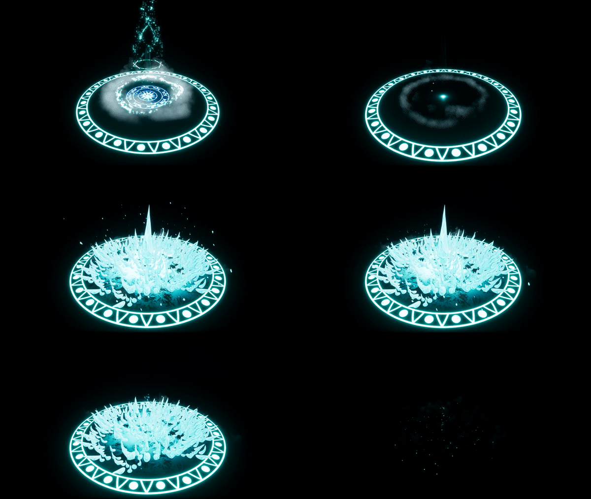
- The elements are well researched and technically well constructed and presented. I think the overall effect of the ice is a bit linear and abrupt in its ending. Layering some more smoke and breaking parts would sell the effect more. Also adding some settling of the ice or secondary movement would help. The audio works well.
- You have clear and concise documentation which enables the reader to see your progression and thoughts through the project. Its good that you have looked at different games titles and real world reference for your mood boards. It does appear though you did not plan the effect sketching the idea, this does show a little in your final version as a few elements are a little confused. You can also add branding or a theme to your documentation to personalise this a little more. Using different coloured titles or a background colour can help to create a brand for your work, especially if you carry these colours into the title screen of your videos etc. You have used some really nice techniques, exploring and creating your own vector fields. This enables you to control the particles and has give you some really nice results with particle movement. The particle movement however is moving into the air so when the viewers eye follows this they expect something to happen in the air, perhaps a falling projectile or something of this nature. When the ice appears at the bottom of the effect this is a little unexpected. Perhaps if the snowflakes formed together and then shot down into the ground it would explain the sudden eruption of the spikes. I dont think the cold mist is as successful as the snow flakes, the flakes have a really nice movement and remind me a little of Frozen. However the mist feels a little clumsy and noisy, it hides some of the effect and doesnt share the same attention to movement. I would perhaps use the mist to help sell the formation of the spikes and add more force by emitting them outwards radially like a shockwave. Perhaps adding a shockwave ring at the same time will help add more force to the spikes. I would give the shards perhaps a little more initial velocity and perhaps a little more drag so they slow and fall to gravity at a similar timing. This would give a little more punch to these elements, having them move initially very quickly and then slow and fall to the ground. I really like the subtle mist you have after the spikes appear, this is really nice and adds a subtle movement to the scene. This element is really well executed. This has a lot of the right elements to make a really nice and creative piece. A little more work will make this a stand out piece of work to add to your portfolio, well done
- Hello as feedback i would say, nice job with the vector fields and the timing. For improvement you can research a bit more in games, about the anticipation and timings, maybe is too long . Also to improve the final impact you can add more stuff like a wave at the end to make it more powerful
- Really lovely work. Lots to like about this. Does the middle bit root the character at the start/ give more damage? I feel some of the elements timing could use a bit of adjustment to help sell the punch at the end.
- This is a well-conceived and well-executed effect, giving strong support to a key game moment. The pacing and build-up is timed effectively. Its culmination, with the slight fade & shrink of the core, followed by the 'pop' of the ice bouquet, is an excellent climax. The material convincingly portrays a chunk of ice - it's clear your real-world reference helped to a large degree. The erosion also happens in a believable and interesting manner. The elements themselves are somewhat simple, but maintain a strong core design - with the attention to lighting, contrast, and shape being particularly pleasing. It all adds to quite a dramatic sum. Perhaps the only tip to offer is regarding the smoke sprites. They could be slightly less opaque, and have more variation or rotation to break up the pattern - it starts to give away the individual sprites, but this was mostly noticeable only in the closest shot. A strong effort - with cohesive visuals, with an efficient technical approach, and with purpose for gameplay.
- Hi Michael, Very nice effect ! You have, mesh, vector field, shader... That's good. Maybe you can add more timing during the build up. You lost 2 stars in technical, just for overdraw. your smoke is very expensive ! Keep in mind vfx artist need to optimise and overdraw is a basic optimisation. Nice work, keep going ! LOWYS Clément Ubisoft vfx artist MONTREAL
Challenge Tier
Search For A Star
Leave a comment
Log in with itch.io to leave a comment.


Comments
yikes that looks like it would really hurt to have cast at you. the counter spins in the preamble really make it feel powerful when it does bust out! great job.
Thanks, I really wanted to emphasize the impact and make it look like it would really hurt.
well you nailed that bud! great job :D