Play operating system
Creepy OS's itch.io pageResults
| Criteria | Rank | Score* | Raw Score |
| Game Graphic & Logo Design | #13 | 4.824 | 4.824 |
| Sound Effects | #27 | 4.235 | 4.235 |
| Music | #31 | 4.412 | 4.412 |
| User Interface Design | #43 | 4.353 | 4.353 |
| Game Page Design | #56 | 4.294 | 4.294 |
| Halloween Themed | #61 | 4.176 | 4.176 |
| Story | #74 | 4.294 | 4.294 |
| Log Line | #80 | 3.941 | 3.941 |
| Overall | #81 | 4.176 | 4.176 |
| Voice Acting | #86 | 2.294 | 2.294 |
| Character Designs | #101 | 4.059 | 4.059 |
| Accessibility | #117 | 3.529 | 3.529 |
Ranked from 17 ratings. Score is adjusted from raw score by the median number of ratings per game in the jam.
Leave a comment
Log in with itch.io to leave a comment.



Comments
A short and sweet game bursting with charm! I AM OFFICIALLY BOOGIES NUMBER ONE FAN SHES SO CUTE! The music was absolutely the star of the show,,, I was vibinggg to the theme that came on when Boogie popped up. The ending theme and visuals were also a banger!
AMAZING WORK MIDI!!
Thanks, Criptic!!! Glad you liked it :D
This was a lovely and sweet little adventure filled with charm and of course was very very spooky! This h00man was very entertained! Love Boogie! Great work!!!
Thanks so much, fellow h00man! Boogie loves you too! :D
As someone who’s tried to make an actual operating system, with a built-in but not terribly good kernel debugger, I kinda had to try this one. I wasn’t sure what to expect, but I liked it.
Some thoughts (categorised to mostly match the rating categories):
Story and theme: The story is cute, spooky, OS-themed and fun. And it uses the Halloween theme in an interesting way. The writing style is also pretty fun.
Audio: I think you did pretty well here, both with the music and the sound effects, although I would have liked if there was a way to adjust the volume from within the game. And the music both fits the old computer theme and the fun writing style in the VN.
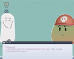
Characters and art: Cute, theme-fitting characters (they’re cuter than Clippy, and spooky like Clippy, what more can I ask for?). And the art, while simple, works pretty well: both the cute sprites and the haunted “screenshots”. The dithering also feels like a good fit for an old computer.
UI and accessibility: I think the UI looks like something that could be in a real OS (in fact, I think Ubuntu’s window decorations used to look a bit like the ones in that textbox). The font feels a bit modern, but still fits the retro-and-cute aesthetic of the game. The different characters having different text colours isa nice touch. But I would have loved to have a back or history button, and perhaps skipping or saveslots. It does seem like I can speed up the text animation by clicking before it finishes, although another thing I would have liked would be the ability to advance the text with the keyboard instead of having to use the mouse. And when the text characters are dancing around it can be a bit hard to read.
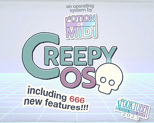
Marketing: I like the logo and think it does a good job at showing what to expect from the game (although I probably expected a bit more interactivity, but yeah, it looks cute and spooky but fun. The page also seems pretty well-designed, and I love how it’s a “downloadable OS” for Windows. The log line seems like a pretty good description that made me want to play the game.
Wow, so much cool feedback, thank you so much! I'm glad you had some fun! :D
Cute, short game. I think there's potential to flesh this out, especially if the devs add interactability to the programs on the computer.