Play game
Linking mycelium's itch.io pageResults
| Criteria | Rank | Score* | Raw Score |
| Theme | #10 | 3.571 | 3.571 |
| Innovation | #12 | 2.762 | 2.762 |
| Fun | #23 | 2.143 | 2.143 |
| Controls | #23 | 2.429 | 2.429 |
| Music & Sounds | #26 | 2.524 | 2.524 |
| Overall impression | #27 | 2.333 | 2.333 |
| Visuals | #29 | 2.762 | 2.762 |
Ranked from 21 ratings. Score is adjusted from raw score by the median number of ratings per game in the jam.
Leave a comment
Log in with itch.io to leave a comment.


Comments
It’s quite a unique take on the roguelike / high score - ish genre with some potential there to be a great game but I just feel like it fell short in a few aspects.
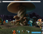
Connecting the networks feels quite tedious which i believe is a combination of low ammo, very small radius of each small mushroom and not having a clear indicator of whether or not two mushrooms are connected ( i know it blinks in a line and that is quite nice i have to admit, but for the placement its very unclear whether or not im placing them close enough).
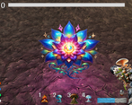
The upgrades feel very insignificant. I saw a few increasing stats by 1% which at the end of the day does not really do anything.
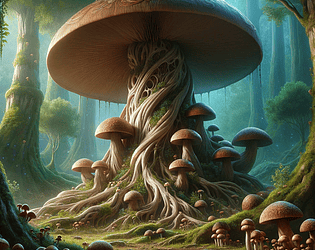
The visuals, even though separate assets look fine, they just dont really fit or blend together. Its not really cohesive enough. Which I understand is hard to do considering the use of ai and to try to skip some labour as a solo developer, but unfortunately the most important aspect of the visual style of the game is not the quality itself but the cohesiveness and overall blended appeal. I appreciate the old school 3D sprite look of the old games though, I have to admit it felt a bit nostalgic
However, given a single developer, it is quite impressive to implement so much in such a short amount of time. Given more polish and proper balancing, and maybe a bit of redesigning, it could potentially be more fun and interesting, and its definitely somewhat unique idea of a game, which i value quite a bit in game jams. Good job on the game :)