Play game
KILL MACH's itch.io pageResults
| Criteria | Rank | Score* | Raw Score |
| Did you make it in 3 hours (put 5 by default) | #1 | 5.000 | 5.000 |
| Audio | #11 | 3.545 | 3.545 |
| Gameplay | #19 | 3.364 | 3.364 |
| Visuals | #20 | 3.273 | 3.273 |
| Overall | #23 | 3.227 | 3.227 |
| How much do you enjoy the game overall? | #26 | 2.909 | 2.909 |
| How well does the game fit the themes? | #38 | 1.273 | 1.273 |
Ranked from 11 ratings. Score is adjusted from raw score by the median number of ratings per game in the jam.
How long was your dev time?
3 hours
Leave a comment
Log in with itch.io to leave a comment.


Comments
Seems like you put a lot of effort into the controls, if you expand upon that you might have something. The look sensitivity was very high for me though.
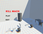
The objects falling from the sky in the menu must be the tie to the theme 😂 I like the gameplay! I wanted more levels and enemies that are on ledges or something and that are far away so I could utilize the zoom, and I also want to have a reason to jump and dash, so I'm looking forward to when you update the game! Great prototype!
Thanks for letting me know! I will definitely keep the request of more levels, and enemies at different ranges.
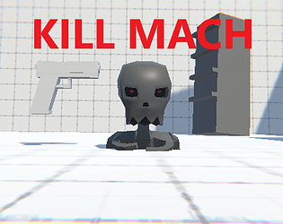
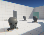
I didn't even plan on the guns falling from the sky in the menu to be tied to the theme, but yeah, I guess they are! Also, just had a question: do you like the skeletons as enemies, because I want to go with a more low poly look and I was thinking of maybe having more jagged/blocky looking enemies, but I didn't put this in because I had so little time.
I like the skeletons just fine, but I agree and think low-poly, retro looking enemies would be great! Especially given the look and feel of your game. The simple style is aesthetically pleasing and fun and a good look and having things that don't quite fit into that style, like the skeletons, might be a little "messy" looking. They fit just fine, but I do like what you have in mind better.
Okay, thanks for letting me know.
I liked the game! not sure here the theme fitted in but i liked the monsters you had to fight off and the sfx and music were awsome!
Thanks for letting me know! Yeah, the game isn't a perfect interpretation of the theme, but that's that I guess.
The music was from the 'Wowie Jam Resources' asset pack! I found the sfx from freesound.org.
cool :)