Play game
Messy Infiltration's itch.io pageResults
| Criteria | Rank | Score* | Raw Score |
| Fun | #5 | 3.268 | 3.444 |
| Overall | #6 | 3.268 | 3.444 |
| Theme | #7 | 3.584 | 3.778 |
| Game Design | #8 | 3.057 | 3.222 |
Ranked from 9 ratings. Score is adjusted from raw score by the median number of ratings per game in the jam.
Did you use any assets? (Say yes even if the assets were premade by you)
Yes
Do you have a team?
Yes
Discord Username/Usernames (It's for the price)
Hashiro#6384, Torus #6747
Leave a comment
Log in with itch.io to leave a comment.


Comments
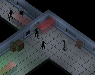
Okay, good things first: The mood is nice, in my original review i said it was too dark but thats because i was playing outside and it made everything look super dark. Now that I can actually see things, The mood you set and the darkness is actually really good. The game is really fun, and fits the theme pretty well. The music is fitting, and so are the assets.
Ok, now for the criticisms:
1.Right off the bat, The UI looks very placeholder-y. Just grey buttons with the default font and black background. It feels weird to not have a "new game" button and just a level select..
2. I spent about 5 whole minutes in the first room trying to figure out how to get past the guards viewcone (view-rectangle?). My first instinct was to somehow push the giant pillar in a way that blocks his view. So here is me, spending 3 minutes humping a pillar and pressing all the buttons on my keyboard to see which of them pushes the pillar. Then, suddenly, I turn invisible for a few seconds. I spend another 2 minutes trying to figure what button pressed to cause that, and finally, I get past the guard. It was only after this that I realized that there was a controls button in the menu that explained everything. I didn't click it because A. I thought the controls would be obvious and B. I didn't even notice it. A mini tutorial or at least a floating block of text would have saved me 5 minutes of my life. You gotta remember when making a game that people can sometimes be dumb.
3. The assets... My god, the assets. Even though they are fitting there is 0 animation so it looks extremely strange. Everyone is t-posing. Maybe put a LITTLE animation on them.
4.The map design is weird. This one is a little more nitpicky because the maps are pretty small anyway. But if you were designing a bigger map, you gotta rework your map design. You have no idea which direction is the right direction you often go the wrong way. Again, this is kind've nitpicky because the maps are tiny and walking in the wrong way for 1 step will make you realize its the wrong way because you can see the end of the path but if you were designing a bigger map then this would be a big problem.
5.The controls feel awkward. Eventually you get used to them but the fact that W doesn't move you straight ahead is a little weird,
6.The difficulty ramps up way too fast. The first level is actually really good in terms of difficulty, but then it just ramps up way too fast and quickly feels punishing and gets you out of the flow state.
7.The invisibility isn't that polished. It works fine when you first use it but it would make it much better if you could see yourself when you turn invisible, maybe just turn down the opacity or something. There were numerous time when i was invisible and fell off the map or bumped into a security guard. Also, show the timer and how long the invisibility lasts and how much longer I have left.
Conclusion: Very fun game with a gigantic scope. The music is really good, and the addition of sound effects are also a great touch. Has a few issues, but they can largely be ignored while playing. Extremely ambitious for 48 hours with no team. Overall I'm giving this a 4/5.
Thanks for such a detailed opinion! I feel like most of the things you said would have been done if we didn't have a time limit.
Also, for the invisibility, it was actually made on purpose so It would also be difficult for the player. In the actual project page of the game (Messy Infiltration by Hashiro (itch.io)), the description says "The stealth suit is damaged as well. It works... kinda. When activated the enemy Guards won't see him, however... we also will loose visual on our Operator.". So that was the idea from the beginning.
Well, my point was that even if you did it on purpose it isn't really fun to have to restart a level because you have no idea where you are.
(Also, I know that you probably would have worked most of the stuff I said in the game if you had time I just wanna at least give a few pointers that you DIDN'T know if you are ever doing a future project)
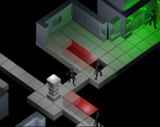
2 things to add. Guard detection cubes near holes sometimes make viewing difficult as they are volumetric and give the impression that the distance they travel is greater. Another thing, sometimes I was behind a guard and it was a bit difficult for me to get to the tile I was coming from because I still had his heel inside and he ended up seeing me. Likewise, it has been a good game even having created it in just 2 days.
I see.. I agree with both things you said. Maybe a little change in the guards collider could prevent the second thing. Thanks!
Good game, but it would be nice to have a checkpoint once you get the elevator key. (The 4th level made me almost want to chop my head off, but I guess I need to get good lol) Other than that, very cool game and my favorite in the jam!
I see what you mean, but I feel like a checkpoint there would make things too easy. Btw, want a hint? When going to get the Key in the 4th level, go through the right side instead of left.
And thanks!
It's fine, I already beat the game!
hey man i had a super long review that i spent like 20 minutes on but i forgot to click "Post comment" before going to another page. I'll rewrite it later just know that i have a lot of feedback
Thanks! Please do. Can be good or bad things, it's good to know opinions from others!
alright there i did it
nice game bro is easy to learn the movements and very good job
Thanks!