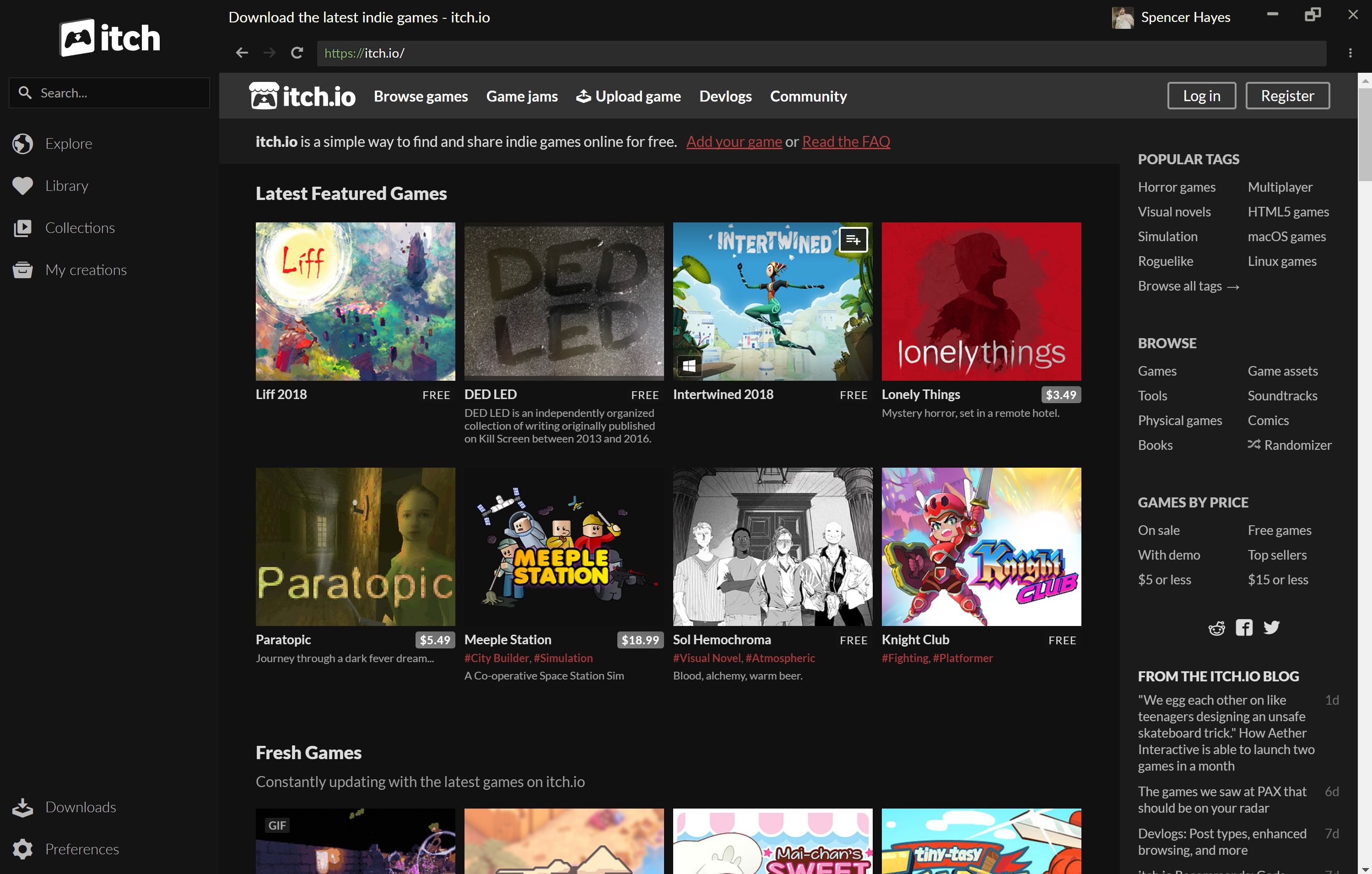
Last week we launched a full revamped itch desktop client and I may be a little biased, but it’s downright incredible. You may have seen our interview with the app’s steward, Amos last week where we talked about what it was like to design this update, but I think there’s still more to be said about what’s changed. Now, I’m not any kind of code wizard so I wasn’t involved in the design process for v25 but I wanted to highlight some of my favorite features included in the update.

New UI
Ok so I wasn’t wholly honest earlier when I said that I wasn’t involved in the design process for the app. When asked for feedback I told Amos that I wanted a new UI for the desktop client and boy oh boy did he deliver. Look at that UI! It’s so clean and easily readable! No longer will you have to close out a stack of tabs, you’ve got everything you need immediately accessible. As an aside -- tab fans can turn tabs back on in the settings menu. Yup, the UI is customizable beyond what you initially see.
Furthermore it’s even easier than ever to find your collections, grab all of the games you were checking out at the office, or look at what members of the community think are the best free games. With collections integrated into the app you can get even wilder with one of our most powerful features. (Note: collection editing is not available in the app)
SWEET MERCY IT’S QUICK
Once you get a decent number of games in your itch.io account the app takes longer and longer to boot-- or at least it did. For those among us with sizable itch.io libraries, the app launches way faster than ever before. Of course this has also extended out into the rest of our desktop client: nearly everything about the itch app is faster and leaner than ever. Boot it up and see for yourself.

That Library view
We’re not ready to leave the Library tab quite yet. While you’re marvelling at how quick things load you can also check out how fresh and scrollable the new design is. Your games will look better than ever with those big and beautiful covers, and now you can look at your backlog in condensed horizontal view or a full vertical arrangement.
Do you have any favorite features from itch v25? Let everyone know in the comments below.
Did you like this post? Tell us
itch.io is an open marketplace for independent game creators. It's completely free to upload your content. Read more about what we're trying to accomplish and the features we provide.
Leave a comment
Log in with your itch.io account to leave a comment.
Hi, is there a way to have a grid instead of a list of the games in my library ? I really don't like long lists, i'd prefer something much more compact, but i can't find an option to do so. Thanks.
Good stuff! It's a lot better than the previous one.
Heh. Good news and bad news today. The new Itch app is fantastic; it runs way faster for me and the UI is so much cleaner and easier to navigate. The new Google Chrome interface is the exact opposite. Anyway, good work guys!
I think Google Chrome looks much nicer now. I also like the new itch app and the new steam ui, guess I'm not part of the people who hate any change whatsoever.
I really do not like the new change to chrome. The sad thing is, I cannot change it back after it updates :(
Also the new Itch.io app is built off of chromium. (Chromium is a open source version of Google Chrome, and google chrome is built off of it)
I agree. It's why I use Mozilla's Firefox as my main browser. So, to use Chrome is a bit
ehfor me. But, the itch app team has done such a FANTASTIC! job so far using Chromium that I don't mind it as much, given my experience with other programs like FlashPeak Slimjet.