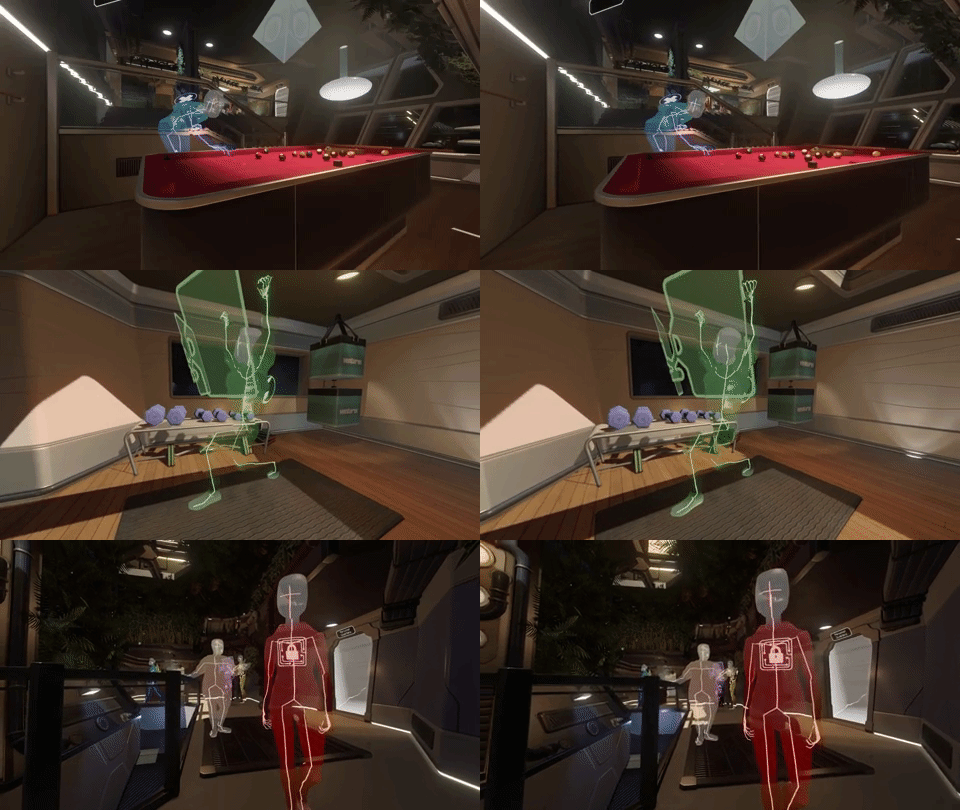
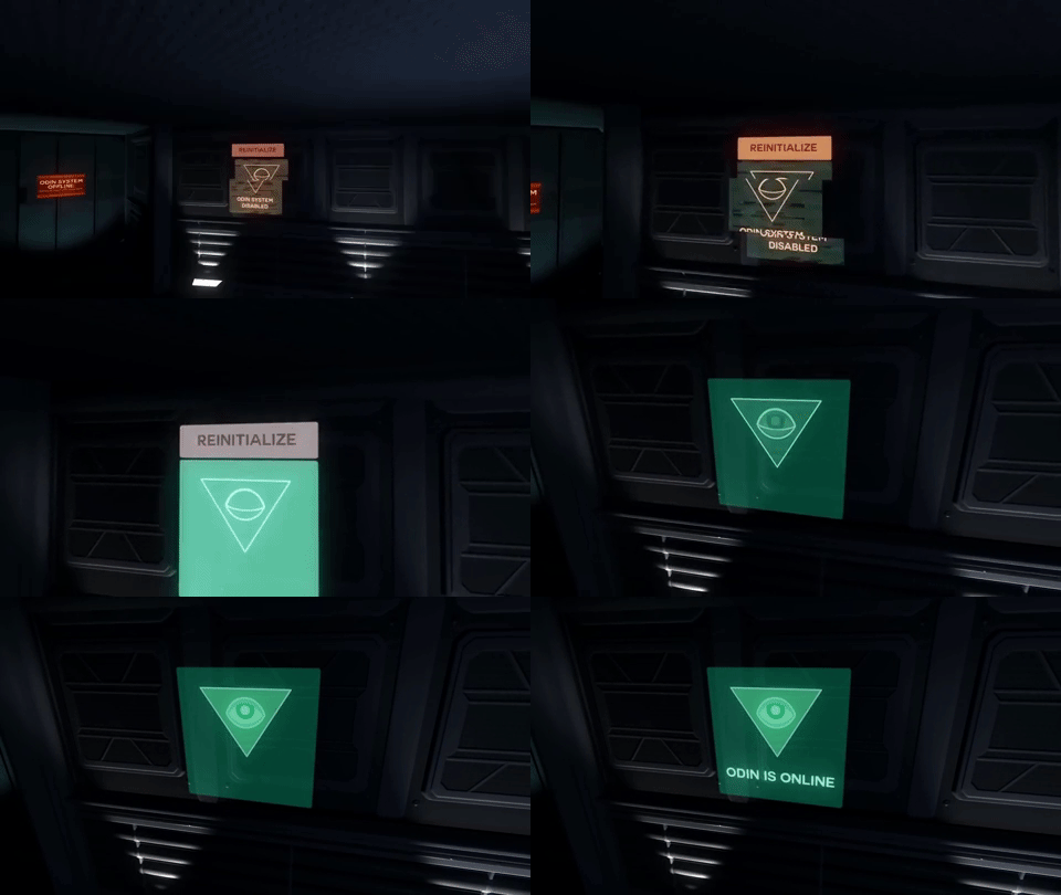
A clarity of purpose is a key part of designing a game. Trimming out what is unimportant to your game is a deeply necessary act of development. This goes for all elements of your work. Tacoma understands this and makes the UI an important part of the game’s experience.
Tacoma is a sci-fi game (think Alien but without the Xenomorph) and the UI matches it. The core mechanics of the game revolve around exploring recreations of events that happened on the Tacoma Space Station. In these recreations characters are represented by large wireframe models and you’re presented with a scrubbing bar at the bottom of the screen. You can move back and forth along this timeline as if you were working with a futuristic VCR. This works within the game’s aesthetic of what I call “adolescent technology.” All of the UI elements are all smooth and developed, but they’re all janky in a very core way. Sure you can replay these huge room-scale projections of people's’ past lives, but you can’t scene skip like a dvd, only play/pause, fast forward and rewind. Just like a VCR.

And the adolescence doesn’t stop there. As you work your way through all of the plot you have to hack into virtual desktops of each of these characters. These aren’t the desktops you know and love, these are a few icons at a time that give us links into things like email and instant messaging. These future gadgets haven’t changed the way people communicate, just the way they access their communications. This is heartening to see. This decision to reduce all of the technology to the future down to pieces we’re familiar with works to humanize the characters because they’re just like us -- or rather, they talk just like us. As you recreate more and more of the events that preceded the main narrative of Tacoma you run into glitches inside of these virtual desktops. Links become increasingly broken and messages frequently become garbled strings of random characters. The technology powering the station of Tacoma is broken. This isn’t the sort of future where everything works. This is the sort of future where everything is built by the lowest bidder, the sort of future where technology only barely works for the working classes because they don’t matter.

There’s also the matter of the technology the player-character uses to interact with the world. During the events of Tacoma you’re on a mission to recover something from the station via a handheld computer. You’re not interacting via some wrist mounted supercomputer, but what looks to be half-book and half-iPhone. It’s clunky, physical and very pedestrian. There’s no gadget envy to be found here.
But why? Why does the technology of this future suck? Without spoiling the narrative of Tacoma (go play it) there’s not a lot to envy in this world. Fullbright understands how to make all of the elements of a game serve its core message. Tacoma takes the themes of cyberpunk but strips out the neon and hands you the core philosophical messages. The working classes are stuck onto janky stations using janky technology to try to survive long stretches away from civilization.
Did you like this post? Tell us
itch.io is an open marketplace for independent game creators. It's completely free to upload your content. Read more about what we're trying to accomplish and the features we provide.
Leave a comment
Log in with your itch.io account to leave a comment.
Thanks, based on your review, I got the game.
Do you know if there is a game manual or map or any playaids of any sort?