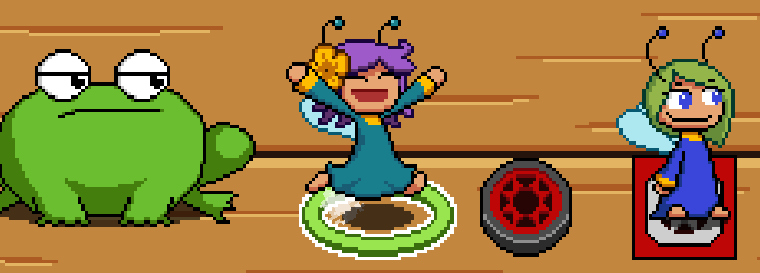
Merry fairy is one of the simplest fairies in the game. While the strong fairy can throw and the blue fairy can poke, the merry fairy doesn't have any abilities. At all. Despite that a plain fairy is incredibly useful for puzzle design, a cornerstone of the game. So today I will talk about my goals and challenges for this redesign.
But before we start, a bit of back story. Even before the prototyping phase I knew I wanted my characters to be lively animated. Animation is a very time consuming craft, so being efficient is important to get things done in a timely manner and recycling frames becomes crutial.

Enter the witch fairy! She has the ability to summon a copy of herself. That copy wouldn't have the summon ability, so effectively it would be a plain fairy. And since it is a copy, she could share animations, effectively cutting the work of an entire character! So the "clone fairy" was born.
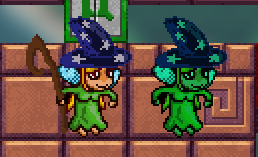
Initially the clone fairy was only present with the witch, but I soon realized how useful a walk-only fairy is for making puzzles. This however caused some issues in playtesting. People were confused about why the clone was alone without a witch fairy nearby. Also they didn't consider the clone a real fairy, but a magical illusion, which also confused people about game mechanics. This made me start realize that she needed to be more distinct to the witch fairy.
The first step towards that was giving her a different personality. I wanted a contrast beween the summoner and the summon, the witch fairy would be moody/stoic and the clone fairy would be cheery and expressive.
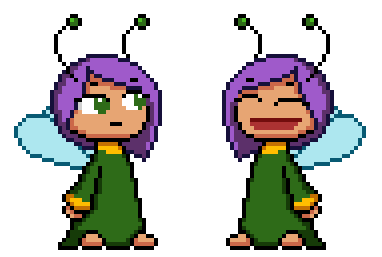
To experiment a bit, I tried dipping my toes in that personality by changing her animation in the beta sprite. This was a placeholder, but wouldn't this mean her running animation on the final sprite would be different too? Now that their personalities are different, maybe I needed even more animations. How many more would I need? Also the green tint looked off, with what would I replace it? How would people differentiate between both fairies without it?
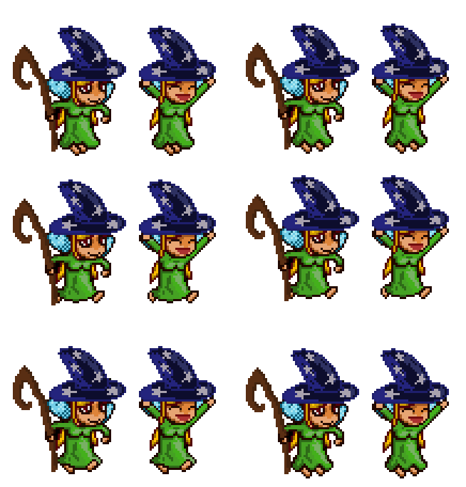
Having two distinct personalities using the same body created more questions than answers. By the end I couldn't figure out a way to make everything work while being efficient. I valued visual appeal more than the time saved from being efficient. The decision was made, the clone fairy would be its own unique fairy.
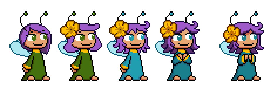
And we return to the visuals! My guideline was simple, same color scheme as the witch fairy (green robe, purple hair) so people knew both were connected and being happy. So the first question is, how happy?
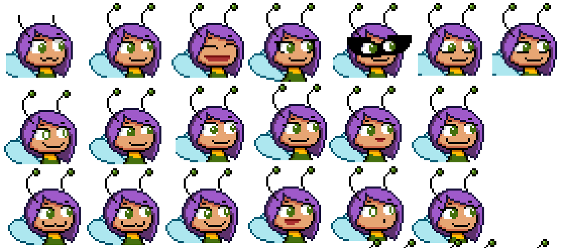
As always, I start with the blue fairy as a base. All fairies have their own kind of smile. I wanted merry to have a honest and big smile, without going overboard and start looking shifty (blue fairy). The open mouth one receives a special mention since it is going to be used for some cases.

Next up was trying different hair styles. My testing goes loose here, the hair should look fine even in a rough state. I usually try a lot of stuff I know that will not end up in the final design, but could give me some new design ideas.
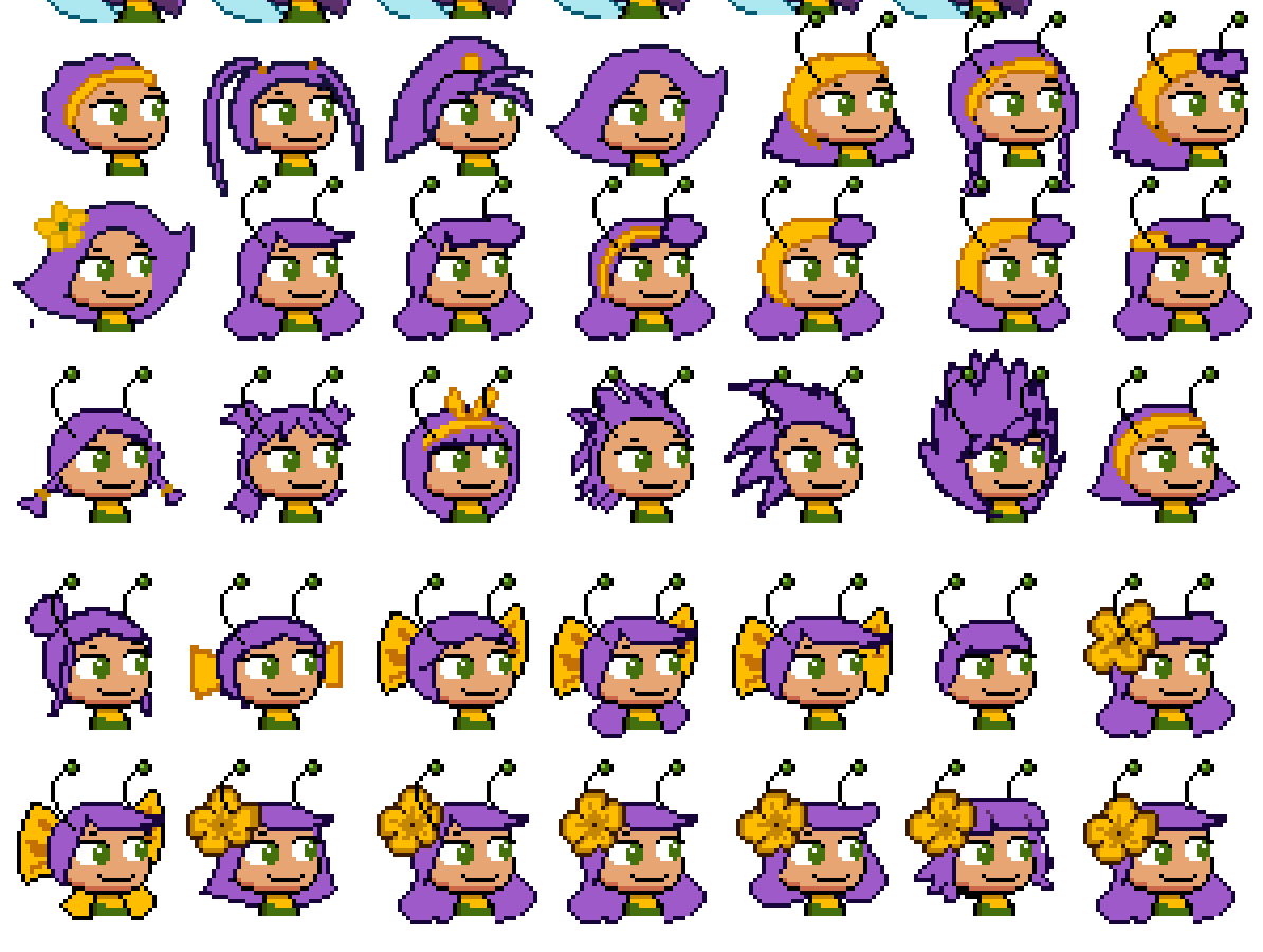
As soon as I started I grew fond of giving her a yellow highlight as a hair accesory. The bow was interesting but it didn't convince me. The flower was an idea that I toyed in past designs. It gave her an innocence aura which meshed well with her personality. Though I also wanted a happy-go-lucky rascal feel for her and the hair would need to reflect that. My first attempts made her look too well behaved.
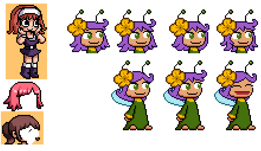
Inspired by Paul Robertson art style, I tried a traditional spiky hair style. In contrast with the other fairies it gave her an action, wild feel to her. This is a relatively complex hair style to animate, so I usually shy away from it. In fact I tried converting it to a soft style, but this diminished the final result, so it was dropped quickly.

While working I usually put the new designs next to the old ones to see if they work well together. It soon become noticeable that having two fairies with the same color was not ideal. Yeah, she is summoned by the witch fairy so having them visually connected is good, but maybe it was way too connected. Also the moody dark green clashed with her cheery personality. So the color was changed to cyan, a lighter, happier color that still felt connected to the witch fairy's green. The hair color hue would stay the same though, because thats more fun for lore reasons.
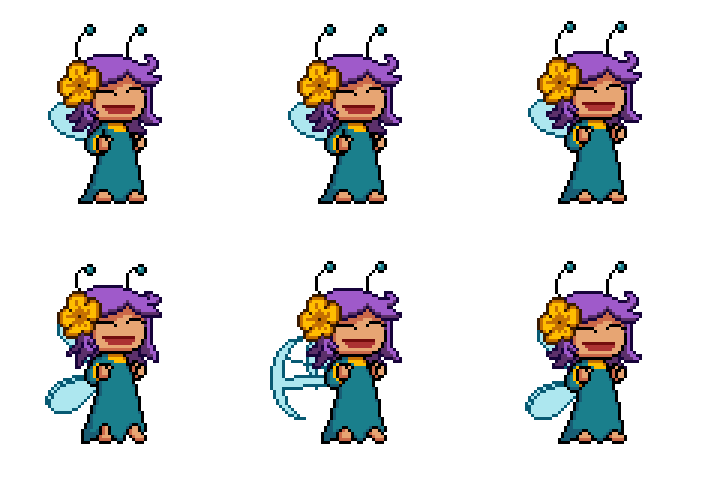
After some polish to the hair, the final touch would be her idle poses. She is a fairy with two states, regular and excited. A lot of things are exciting for her, like moving, getting thrown and getting poked. This is the point were the big smile is used.
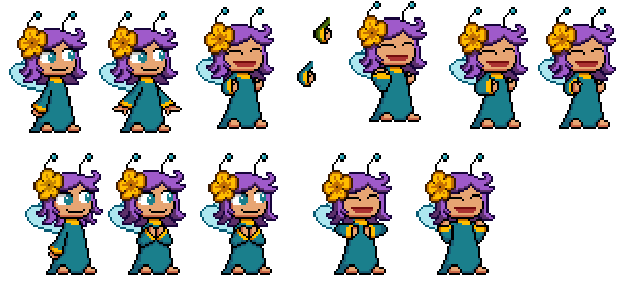
The excited pose was easy. The regular one was a struggle in getting the right mix of high energy and innocence. Fun fact, several people confused the hands on one of the attempts with breasts. Usually don't mind that kind of confusion, but it meant the pose wasn't communicated properly.

And with that, the design is done!
As a final note: from playtesting and videos a lot of people got surprised when they learned she had no skills. Some even suggested abilities for her, going from complex like hugging toads to very simple ones like increased movement speed. As fun as they sound, I want to stick to my guns and make her as simple as possible. There is no need to overcomplicate things.
I believe that this proves the design is faulty. It fails to communicate this fairy is not mechanically interesting. A more plain design could have achieved the goal better. But honestly, if I'm going to spend time making a character and players playing with it, wouldn't it be better if the final result was fun to look at?
In fact, I believe that not having any abilities at all makes her interesting in its own unique way.
Did you like this post? Tell us
Leave a comment
Log in with your itch.io account to leave a comment.
Interesting thought process. You had an idea to lessen the required effort only to talk yourself out of it while implementing it. It happens.
As for the placeholder, it probably didn't help that illusions look like that in DotA and Warcraft 3, but tinted blue instead of green. That probably helped condition people towards that interpretation.
Also, I'm still a little confused about the fairies. Is the summoned fairy some sort of construct that only lasts for a level, a merry fairy that was at a different location and got teleported in, or a fraction of the original witch fairy contained within the marble?
Yeah, change of plans. Thankfully I don't have a strict deadline so I can afford to take the time.
I completely forgot about that! I played a lot of dota so maybe the green tint was a subconscious decision at the time.
Sorry I wasn't clear on the devlog. The fairy is teleported where the witch fairy is. Where the summoned fairy is something I haven't revealed yet.
Great post, I love how you go through your design and thought process. It really comes through in the final design, all of them.
A question is have is did you have and specific palette that you were sticking to during your design? Or do you just pick whatever colors look best?
Thanks for reading!
Originally I wanted to have the 5 colors in the game (red, blue, green, yellow and gray) be reflected in the fairies, the toads and the level contraptions. I tried to stick to that for a while, but some fairies like merry needing a different color and the brave fairy looking subpar with yellow, so I bend the rule but still kept is as a loose guideline. By the end I just experimented with colors to see which ones meshed well together.
One thing that I did manage to keep constant was using yellow as a highlight for all fairies.