Congratulations. You're a champ/
Axelstems
Creator of
Recent community posts
Haven't played this since it's first iteration, it's a lot better! All the spells felt powerful, and useful. I liked how you got more elements as the game progressed. I don't really have any technical feedback, but do have some idea guy suggestions
- More sound effects for enemies
- More enemy types in general
- Wave attack encounter (Like vampire survivors)
- More power ups for specific elements (Maybe give up one to empower another?)
- Map is a bit inconsistent, some nodes have 5 encounters, some have 1
- Still love the art style, it's cute, clear and memorable
Anyways, good job!
Hit an error while playing some more. Consistently happens on the 2nd boss (The head of security).
Happens on his 3rd attack
############################################################################################
ERROR in
action number 1
of Other Event: User Defined 1
for object o_enemyHeadOfSecurity:
Push :: Execution Error - Variable Index [0] out of range [0] - -7.otherActions(100860,0)
at gml_Object_o_enemyHeadOfSecurity_Other_11
############################################################################################
gml_Object_o_enemyHeadOfSecurity_Other_11 (line -1)
gml_Script_startPlayerTurn (line -1)
gml_Object_o_turnText_Step_0
Great presentation. Felt just like a classic video game in the best sense.
I didn't mind the controls, they felt fine once you got used to them, and were a decent challenge.
I only played two challenge levels, with games like this I much prefer a long running story to keep me interested. But I am happy to say I think there's plenty to build a story around here, and you definitely have the tools to make it interesting/fun.
Keep at it!
I played a good amount of this.
It's fun! The slot machine stuff hits well, and it feels good! Right until it doesn't... Which for me was right around the 1.5th level marker. Not sure if I was doing something wrong, but I would get my ass kicked by a queen or king, much less challenge a second level boss. I thought I was getting the hang of it, but was maybe just getting carried by good items (The all dmg = 8 was very good!).
Anyways, some bullet point thoughts.
- Good art style! Everything flows and works well.
- Some time rolls can get tedious. Regular slot machines have a function to "auto resolve", and it wouldn't be missing here, even though that loses some of the "skill" benefit
- Like I said, the game is really hard! Maybe ease up a bit, or ideally make icons a bit more powerful IMO
- Some enemies can just be 100% round over, which kind of sucks. With my limited control over dmg output, it makes approaching some of the mini bosses too daunting.
- With the money gun was more viable. It and most of the healing icons felt almost like detriments. All my best runs were dmg focused.
Anyways, really like the game, think with a few balance tweaks it'd be ready for steam. I'd buy it at least.
I meant to leave feedback, so here goes.
I played two rounds of assault, had fun in both. First round I get shooting fliers which worked really well. I destroyed 3 spawners, and then died stupidly. Then I got some cool techno knights with a shield. I build a lot of buildings for them,and they did seem to get stronger, but I wasted time trying to conquer another coven but ended up getting split up and overwhelmed.
Things I would like to see
- A way of improving or customizing your lich king. Some new attacks, or speed up, or anything would be really cool.
- More clarity with the impact the buildings can have
- Some kind of defensive structure I can build to protect covens when I'm not around.
- More clarity on what the items do, and the impact they have
That's all, I mean to play more of this when I get a chance.
>14300
God damn, impressive. I really appreciate the long playtest, and you finding the issue with the stalemate tutorial. I will look into making it more clear.
- sometimes annoying having to wait for animation until you can take next action
I've thought about a setting like this, but need to look into it more.
- thunderstorm can clear grass, idk if that’s intended, gave a lot more breathing room once I had noticed
Yes this is intended. Otherwise between storm + death you have to kill off creatures too much.
- In general, I feel that the balance between placement actions and other actions is off. The game concept on top level implies that it’s like Tetris with animals, let’s say. But in reality half the actions are "weird" meta-actions that interrupt the flow a bit.
I get what you mean, and these sadly are needed for the reasons you state (getting out of corners, etc) but I have though about turning the turn action into a single move with 3 options (u-turn, 90 degrees etc.). That could possibly help, or just make players deliberate over moves longer...- The death action also feels off, because it’s so immediate. Maybe it could also be sth. you place on the map and that has impact only eventually, playing with the chaining?
Having this be placed would be very interesting, I'd have to mess around with it and see how it feels.
Anyways, thanks, really appreciate the footage! It's really helpful.
I can feel major improvements from last DD. Mech feels better to use and move around. Mostly used the machine gun and grenade launcher. Was able to get decent high scores in arena mode this time.
My specific advice would be to add some menus to the starting/ending UI. Even just white and black boxes would help make it easier to navigate.
Keep up the good work!
This is a crazy ambition project, and I have a newfound respect for games like this after dabbling in 3rd person 3D development myself. That's not even factoring in everything seems handmade by yourself, which is just nuts.
Feedback:
- More checkpoints would be appreciated
- Levels could use more set dressing, just simple things like statues or torches.
- Fire breath is OP, but fun because of this.
- Obviously there could be lots of polish
I need to play some more when I have some more free time. I don't think I got through 1/4th of the content.
Thanks for playing, 35 minutes isn't bad!
>Tooltips on the Things might be alright,
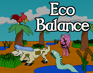
I need to at least add a hover tooltip to the 4 abilities on the main game page. They are pretty confusing unless you know what they means. Same goes for the food chain diagram.
>Buttons can only be clicked on the lower Part.
This is weird, most are the default button in godot... I'll need to try this out.
>sometimes feels like quite a bit of Stuff to take into consideration at once tho, with the Thing to place, what interacts with what, how long each Piece still has to live, and so
That's good, because that is the intended feeling. It starts out simple, then it turns into a big soup of possible interactions.
Really appreciate your feedback, it's always useful.
Talked a bit about this in a stream chat, finally played it.
Feedback:
Movement is a *bit* slow, but this could easily be fixed by levels or pickups
Some spells seem very week specifically entangle, fireball and steam burst. Entangle hits on enemy, fireball same issue with weak damage, and steam burst puts you in melee. Entangle should hit at least 5 enemies, fireball should be a big explosion with knockback, and steam burst should be more of an escape.
The game got really hard really fast. I'd love some kind of upgrade system similar to VS or Halls of Torment.
Encountered a bug where enemies could push me into the walls. Then they couldn't reach me, so I could easily farm them forever.
Really fun base, especially with elemental weaknesses. I think you could turn this into a fun VS-like with some cool spell specific upgrades and stuff like that.
Thanks so much for playing and recording your gameplay! It's super helpful for me.
>There were a lot of moments where I wasn't sure what was going to happen first.
This is a good point, establishing an "order of operations" would be good. Not sure how I will do it, but it would help a lot.
>Why do trees have counters on them?
There's a related achievement, other then that nothing.
>I found the storm usefl mostly to destroy trees
No it shouldn't be, and I thought I had fixed this. Thanks for the bug report.
>For me the screen on the right was mostly informative so the interactable button got camouflaged.
This is a good point. I'll make it more noticeable for sure, and hopefully involved with the tutorial more.
>Very nice work!
Thanks a ton for playing and the great feedback!
This is a solid fun puzzle game. I think you could have the random number pop up a bit more, and maybe remove some rows to make it more difficult.
Could use a volume slider, the background music was a little loud.
Sound effects are nice, art is pleasing. I could see this being a successful app store hit.
I took notes on each level
Level 1
- Loved the intro and drop in
- You could hover off the end of ledges
- Flags have no sound :(
Level 2
- When the OST hit the "ba da da da da, dadadada" I said "there it is" and it was great
- Some segments with enemies were frustrating because going down block slopes can be frusterating
- That big jump was satisfying to finally get
Level 3
- Not much to say, although it solidified some of my general comments below
Level 4
- Love the piano track
- Super fun level, reminded me of the star levels in super mario World
Level 5
- Another nice and fun level, hard but not annoying
level 6
- Ahhhhhh FUCK this level
- FUCK that end puzzle
- I HATE blorb
The end
- Kino. I cried
General Comments
- Really fun, challenging platformer. You have a great skill for level design, and challenge. The last puzzle was really well designed.
- I wish this had a sonic type deal where all your blorbs flew out when you got hit, rather then an insta death
- In the same vein, I wish blorb had a "fast run" similar to mario in super mario world, or something like sonic's spin dash. Some more speed would be nice.
Over all super, super fun. Loved the music, gameplay and tone of the game. Great job!
Thanks a ton for the vod, it was super helpful for making my post DD-todo list. Loved when you got the acheive for killing the last wolvenhoof. Also glad you liked the new animations and sounds!
Hope next time I'll have a better tutorial, that won't just be a huge wall of text!
Thanks for streaming, really appreciate it.
This game is pretty awesome. The intros were amazing, it really sets the tone well. I couldn't believe the amount of classes I could pick from, but I picked the slave guy the the hand crossbow and sword.
My first bug was I loaded into the battlegrounds, then ran right back to the camp. After this, the map didn't work, so I reloaded, and every time I went to the battlegrounds I fell through the ground. So I made a new character, and it worked! I was smacking guys all around it was tons of fun, Got the cyclops boss, took the elevator and pretty sure I got to the end of the demo.
Feedback
- Targeting is kind of weird. Lots of times I'd turn around *just* as my spell was going out
- Some spells (like my ground AOE) felt kind of small compared to the effect
- Terrain can be hard to navigate, but I never had too much of a problem
- Soldiers kind of got lost all over the place
- Needed to stand really close to check points, and it was hard to tell if they were being captured or not.
Anyways, super cool vibe, super cool game. Loved it and can't wait to see where it goes.
I thought this was a cool concept, even though the controls were fiddly. It would definitely be nice to see vision and gun ranges, as well as have sound confirmation they are going to shoot at a target.
I could see this being super cool though, especially if you went with some kind of gameplay feature where you could zoom into a tank view or something like that.
I can tell it's a prototype, but it's definitely got potential.
Thanks for playing despite the shitty performance issues
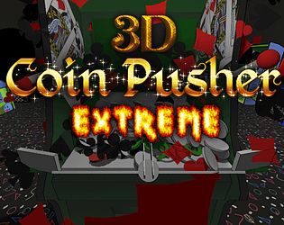
>I want to rip those f$#&ing levers off. Please add WASD or arrow keys to change them instead.
ahahaha, I knew this control scheme would be a mess. I'll get this fixed for sure.
>The arcade machines being links to other games just feels a little tacky, tbh
I was using this as a way to learn texture painting, and didn't want to use assets for free, but I get what you mean.
>If you enable both cube and cylinder, you'll launch a cube but be out a cylinder as well
Thanks, good bug catch.
>Despite my complaints, I want this to succeed. I've spent hours at Dave & Busters playing these things!
This is mostly a learning project for me, this game will scratch that coin pusher itch probably much better then this ever will.
I do appreciate you pushing (haha) through the lag and trying it out!
This is harsh, but very fair criticism. The button issue is odd, but I bet it's an issue with focus. The music actually is creative commons music, but I did not spend much time picking it clearly.
Tutorial is the top of my todo, as well as putting players through it at the start. Not exactly sure how I will do it, but I'll figure it out.
I really appreciate you playing it, and giving me some clear things to improve on.


