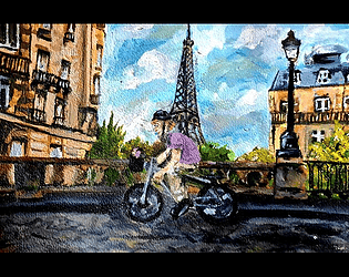
art style is really cute. background assets less polished but that sakura tree near the start kinda has some crazy interesting texture. terrain is rough though.
displayed ui in a nice readable way ingame, kinda surprised tbh. while easy to understand, still didn't feel easy to play.
hmm the ui looks kinda scuff sometimes. like text being displayed under hearts?
art is fairly charming. overall visual style kinda mixed, some nice things here and there but not quite meshed together into a cohesive package imo (some of the ui and irl images that aren't colour corrected much) the background and colours on this overworld look quite appealing though. design details like the little sheep puffs and welsh flags are super endearing.
whoever's art style this is has some interesting shapes particularly noticeable on the player sprite and the trees. also that player sprite kinda have a bare ass?
cycled all over ironmouse's house.... why is connor so small btw lol.
does she not like water? kinda don't get that but i guess don't touch that. seems like a vibrant oc. thought it was fun when connor ran into her and that voice clip played, although i think it woulda been better if it was a wee bit louder. the tiny mouse in connor's basket is quite adorable.... mouse controls make it easy to pick up and play. except i'm so bad at it. but was still easy to pick up.
pretty in ya face visuals. poppy. cute overworld sprite style and textured brushes with pixel. funky movements on start screen already set a vibe alongside the beats and boops.
wow the mouse icon is quite cute....
the E prompt right next to dialogue nice and readable and visually clean thanks. i'm seeing text instructions also just dumped in the corners too though so.
i don't really get, what rhythm mechanic is. like at all? the flashy words on screen are cool style though. the "BRO" is funny.
kinda weird how the bike is here, it has it's own set of controls to pedal, but the monkey sprite isn't quite integrated into the bike it's riding rotation-wise..... idk.
exploring the world without the bike for now. got hit by a few cars and that crying monke expression is super charming lol. i kinda really dig dig this style. i just dunno how to play it. cycle ui didn't go away despite me being far far away from the bike at this point.
damn i just walked up to the finish line and it let me win. that's kinda funny. would be funnier if the game detected that i'd walked up and chris actually was like. damn dude you ditched your bike?
sorry i couldn't figure out how to ride the bike at all. i'm glad i got to try your game though because the style looks pretty great.
(got back in again to try one more time) right around the exit point, if you turn a certain way the trees do kinda clip under the road a bit.
i maybe got a sense for it? idk. i'm trying to hear for the rhythm in the music. but maybe it's just supposed to be some alternating rhythm in the pedaling? idk.
please let me pause the game so i can write these notes. the game booting up on silence, then you shoot a dart, then the music comes in, is an interesting sound flow.
the controls are all crammed into the bottom left corner which, fine. it's good that the controls are in the game somewhere. but damn are they hard to read. especially at my brain fry rn.
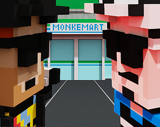
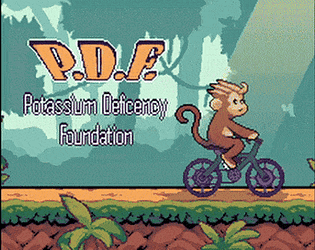
monke dart tower defense inspo with the balloon meta is cool. even with the layers too. and then having bananas fall out of it kinda satisfying to the oog brain, to shoot and collect more. p.
the ironmouse checkpoint logs stand out a bit amongst the art style, maybe the line art makes it feel a bit off.
the rotating orange and yellow shapes to show potassium, and the way they kinda move, is a cool visualisation of that.
i'm ngl i can't figure out how to accept mouse's gifts. how. surely i can just. click on them? no? i mashed my keyboard and nothing. i don't think the game is actually broken here, everyone else seems to run it fine. i must just be fried out of my mind that i can't figure this out. so unfortunately i end this play through way too prematurely. try my best to rate fairly though.
cycling theme does seem a bit inserted and not fully embraced to work nicely.
okay that music is quite loud though. i find the rough edged aesthetic of the game title and ui elements to be quite appealing. pretty gradients on that title that kinda compliment the softish colours i'm seeing previewed in these environments. i thiiink maybe the pill shaped buttons of [play] [settings] and [exit] shouldn't have been perfect shapes (straight lines, rounded sides) but all together everything kind of has a nice aesthetic.
hey i adjusted my sound from the start menu. then when i enter the game, the music is back to loud again lol. ummmm. a bit rough. espeeecially the sounds of the bananas, the mixing seems kinda off. i keep putting the volume sliders down and they keep being crazy loud. and then sometimes it sounds like the bananas are being picked up from afar? bit weird.
alright this game is already kinda wide in scope for me (bad at 3d space) and i don't really have the time or patience right now to learn a tough game (sorry) but it honestly did impress me, mostly visually, with the vibe you accomplished. like the backgrounds, from what i saw they have some whimsical structures and formations made from simple geometry and with quite a lovely and soft colour palette. your rendering technique also gives it all a nice look. i accidentally cycled off the platform and fell to the depths. but that scene of the monkey falling into the light, something about it kinda had this ethereal memeable quality to it. it's kinda cool.
the controls did feel harder for me to grasp unfortunately, and that might be what brings down this game. tbh i haven't explored enough to really judge the gameplay completely? i'll try to fair about it though.
red unity screen is already kinda standing out, it's nice. actual start screen feels too quiet though. maybe some jousting ambience?
"acceleration increases you damage" there is a kinda odd offset of layering happening on this screen? from the top and bottom edge? (tried to attach an image but this text editor didn't let me save it)
tbh i kinda didn't read this screen but later i was in a joust and the space bar on screen quickly identified to me how i should be using it, to speed up. and then, eventually after seeing the percentages on different parts of the opponent, i caught on that i should try clicking on them. i didn't even register that this was being explained to me earlier. but the game design was effective enough for me to intuitively figure it out. that's pretty awesome.
don't like the W and S keys for building momentum, that position makes my hand hurt..... and to me, i understand using A and D more because they're positioned sideways from each other, as opposed to up and down. for horizontal movement. idk why everyone keeps making their bikes move with up and down but i don't get it i can't get a good grasp on it intuitively.
i like how the demonic bike is designed with the demonic colours and slight shine. idk small things like that feel nice.
you've got some nice sensibilities on compositing and sound design (i'm noticing in the shop) with the hover over noises and slight glow on certain elements.
so i did lose on my third joust. kinda gotta move on to another game now. but this was quite nice! jousting tournament feels cool. not too much cycling theme going on? but it's kind of cool to the aesthetic (bikes instead of horses) and you did seem to put some thought into alternative bikes, which i add to theming.
first thing that comes to my attention upon opening the game is that the background layers are moving a bit out of sync which creates a bit of a jittery movement that feels a bit visually messy whoops.
tried playing on controller first. not used to the select button on the controller being B but maybe that works better for the jump. the controls board was kind of hard to grasp while zooming past it so i died a few times round before i fully understood my controls.
usually with my brute force way of playing these games, i don't fully get a feel for the gauge i sometimes have. in this game, they never even told me about it but i was eventually able to figure it out myself, just from the way the gauge moves in response to me speeding up, and collecting bananas. this is good game design to me. also like the black bars coming in to make the feel more intense + camera shake + intense zoom is prettty sick. that line transition that moves across the screen upon death is coooool.
still don't have a grasp on how to make the monkey not explode by landing on his face though. i'm really bad at keeping my bike upright, in most of these games. definitely has mad impact though and the transition between dying and starting the level over, feels snappy enough that i don't feel as frustrated and quit as i might usually.
i feel scammed for dying by hitting the edge of the screen.
are the hazards orange because oranges are evil?
music is pretty groovin.
kinda sneaky how you slipped in the extra cycling theme through the circular platforms that you can just, cycle around and around on. nice. on top of it also being a cycling game, and the wheels feeling kinda right as the means of movement as opposed to being a substitute for any monkey running around. so nice cycling feel ya got there. didn't catch much else besides the movement, but at least the movement is fairly strong.
alright cool. kinda quit in the middle of level two because for some reason i can't teach my hands to rotate the damn monkey away from the next surface so he doesn't smash his brains out. it's just been a long night and i still got lots of games i wanna try. but definitely seems like a cool feeling game. movement feels cool. maybe it might be jank somewhere but, you've created a feeling of epicness in the gameplay here. the level design kinda is harder for me to learn, but it can be satisfying to figure it out. maybe if i had more time. could be interested in playing the upcoming version.
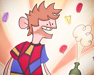
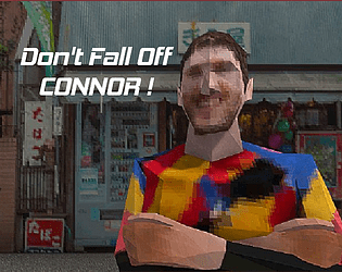
damn this connor sprite is hoped up on some donations (he seems quite excited)
yo card format is really cool. thought i could drag them at first but no. i think it'd feel nice to be able to drag them into spots. sound design sounds pretty great so far (nice music and hover over sound effects)
is your text under "choose a card to build japan!" kinda highlighted weirdly? seems a bit odd. damn even having a speed up mode is pretty cool. that attack mechanic (with the circle?) seemed cool, i was a little stunned and unsure how to react at first but i was able to read what i should do well enough i think. i think if you revisit this though, that circle should also be done in pixels.
damn sound design on this one is killer. the clicky sound of the bike moving forward sounds so satisfying especially when sped up.
huh, the land under the city blocks contrasts quite oddly with the grass around it. must've been a time thing. but would be cool if a smoother transition was made along those edges, just like the outline of grass.
so it's really cool how you've gone and made use of the cycling theme here, in a totally unconventional manner. the sound effects, the cycling around a loop (on a bike) the cycle battle mechanic, it's pretty awesome.
so i'm a little brute force with playing this right now, so i'm not entirely taking in all the strategy. some things to note. donation money, kind of not a thought. i'm aware of it, but i don't really get a sense for, what that money even means for me in this game? (like is that our spending money? we just trying to get a big number? when do i get more money and stuff?) basically what i'm getting at, is that i feel like there could be more feedback on that number, because it seems important but i'm not keeping up with it at all.
what is this phone ringing sound for? since it plays faster when i cycle faster i'm assuming it might be the sound of passing by a konbini. didn't pick up on that before, and i thought i had konbinis put down already? but cool, maybe unclear to me why they are making specific noises though. maybe it's donations?? i don't get what's changed though, why it just suddenly started making that sound?
yo the pete card is mad cute. what a charming fella. the american flag is mad goofy lol. damn bro the little bounces on these character anims are pretty cute.
the fun little circle battles have been slower than they were near the start of the game. i suspect this might be because of my battle skill going up maybe? but tbh, i was looking forward to getting good at those, and now circling around and fighting the same enemies with the slow circles is feeling a bit tedious.
actually thinking a little audible feedback from the blocks i pass would help my intuitive understanding of what's happening at once, and also lets you feel the progression of your city through the evolving soundscape. might actually be messy in practice, but seems kinda cool and satisfying in my head. also a visual indicator for those blocks would be cool too, just like the slightest motion animation maybe? trees swaying? konbini doors opening? city lights flickering on and off? so when the player goes by their city, it kinda feels alive and like it's lighting up in a wave as he passes by.
anyways i've now filled up my town. it's pretty cool, but i am a bit at a loss for satisfaction i suppose. don't really have the time or desire to get the highest score possible, so maybe some tangible reward or something, would be nice just so the end isn't just, open ended and you kinda close the game? maybe a little cheer sound at 10 million dollars? or just for finishing the town? idk.
kind of a crazy sweet game that's super simple. not without flaws of course, but damn does it have some nice presentation.
oh dear the ui does look like default stock assets.... if you had the time it would've been cool to see ui like this done in a similar traditional method, maybe not paint because it might blend in too much, but blank canvas paper cutouts with text on them maybe?
lowercase f for france denotes a not so glorious country. unsure if the "undeceided" mistype was on purpose or not.
so far these screens look pretty unique and impressive, the paintings have a looot of depth and texture to them and they look pretty otherworldly in the context of a visual novel.
i was jumpscared by the loud ass connor clip audio, wow. and suddenly someone's playing ukelele in my ear? the clip being so loud might be my fault i'm not sure, but maybe check the audio level just in case?
looping gif of ironmouse doing heart hand is charming. her face is so. you clearly don't have an air fryer type expression. kinda crazy level of smugery depicted here. kinda don't think it was intentional though?
wow the text on the france sign is so clean...
damn did connor die? fell so hard they lost their paint textures. i really like the highly expressive mouse shocked face though. you even gave her a wing flapping animation, that's so cute!!
actually can't tell if you maybe need a spellcheck read through or these mispellings are on purpose.... "stollen" is that emphasising the latina way of pronunciation or something?
it'd be funnier if the "LOSE YOUR SHIT" was in all uppercase while the "keep calm" was in all lowercase in these button options.
oh my god your connor voice clips are so so loud. you do really nice shocked expressions though, filled with cartoon whimsy.
there is a potential issue with text readability when you just have it over the screen like that. not that i've struggled to read it myself, but i can see now looking at it on top of connor's shirt, that it is kinda visually busy. usually vns have a slightly transparent box underneath the text so it's guaranteed to stand out. you might not wanna cover that much of your art though, which is fair. but text readability is something to keep in mind.
now i fear the french voiced lines are being majorly overpowered by the ukelele back there. i haven't changed my volume at all and connor was a piercing loud earlier. so, my recommendation is to open up all your voice lines and clips and music into some editing program and really listen to them side by side, then make the voices all sound the same and the music a bit lower but still audible enough to support the scenes. audio balancing.
suddenly all of the apostrophes have been stolen too.
these french people designs are cute.
the nonstop ukelele loop is starting to get mildly annoying, and it's not the most fitting for every scene so far ngl.
oh wow the bike art is really nice!! wow. and the basket is actually a nest, so did you seriously make all variations of this bike? that's pretty crazy and cool. unless i've just been duped, and it's just this one bike design.
wait why do we need to go to the airport now can't we just cycle back home now?
that's a crazy sketch she just made of us. i'm over here wondering if this is how we're gonna make our casino funds.
the not a mouse sign is crazy. this is so camp. she hangs it around her neck?? i thought she was just gonna be holding it like a wand or something damn. both look ridiculous though.
classic french employee shooing off a foreigner looking for help. dude there's no way it's worth getting employed by the french for a few hours when we could just cycle home instead.
damn that fucking bicycle in french question got me good. i had no clue between le valo and beic. hey why did she look disappointed after my totally correct french food answer?? i was scared for a moment dude. maybe make her look a little less judgy on a meant to be positive note....
ironmouse soup is crazy. i can't believe we made four complete euros outta that. is that even minimum wage?
damn this bodyguard saw our five euros and is so ready for us to get uber scammed by the casino. they keep offering me options like "get me a drink" and "visit claw machine" but i know. that those are tricks to get me to lose my precious euro.
okay this is so sad that you didn't manage to oil paint this gambling wheel but that's okay. i was actually expecting slots from the way people talked about it, but making it a wheel like the one connor uses in content is pretty cool.
i can only gamble one euro at a time?
holy shit i hate gambling. i won, a total of ZERO TIMES I LOST IT ALL!! and i forgot to save. i forgot that was even an option. no way. i'm in shambles.
the way the cinnamoroll loaded into the scene before the claw machine overlay did, is pretty funny. "omg please don't look at that claw machine" is such a dumb ass line for connor to say but it's made me smile for how ridiculous it would sound in his voice.
there's no fucking way we needed the cinnamoroll in order to get the good luck needed to win gambling. this is such a scam.
well there sure is a cycling minigame, i can't say you didn't have cycling at all. by the way, that massive orange bridge of a vehicle is so dumb. how did you even conceive of such a thing.
so the screen kinda seemed to just black out after we declared being too poor for the plane. not sure if that's intended. but anyways, would like to play again maybe and actually afford a ticket. but, perhaps some other time. very charming game! the oil paintings and character art were really fun to look at and the mini games and little jabs around them were full of character. for a three day rush from three sisters, two of which i assume don't gaf about connor that much, to get this all done is super super impressive to me. and i'm quite endeared by how it came out.
you gotta work on that audio balancing though, and making the ui fit would be nice. sorry if this was more of just a live reaction rambling than any well thought reviewing, maybe my brain is too fried now.
opening scene is pretty cool dynamic framing, with rendered shadows and stuff. impression of cool. and i like the font you picked out, i think it works well so far with the aesthetic (i don't usually like font choices in game jams rip) why the white outline on white text though? why not, black outline on white text? (this is about the hover over) wow impressive little slide animations to the ui.
xshojo????
make that damn box bigger please, i'm at full screen on my monitor and it feels too small to me. is that a minecraft dirt texture on the sign?
the gimmick of naming parts after fellow friends is fun. but, i think xshojo pedals should look something like xshojo (pink?) and mogul bike frame could look anything like mogul. or that other guy ludwig (sakura on miku bluegreen)
so i clicked skip and i thought it was gonna ask me about every bike piece in the store until actually moving on..... it just threw me into a cycle what. anyways. totally forgot this was called an "auto" cycler/battler because i was clicking some keys thinking what am i supposed to do now. but it's auto. i see.
oh shit he went into the ocean.
so this time i automatically clicked get on the first three items and then it threw me into cycling again. was i poor?? anyways suddenly it looked like i was underwater (blue filter) and i was slow as fuck. bruh. was it the za warudo? not a game for the spam clicker. anyways i lost, and i think it woulda been funnier to let my character make it all the way to the end before actually ending. i say that even though i hate waiting but idk. imagine seeing chris lap you. that would be fucking nuts.
so i didn't want the za warudo pedals, so i skipped them. and then it threw be back into cycling!! i don't get it. i'm at this point very confused as to how these skipping mechanics work. am i only ever allowed to buy bike pieces one after another??? did i miss somethign????
so they have been getting less detailed now on the third (unconsented) auto cycle but, i have been impressed by the voxel environments. i can't believe you made all of that within the jam? surely all the different buildings and stuff were assets?? it looks pretty impressive though wow. the sky kinda look weird but it's kinda fine, abstract is better than plane nothing. it would be kinda cool if the sun came down over the horizon over the cycle, y'know kinda like mimicking the passage of time during the cyclethons, but stylised to be shorter in these little segments. kinda feels cool to feel a change like that in the lighting. also because just watching them cycle kinda takes a while.....
i'm at the point where i feel my bike build is ruined beyond repair, chris will only get stronger while i fall behind because i don't understand how the shop works.....
nice final scene of connor in trash can and pete t-posing on the van. the miniature looking tokyo tower also has quite the charm to it, like they're posing in front of some plastic replica put outside a lawsons. charming end scene. that continued on without me while i was writing this so now i'm back to the start menu. maybe implement a pause menu? or at least, don't let the end screen go on without player input......
at first i kinda got the idea of building a better bike, but the shop was kinda confusing to me, and it only got more confusing. not sure if this is a bug or if i just didn't play it right. but that was my first impression play through of the game.
would perhaps be interested in trying again to see what alternate end cards look like. although the auto-cycle sections being so long, especially the last one which barely has anything cool in the environment to look at, might make it a bit of a drag to play through again. then again, it might not be, if i was actually good at the game and made a faster bike.
voice clips could perhaps add some character to some of this but also, you might wanna stray away from making them sound like npcs with their one voice line. i did kinda feel that the game was a bit silent even though there was music.
sorry if that was scuffed i gotta move on.
i like that there's a cool glow on the one stop exit button (start menu) really satisfying to look at. i'm sure you wanted to add that to the other buttons too, but at least the vision is there for one. anyways drawing the ui is a great sign for these big art heavy games, it tends to match the style a lot more imo. your whole title is definitely hard to read though (and i did see a wip of it that still felt not the most readable ever but that's maybe for some other time) cute star. i like how the pointers change signs too. although i don't entirely understand the interpretation of red sign (unclickable?) yellow caution sign (can click?) i'd think maybe can click would be a green sign? the "play" text could also be much more prominent on that sign.
nice that there's ambience in the tutorial. sounds nice, kinda, like a bit oddly squeaky but def much better than the classic nothing. lol nice last minute pause menu. damn these words actually clickable?? that's crazy. love the functional scuff though.
i think the box for the tutorial text in the back, should also be a shape drawn by your hand, so it matches more organically with everything else.
that one car horn that beeps and nothing comes is funny.
damn that car is so real bruv. you still managed to make it move with rizz though so that's pretty ohio of you. keep accidentally clicking on the options after pausing to write whoops.
the dead connor animation and end frame is really charming lol. he's like a bowling pin with major ass. the lead up to the log with grass and shit? made me think "this ain't logs" but y'know they do do a decent job of warning of the log beforehand.
signal lost is cute, fun to reference stream dying with game dying.
playing the tutorial again is kinda taking a while though, especially with me writing notes. i think you missed a pole on connor's bike when colouring it in rip.
i managed to jump over one log and was surprised i made it. the next log was not so lucky. clicking parts to do actions is a bit tough ngl. i'm thinking maybe having the part of the bike light up on hover would make me feel more confident that i'll click the right thing.
that's a crazy road sign (how low it is) wow yay nice cheer sound, i can pass the tutorial :D
what the fuck how is that truck so cheeked up? (oranges.....) (i mean it has really lively movement to it kinda crazy) when there's that tight moment of trucks coming in really close to each other, dude i swear i clicked to move lanes damn. something about these controls definitely might feel off.
i appreciate the option to skip days, so people like me could potentially see more of the game if they suck at it and don't have much time. the mixing on that noise when car drives by is really loud though. okay tried that tight turn again but didn't work. just gonna skip day sorry.
holy shit that truck on top lane is clipping over connor's head. kinda hard to react to incoming log by clicking the wheel, because since you want to be clicking near and around connor, you're focus is there so it's easier to not catch incoming objects before it's too late. i am now skipping all days so i can get through this fast. i thought puddle mechanic was interesting. the third puddle or something (second last) didn't seem to do anything though.
dude your text to speech was crazy. and real voice (your voice?) is kinda rad actually. my ass did get flattened though. bruh. (rebooted) i think i need to remember to change lanes after the puddles. the log got me again. dude if my mouse is in front of him, moving it to his wheel is kinda tough. no more skip day though i think that's it. cool game. fun humour. trans rights.
so you have a tutorial button, but damn text instruction tutorials are noooot fun. decided to play before reading for first try.
hovering over shop (?) items on the right side of the screen the info box is cut off, can't read it.
sound would be great. some nice snap on noise for when you apply things to your wheel base?
so i click fight, and it puts me against this other build. i kinda understand what's going on? i think the sections of the wheel are cycling through at the same rate and that's the fight. i can't tell what my current move is at any moment though. is it where my pedal is? or where the long stick gauge comes up from? or the section directly facing the opponent the most? no clue.
next i fight this guy who only has 3 sections on their wheel. did they just spawn in? can't tell if this is somehow online multiplayer or randomly generated wheels.
what am i getting coins for?
any sort of feedback on what section is currently playing would be good i think. like, maybe it pops out just a little for a bit before popping back in?
so i ended up with a build that seemed to carry me pretty damn good. my final opponent was also a one spoke andy with a singular christmas wreath or something. dunno what's up with that, shouldn't the opponents get harder over time? or at least, not have less parts than you? and by like the last two or three medals, i pretty much had way more money than i could spend. so the scaling could be improved.
generally, really neat idea from what i gathered (still didn't read the tutorial) just polishing things up so they're easier to understand (like what's going on in fights without having to slow them down too much) and making it feel punchier with sounds could make this a pretty sick game.
oh yeah and the cycling theme is also very strong in this game. like "cycling through different segments of the wheel" it's really literal but yes it really does feel like cycling actually. this is not always achieved by people to decide to interpret the theme like that. so major props.
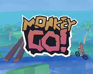
very charming ironmouse model on the thumbnail. i didn't get it at first because the game is called CDAWG CRASH and there isn't a cdawg crashing in sight. i would've criticised that thinking it doesn't do a great job of showing off what the game is at all. but now that i've actually played it i get it. the game is really short and simple and this ironmouse model is like the big kicker that launches it off, so it's actually fitting that she's on there with zero context given the kinda scuffed instant mac vibe this game has.
wish i could better see the art for all the guests that were drawn, it's so hard to see properly when you're zooming past them and i only ever landed at natsuki. so i would've liked some easier way to see that art and the signs they had, maybe they meant something idk. was surprised to see sydsnap's grandma there. maybe a gallery of pictures would be nice on the game's page. the CRASH part of the game is quite fun. connor instantly turns into a spaghetti shape which is charming, and i found out on accident that you could donk him extra a few times. that wasn't clear ingame though so maybe a direction on that would be nice, or you could keep that as a fun surprise for the short and silly game.
this game's visuals kinda work with the vibe already. i'd point out the grey sky above the blue sky that doesn't go high enough, but the sky already visibly loads as chunks from the right so maybe keeping it like that is keeping it in the spirit. because i think the chunks of sky loading in is a fun scuffed visual for this kind of game. oh yeah and that quarter circle launch meter is kinda ugly. i think it'd at least be better to make it look as gaudy as the other assets but maybe that's none of your concern.
music and sounds are fun. cycling? mouse is on a bike but she's not exactly cycling on it, she just kinda appears to crash connor from the side. but connor himself is cycling in the air with his twisted limbs. guess that counts. oh yeah and the road signs as, i assume something like distance markers? or whatever they are, they're still a nice visual that also ties back into cycling imagery so that's cool.
did not expect 3d graphics at all from the thumbnail. presentation is pretty important, maybe you don't wanna show off the 3d visuals of this game? but at least, i feel the zombie aspect could be hinted at anywhere. i thought this was gonna be a mostly 2d art visual novel or runner type delivery game instead of what it actually was.
can the ui not kiss the edges of the screen please? it just looks cluttered and all that information seems more out of sight than i think it should be (referring to the tasks rectangle in top right) look up margins for more info.
resume button on the pause screen broke. had to keep restarting the game every time i paused to write.
you start day 1 cycling past this house, and cycling straight from there there's already like 3 different location points clumped together at the left side of the screen. if i'm supposed to be able to read them, they're kinda very messy. if possible coding them so that they somehow don't overlap as much might be helpful? or if they do overlap, only the closest one is visible while the others are hidden until your perspective changes so that they wouldn't be overlapping anymore, if that makes sense.
i then learnt i could turn my bike in this game. ingame tips or instructions for the controls are pretty important.
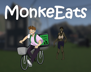
tried to go to jollibees, went up to the door and phased right through it. very confused. then i tried to go through it back and forth a few times wondering if something would happen until a zombie came and got all up in my face before folding me. kinda rough. next playthrough, i see that there's an E prompt for collecting food. i try to press it but i'm also still moving and phase through the door. idk if i got the food or not. similar thing happened the next few times i tried. feedback on doing things, would be good.....
the bike automatically has food in the basket. maybe that food can not be in the basket, and comes in once you've picked up some food. idk. haven't played enough of the game to reaaaally know.
i don't know where connor, pete, and bubi live. at home? after visiting jollibees and dunkin, i went home. and apparently that ended the day. i don't think i did anything. so. how do i collect food bruh. how do i give it to people. bruh.
anyways, zombie games and moving in 3d space are two things i'm not that into. so i gotta move on to other games to rate. the idea of a food delivery boy for these guys in a zombie world? kind of fun. but gameplay did feel kinda slow, and aimless. i might just be out of my league. but those were my impressions for now.
only got up to when that rag tag gang shows up in the car spawns in, not very good at this as expected.
definitely hard, kinda sadge that maybe most people can't appreciate most of the game because of skill issue lol but still seems pretty impressive just from the start.
sound effect for getting hurt would be good yeaaaa. and for more oomph on attacks.
had more notes but lost them, recover from recording 2024-06-24 02-12-48 at around 30 minutes if possible.
already pretty based is your distinct visual style. all hand drawn from the start menu with traditional style mediums! very cool and fun. even like the road sign designs on the menu buttons. it's not perfect everywhere but i do like how the assets are cut out, it's mostly clean. love the reverse sign for going back in a menu, i had the exact same idea (but didn't manage to get around to it) it's cool to see someone else has also thought about these things. even the text is a separate asset from the icons themselves :0
did noooot expect the same level of unique menu design to also exist when i esc midgame, usually those menus are a bit rushed or nonexistant. it's so sick though that you've drawn the goals up there aand designed new sign icons for the options there. awesome. i did misread the options sign...... to be something else. but i assume it's supposed to be a human taking care of a dog? could distinguish the head shape harder so the dog looks less merged into the figure's crotch.
sound effects should definitely be louder on default, they're not very audible compared to the music. also, all the moving figures are so small on the road. feel like they should be bigger, maybe just zoom in on the road so that it takes up more space horizontal-wise.
at first i just kinda ran into people for fun, because idk what i was meant to do and hitting them didn't seem to do anything. maybe some negative feedback, or something flashing on screen to indicate that a goal has been failed? maybe at least the person i bump into to make some whiny noise in complaint. goals should prob also flash on screen before the level starts, and not only be visible after someone happens to esc into the menu.
(note: it seems i was just already at the lowest point of speed by the time i was really paying attention. i now see how it disrupts my speed. this function a bit unclear but the player can maybe be trusted to feel it out themselves anyways) (still think flashing the goals on screen before the level start would be good)
(note again: i think sometimes the speed bar stops going up? um so that's probably why i was confused at first. maybe a bug)
(note again again: just realised, i need to move up to activate the speed bar. i thought the first few times i tried that, and i wouldn't move in those directions at all. am i just tripping? or is there a bug?)
no indicators of incoming traffic which makes the zooming cars especially hard to avoid. maybe this is part of the difficulty you want. but just putting that out there.
don't understand what "ride against the traffic" means and how i would do that.
just finished the level. is it just the one level? i guess that's why your goals don't flash before the level, because you wan them introduce after? maybe then, hide them from the first level playthrough and replace with controls, to make a bit more of a learning curve experience?
need some positive feedback on whether certain goals are in motion or not.
the little progression bar at the bottom is very cute. the blue lines however, maybe blend in with the background. maybe you can do some post editing magic to up the contrast there digitally.
i just assumed that it was just the one level so i stopped and didn't end up completing it twice because the challenges were pretty hard and i didn't think i could finish with having done any of them, so i figured the outcome would be the same. if i missed something, this might be something to consider making a bit more apparent ingame.
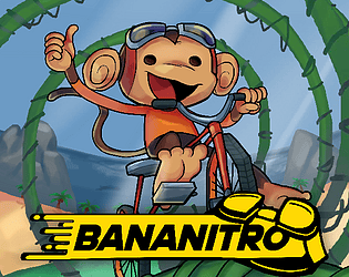
charming style. think i'd have liked it more if all the lines were hand drawn or however you did the lines on that monkey sprite (he looks like such a cool dood btw) just anything like straight boxes and perfect circles look too clean next to art usually so i just think it's better to embrace the roughness completely.
i like that you used scratch. makes me consider using scratch, since i'm a dummy at code, and i have used scratch for a game once upon a time. very inspiring.
i'd make the answer box less wide across the whole screen, maybe positioned at the top because there seems to be more space there and dialogue boxes are usually positioned above the characters anyways, and then make so the text isn't super small.
would be nice if dialogue was controlled by an input. so you progress to the next bubble by pressing spacebar or clicking. otherwise we might either get impatient, or miss something because it went by faster than we can read. the only moments to really pause are the answer prompts.
yes and no answers should be buttons on screen instead of text input.
the night time box and other boxes like it (game over?) don't cover the entire screen so you can still see the game underneath it on the right side a bit.
more sounds would be good. like a sparkly nighty night sound for the night time screen would be fun. for every hanging out time you do with the other bikes would add to each hangout but giving them their own music. like rita could have random cool skater music, wheelson could have beach noises or tunes, and wheeler can have some corny theatre orchestra or something. then you could end it with cheery or sad music at the very end.
wheelie had the most distinct written voice. would have been fun if you gave them all distinct voices in their lines.
"answer with their name" i'd say that this should be buttons but, it's also a test of if you remember their names so tbh. fair. especially in the context of connor, who sucks at names.
had to check and you even made seperate sprites for the different identities (masc, fem or monkey) which is nice. i tried them all, my fave is monkey, but masculine being bald with the egg head shine is funny. it'd be even funnier i think if feminine was also bald, and they can all be almost bald together. but it's fine if that's not within your vision.
actually cool how at least half of the bike love interests had bike related hangouts. like cycling along the beach and doing stunts. the others were less relevant, but that's okay it's nice for variety. but i like how this shows, a little, that you thought a bit about incorporating the "cycling" part of the theme, beyond just making the characters bikes.
seemed a bit unresponsive at times, like i farted once and there was no fart noise. and idk i get stuck in crevices very easily. this is giving me winnie the pooh horror vibes (from my surface level impression of the marketing for those)
i thought it was shrek in the thumbnail for the longest time before actually starting the game, i was confused to see peter griffin shape and being referred to as peter. was shrek chasing me? i was a little afraid i might get jumpscared. but it seemed not bad, just some goofy mario style ghosts and cartoon sound effect? pretty camp but in an undercooked kinda way idk. could've leaned into the scuff more with more random peter griffin funny lines and moments™ like he's talking to himself while biking.
kinda interesting the mouse controls for the camera while cycling? i was bad at handling it though. sound cues along the road also confused me. generally had no clue if there was something i was meant to achieve or something, like an end. i imagined the big arrow was pointing to a destination but the game kinda seemed scuffed to the point that i believed there wouldn't be anything there rip.
tbh so dark i can barely see anything, which is not terrible since there is a flashlight that seems cool for a bit but once i've kinda gotten lost it's kinda rip bozo for me.
not my kinda game sorry. but definitely something different at least. and i can kinda see where the ambitious vision might've led.
the on hover shadow boxes over the start and quit buttons should be centered around the text, so the text looks more cleanly in the middle.
i like the ps1 style graphics, quite distinct and cool.
don't know if i just suck or the balance is pretty tough, but when you're pretty much parallel to the ground but not dead yet i can't seem to nudge him back in the other direction at all to upright myself and i just die.
is it intentional that his shirt.... stretches out like that on dying screen? it is kinda funny. the whole aesthetic is pretty funny.
are you supposed to cycle on those yellow high friction lines?
you even put effort into making nice and varied (from what i was able to see) background elements based on japan which is pretty cool, usually the backgrounds look a bit less polished than the player character but it's more the other way around here. (besides the open sky box.....) and connor looks scuffed in an entirely intentional way. fun.
think maybe the road where the cars pass by is too textured, your focus is meant to be connor so having such high visual noise going on elsewhere is a bit distracting.
also kinda funny to watch connor's body clip through vending machines and cars without trouble, before kissing the pavement. don't know if that's really a bug, maybe you want the only challenge to be keeping balance? but if you wanna add more, i guess you can easily give these objects collision so he can get knocked off his bike if he's leaned in towards them at inopportune times.
i thought i got softlocked in that area with the jump over spikes because i didn't know how to get back and just had to reset. figured out how to run up the wall randomly, kinda hard to figure out ngl and sometimes controlling the speed enough to be able to run up those walls, while you keep bumping off of things and losing momentum is quite hard.
visuals are stunning though. mostly for the player character. animations are so lively. background details look less polished but not terrible either.
i'd like to come back to collect more but i've gotta keep rating games, interested in 100%ing this if i can. (tried playing on controller first then keyboard) (can you have a way to show inputs for both methods somewhere easily accessible? any menu screen you can esc to ingame?)
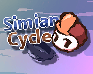
what does simian even mean?
i always check settings first and pleasantly surprised by banana sliders, cute. and they dim on mouse hold, that's cool.
the Inconsistent capitalisations of This button, [I'm Connor And i didn't read] does bother me.
energy is based on speed as opposed to how much line put down..... tripped me up at the start. still kinda unintuitive tbh. can't click close to player or blocks which is kinda annoying sometimes because it's harder to draw a ledge that he can smoothly bike on to. also interrupts the lines.
cute monkey heads, nice score system. so many levels???
wish i could undo instead of having to restart all lines over.
watching connor struggle like a bug is kinda funny.
game feels less puzzle more just draw faster bozo.
i'd roughen up the edges of certain assets like the grey platforms, similar to how you've drawn the shapes of the trees in the background. then add an outline so it still stands out, while still looking organic and cohesive.
level 9 one banana with the slope up, it's kinda high up so the ui is in the way. reposition? also seemed to be the only level that really encouraged the ramp which you have in the menu screen so i thought it'd be more prominent.
final level was so easy?
cute ending art though, first time actually seeing new art made to reward the player for finishing :) (i am bad at these games)
hover over ui sounds sweet.
also like the design on the logo and background of the page.
cool that it seems to remember me and my full scores even after leaving the page.
redid level 4 because apparently i shoulda used a ramp there, and it was hard because the middle block required a wide enough gap that was hard to achieve without the line breaking after drawing too close to other blocks. that did have a ramp solution though.
cycling theming, kinda there? like i guess the ramps make most sense with a bike, and it def seemed like those individually moving bike wheels were fucking with his movement so the bike did inform the gameplay. maaybe could have had something a bit more though, bike sounds?
a coming soon screen on settings kinda crazy (i get it though)
learn margins so stuff doesn't look so packed to the edges on the screen (visually easier to look at)
draw a bike please hshgds even tracing it by hand will help make it look more organic with the rest of the style. in general, would look better if any straight lines were redrawn or traced by hand or at least done with thinner strokes like the connor profile art.
the last screen kinda spooky.... idk is this supposed to be a spooky game?
support the monke business button on page is cute. good luck on game.
i've seen some of the other art that didn't manage to make it into the submitted version of the game. so from what can be judged here, the visuals could be more cohesive. but maybe with the full picture that would change.
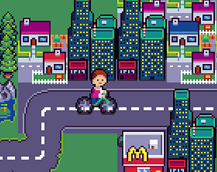
sprites look so well made, i like the start screen panning, pink rv cute, perspective may be off on some things.
monkey face on setting scrolls very nice.
monkey hanging sign adorable.
you did nice job on explaining gameplay at start, and then letting us figrue out the road cues on our own.
that one instruction read a bit awkwardly though maybe it could be presented a little diff, the "things on the road" one.
banana and sunscreen sound kinda wet, not huge fan.
a bit slow near the end, could make the commands start comin way faster all over each other and stuff for more stream chaos.
really nice visuals, cool leaderboard, more difficulty?
should introduce store after at least one level played?
infinite autoscroll? is there an end to be reached?
visual indication of cooldown having cooled down on the player sprite (ui is so out of the way)
raise the road so that rule of thirds visually.
"SEGGS" voice clip fade out cleaner.
awesome spritework buddy.
could get faster over time?
should award something for blasting many vehicles at once, just feels a bit satisfying.
sometimes at start that anim would look a bit jank (framerate drop?)
is there an end?
nice bounce and sound to the jump.
nice metal pipe hurt sound.
banana birds idk they don't line up into tight jumps usually i just jump into them sometimes because i'm impatient but i feel like they could do more.
placing cinnamorolls in between vehicles challenge?
not thaaat much about cycling, cute mono-cycle design but it's just there and the jumping and screaming gameplay doesn't really lean into it much, besides the passing vehicles which do look great but comparing it against others, it could have been leaned into stronger here. not even the buffs were cycling related at all.
i appreciate the self voiceover, added character and charm to the story. subtitles would've helped follow along but i was able to catch most of it i think. i saw you wanted to add text to speech over the cycling minigame and that's a great idea, i was thinking you might as well go all in on the narration for the whole thing and since the gameplay isn't that intensive it's nice to have something else to pay attention to.
speaking of, that's very a simple mechanic you came up with. i was playing this game one handed so it was a little awkard for me to press the spacebar to start, just for convenience why not make the start D? i also feel like some sort of audio or visual cue for when you're on the line would help get a better sense of "yes i am doing a good job of tracing the line" because it's hard to really pay attention to those numbers.
i didn't understand why joey was there? he wasn't on the cyclethon. maybe that was the joke? i didn't get it though i was just confused as to why he was there.
when it came to toss or befriend the mouse i first decided to toss it. so i proceeded to click around my screen for a while thinking i'd gotten softlocked. then i realised oh, A and D aren't on screen buttons they're keys that i'm supposed to press.... so. maybe a clearer visual instruction would've helped with that one, the pointing arrows threw me off.
so after accidentally figuring that out, after tossing the mouse i was pretty confused as to if that'd changed anything?
the cover art in particular could do with more contrast between the colours.
you recorded two different endings, although i wouldn't have known at first because nothing happened after the toss mouse that made it seem like the decision did anything. cool that you drew out different environments though, the beach one didn't make sense to me (beach mouse?) but cinnamoroll hell was fun.
could have simplified control screen by grouping wasd keys, looks a bit confusing separated like that, visually harder to understand quickly.
stream died screen cool visualisation, a bit off with the theming though but smart.
vibrant colours, layered rendering with the shadows, some bouncy movements.
personally really not a fan of the (positionally) up and down keys to be moving left and right.
rv protector, like rv gang helping out?
camera as an attacker?
could do with more cycling themed game elements.
from what i saw in the preview, cute ironmouse sprite.
could do with explode sound on explode buff.
option to skip intro pls.
mechanic on this game isn't really about cycling, it's more shooting.
i was bad at the game but there's a bit of a learning curve and then it feels fun when you figure it out and start picking up piles of money at the dips. still bad at the game though ngl.
pretty cool that your story is in a png outside the game, means i don't have to wait for it ingame and can reference it easily, also looks fantastic.
ui design pretty slick, with slight on hover movement and sounds.
saw the ui for buttons on the menu, a bit late. good that it's there, would be nice if they were somewhere a bit clearer though (note: i did have colour temperature filter on, my bad. but still maybe they could have fit at top left where there is less art in the bg and is on the same side as the buttons which i click on or appear ingame)
were you really supposed to play with wasd and zx stacked on top of each other like that? i used arrow keys instead.
the actual impact on hitting and getting hit feel a bit bad though.
didn't get that far but diff colours for diff areas feom the image previews definitely great.
no cycling? like, at all? where are the spokes?
i like that you had the intro text timed, and short, so i actually read it :)
actually displayed ui on screen where you'd want to use it! revolutionary.
map ui quite cool, maybe move it in a bit more so it isn't right against the edge of the screen and is a bit easier to see while playing?
store items should maybe be the same pixel size lol, i guess the guns were the ingame sprites (for time?) but uh, would be nice.
i was thinking the player hitbox for getting hit was very generous until i realised it's just the heart, which is visually clear enough i suppose but maybe would be coool to incorp a undertale style anims before starting and after getting hit (player flashes dark while heart flashes white?) to make this even clearer.
like all the varied monkey designs, stages of damage and sound design on the truck was also cool.
bit difficult to see the red bullet against the red laser line on beeg boss monkey.
nice bald spot on monkey.
clearer dying animation for player would be nice.
particle/boom effects nice, i like the heart shaped bomb from ironmouse.
restart doesn't work on end screen.
ui hand with noise kinda cute.
art very lovely.
can't click start? confused at first. whoops, throw to progress was unclear?
another start button??
wheels didn't click on whule i was still holding on to them, which i was waiting for. maybe that could be clearer, or make them connect automatically (would feel much better)
rotatey physics majorly frustrating and chaotic to play with.
maybe slight variation to mechanics besides just dragging them together and hoping they link.
only two levels?