Play game
Make Like a Tree's itch.io pageResults
| Criteria | Rank | Score* | Raw Score |
| CREATIVITY - Does the game include something unexpected or innovative? | #59 | 3.167 | 3.167 |
| FUN - Is the game enjoyable or satisfying to play? | #75 | 2.833 | 2.833 |
| ACCESSIBLE - Does the game have good OS platform support? | #76 | 3.500 | 3.500 |
| OVERALL - Is the game just objectively good? | #88 | 2.833 | 2.833 |
| THEME - Does this game represent the Autumn theme well? | #104 | 2.833 | 2.833 |
| TECHNICAL - Is the game poorly put together, or is it technically well designed? | #107 | 2.500 | 2.500 |
| AESTHETIC - Does this game have a great atmosphere or mood? | #113 | 2.500 | 2.500 |
Ranked from 6 ratings. Score is adjusted from raw score by the median number of ratings per game in the jam.
Leave a comment
Log in with itch.io to leave a comment.


Comments
Well done for completing and publishing your first game!
I found the game quite challenging, it felt like the colliders and sprites didn't quite line up and there were a few contrast issues with some of the obstacles. It really helped that you added a level select option as I got stuck around level 5.
Overall, good job!
Great concept! I spent a couple minutes trying to get the first box on the button, without realizing that pushing it beside the button was enough to open the door. Whoops!
Movement is unique and very challenging.
Good job!
It's actually way more challenging then it looks.
When I got to the big spikes, I just gave up. It also wasn't clear to me when a button was activated, would have been good to have them change color or make a sound.
I really enjoyed this game. Those spike tunnels are such a challenge!!! I really had to BE the leaf... no room for panic. It totally reminded me of that Firefly/Serenity reference, "I am a leaf on the wind". Unfortunately for me, I'm not a very good leaf.
The music is such a contrast to the floaty, graceful leaf and I felt like it was antagonizing me, letting me know how futile the effort was. If you were going for melodic chaos, you nailed it. Honestly, it amps up the angst, so when you have so much floaty, open space, maybe that's not a bad thing if you're trying to create tension for the player.
The art style was simple, but it accomplished the goal. I'd recommend setting up your colliding mechanism (or whatever triggers a hit) closer to the actual spike image. I felt like level 4? with the big spike tunnel was causing a collision when I was about 1 pixel away from the spikes. It led to a lot of frustration and frantically smashing arrow keys. I'd also recommend making sure the baddies contrast with the background in future games. I didn't realize that the spikey balls had spikes at first. Going with the theme, it may also have been cool to switch up the look of obstacles so that they related more to the plight of a leaf... like drops of water instead of spikey balls.
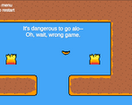
My favorite part was the text in the pit and the "hidden" reference to zelda in your first level. I'm a huge fan of hidden areas.
Great work on this. Hope you had fun making it!
Music can use a bit of work. Overall graphics are ok music is ok at best.
I'm primarily a game developer, I tried lol