Play game
Ponto Sneak's itch.io pageResults
| Criteria | Rank | Score* | Raw Score |
| Completeness | #23 | 3.500 | 3.500 |
| Innovation | #30 | 3.000 | 3.000 |
| Fun | #40 | 3.000 | 3.000 |
| Roguelikeness | #40 | 3.500 | 3.500 |
| Overall | #80 | 2.917 | 2.917 |
| Scope | #88 | 2.500 | 2.500 |
| Aesthetics | #154 | 2.000 | 2.000 |
Ranked from 2 ratings. Score is adjusted from raw score by the median number of ratings per game in the jam.
Judge feedback
Judge feedback is anonymous and shown in a random order.
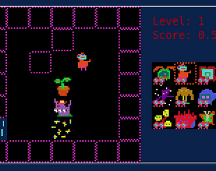
- This game obviously has a great deal of tactical depth, but I was only able to access half of it due to the complete lack of instructions or manual.
- This game was extremely difficult for me to figure out. A one-paragraph explanation of the mechanics and what the different icons do (I only managed to figure out like three of them, and I still don't know what the little pips in the UI indicate) would go a long way; as it stands, Ponto Sneak isn't really the highly tactical, interesting Broughlike it could've been, but more of a "I'm going to move this way and hope the orange guy icon does something useful". The game is pretty short, especially since you can just run through the levels with little regard for the enemies or pickups. The art is okay. It certainly has an aesthetic to it. The map generation was the most enjoyable part of Ponto Sneak, for me - even though the levels are very small, they are usually pretty interesting, and have a very nice progression of difficulty. Overall, I feel like this would've been a much more enjoyable game if it was slightly longer, and offered at least a short explanation of what the player avatar can do - to actually make it play more strategically.
Successful or Incomplete?
Success
Did development of the game take place during the 7DRL Challenge week. (If not, please don't submit your game)
Yes
Is your game a roguelike or a roguelite? (If not, please don't submit your game)
Yes
Leave a comment
Log in with itch.io to leave a comment.


Comments
I'm digging the Broughlikes in this challenge! This one seems real cool, but I'm struggling a bit to get started--I can be into the 'learn by trying' style, but I bet you could add a touch more feedback after you use a spell without sacrificing any of that.
Thank you. I will think on it for updates that may come. Do you have specific suggestions?
P1 select has good coin animations and little arrows pop up when you use an ability, but that was tough to put in during the contest both because of time and my skill level. More UI and feedback could definitely get put in.
I think it could be pretty simple (although getting any animation going in a turn based thing can be tricky if it wasn't designed from the start)--even something as basic as a 2-frame animation that the character does when they cast the spell and a 1/5th of a second overlay on the affected square would do a ton.
This is a really cool idea. Some of the character powers are a little tricky to figure out, but I'm having fun trying :)
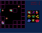
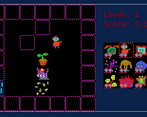
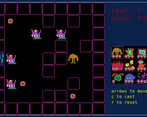
Yes.. without saying which is which, there is a heal, a pickpocket, a quick dash, immunity for 1 turn, a spike trap, a houseplant decoy, stun, swap places and a kill. There are 3 upgrades, each affecting 3 of the powers exclusively, and you will see added icons on the splash screen once you obtain one of the upgrades.
Enjoy :D