Indie game storeFree gamesFun gamesHorror games
Game developmentAssetsComics
SalesBundles
Jobs
TagsGame Engines
A jam submission

Reclaim The SurfaceView game page

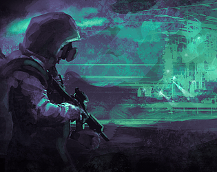
A short survival roguelike in a post-apocalyptic future
Add to collection

Play game

Reclaim The Surface's itch.io page

Results

CriteriaRankScore*Raw Score
Roguelikeness#623.6744.500
Overall#733.2664.000

Ranked from 2 ratings. Score is adjusted from raw score by the median number of ratings per game in the jam.

Successful or Incomplete?

Success

Did development of the game take place during the 7DRL Challenge week?

Yes

Is your game a roguelike or a roguelite?

Yes

Leave a comment

Log in with itch.io to leave a comment.

Comments

Submitted(+1)

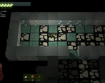
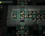
Really enjoyed this game. Wonderful graphics and a fantastic storyline. Could maybe have used a few more enemies or types of enemies, but great traditional feel and i liked the upgrade mechanics with a larger end-goal of rebuilding the machine. 

(+5)

Good roguelike, liked the setting and the lore / premise around it. The visuals and graphics were great, thought they all worked well.

I got the WRNN, wasn’t sure what happened afterwards but then tried to get as deep as I could until I died.

Overall I really enjoyed my time playing it. To expand it I’d like some kind of world lore hidden within the world so I could get more from exploring besides resources.

I really did enjoy the feeling when I was missing certain resources for the WRNN and going out on missions to the world to find those resources. So I was only looking for metal this run and tried to stock up and then the next run a different resource.

Suggestions

  • the character animations look weird if you keep moving in the same direction because he always steps with the same foot. to make it look nicer you could make the animations alternate so that one the first move its left forward, next right forward, etc .. so it looks more natural walking.
  • having to use the mouse to confirm and navigate the workshop feels jaring, i would rather be able to use the keyboard (on the same keys using to play) so that i don’t have to move my hands
  • at first it was hard for me to see the doors (i felt they blended too much into the walls). but after a while they became more obvious. i’d recommend changing them to contrast a little more.
  • it would be nice to have your inventory more displayed in the work shop, or at least show how many items you are deficient when trying to build the WRNN, i had to go back and forth between the storage and WRNN page to see how many resources i still needed and what kind
Developer(+1)

Hey! Thank you for your time, writing a review.

The walking animation will be fixed, and having hot keys for buttons and menus will be in the post jam version.

For the doors: I absolutely agree. We already have new models to replace the old ones.

And the inventory in the Workshop is also a must and will be implemented.

Tanks again!

Submitted

Very nice graphics!!!

Unfortunately, as I have  a Mac I cannot play it.