Indie game storeFree gamesFun gamesHorror games
Game developmentAssetsComics
SalesBundles
Jobs
TagsGame Engines

A Box Pushing Game Made With Cardboard Boxes

A topic by galactical created May 17, 2023 Views: 381 Replies: 2
Viewing posts 1 to 3
(+1)

I'm creating a Brough-like procedurally generated dungeon-crawler based around Sokoban inspired box-pushing, with all art assets being made from cardboard! 

Before creating any of the art assets, I created the game layer using programmer art.
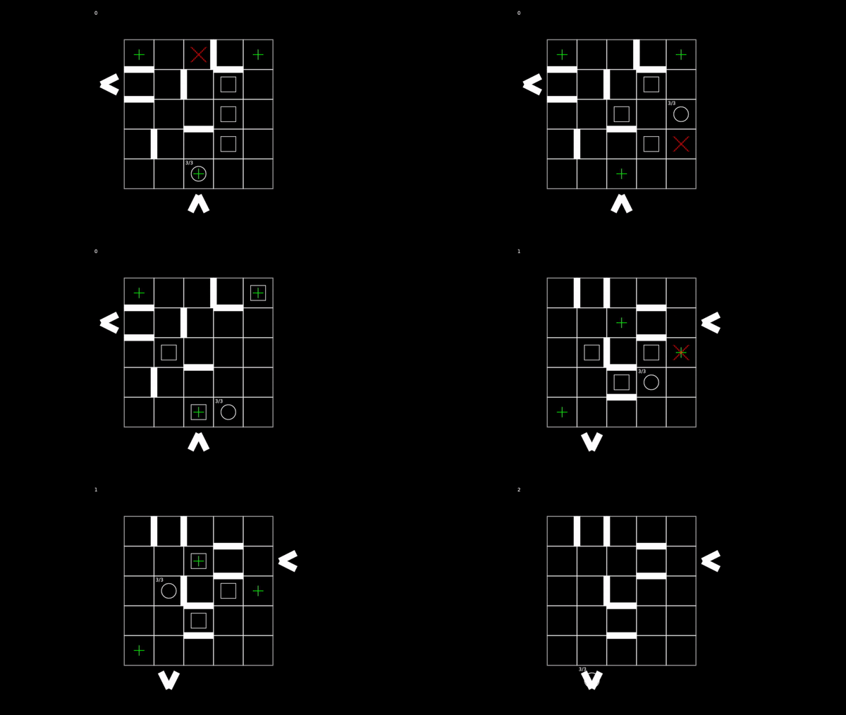
I did this because I wanted to be sure of exactly what art assets I would need to create, and also to make sure my game idea could work before making a big mess of cardboard in my room.
The gameplay is simple; The game creates randomly generated 5x5 rooms with 3 boxes, and 3 goals. The player gets points, and refills their health when they place all three boxes on their goals. The map also has enemies in it, who try to chase down and deal damage to the player when next to them. The player can defeat enemies by standing next to them and pressing toward them, or by pushing a box on top of them.


There are some other surprises I won't spoil, but I'm essentially done with the gameplay, so it's time to start cutting up boxes!
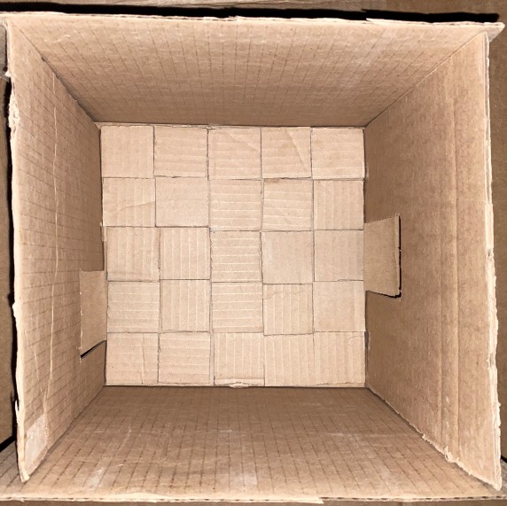
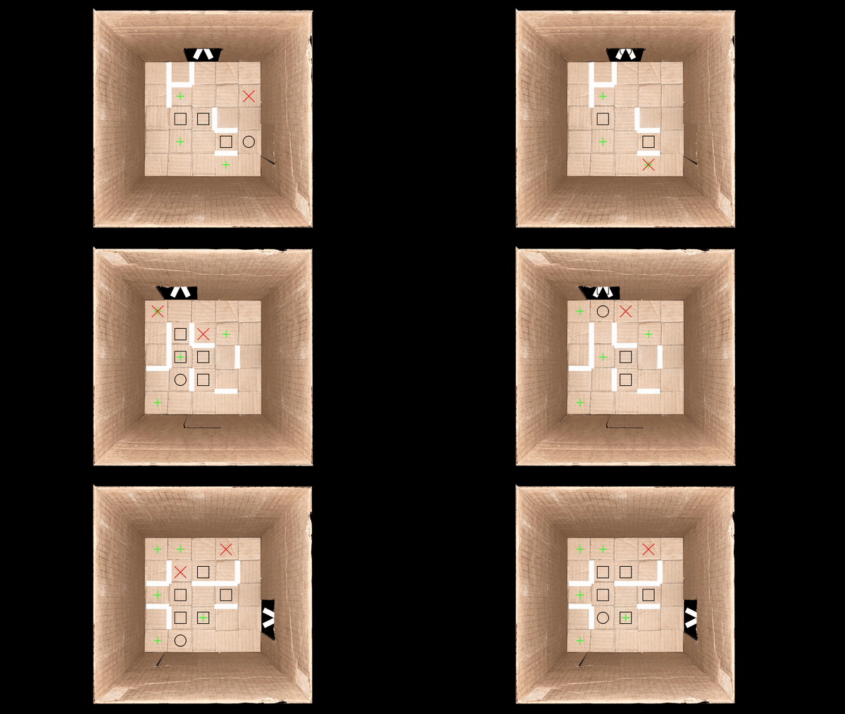
Here's the 10x10 inch model of the dungeon in the game. The plan is to use photoshop to create the various different door locations out of this master image. Doors can never be in the corners, so by rotating and flipping these two doors I can create all the variations needed.

On a side note, have you ever seen those videos where people build massive cardboard recreations of video games and then put a hamster in it?

After building this miniature dungeon, it makes me wish I had a hamster...

Anyways, that's all for now. After I get the room/door visuals working in game I'll create the player/enemy objects. I'm planning on making them out of flat pieces of cardboard laying on the floor, so that they can look convincingly like part of the space as they move around the screen. I'm totally up for suggestions for what the enemy should look like, as I'm still not sure. Let me know what you think!

And here is the cardboard room working in game!

Even after a lot of painstaking photoshopping to make everything line up, somehow there's a weird visible seam/misalignment with the top wall. I'm pretty sick of that photoshop file for now so I'm leaving it as is. Even with the ugly programmer art on top, travelling through the doors conveys depth, and really makes it appear like the objects are in the space and travelling through the door. I'm still debating exactly how much animation I plan to do for this project. The character really needs to move smoothly for visual clarity, but I don't know that I'll do anything too fancy with the room transitions. We'll see though. Next step is replacing that programmer art before creating smooth animations.

I made the cardboard enemy/player art today!


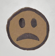
Here's the enemy: He's basically just the frowning devil emoji. My only goal was to make something that read as an enemy (hence the horns) and had a face that was different from the players. Also, the fact that he's frowning plays into how the player's facial expressions work:

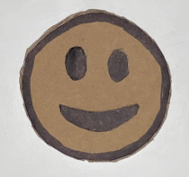
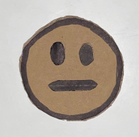
I ripped the health system from Michael Brough's 868-Hack, in which the player has three health states: Full (smiling) half (meh face) and low health (frowning).

Lastly, and it's not very impressive, I made the box:

I don't know why it's so huge on the post but here you go I guess! The plan for the targets is that they'll be some sort of fake stickers I'll make on my computer and past onto the tiles in the room. It will be something thematically consistent, like the kind of marking you would see on a cardboard box in the style of "Handle with care/WARNING Fragile" etc.
That's all for now. Next: I need to get these things moving around in the game.