Indie game storeFree gamesFun gamesHorror games
Game developmentAssetsComics
SalesBundles
Jobs
TagsGame Engines
A jam submission

Unholy Commotion [DD29 Demo]View game page

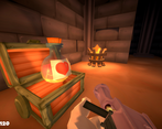
The restless undead are standing between you and a good night's sleep.
Submitted by Jasozz — 2 days, 7 hours before the deadline
Add to collection

Play game

Unholy Commotion [DD29 Demo]'s itch.io page

Leave a comment

Log in with itch.io to leave a comment.

Comments

(1 edit) (+1)

i had the most fun with this demo of all of entries, this reminds me of ziggurat. the little details add up and there's charm everywhere, the sound and visuals are great. some negatives: the jump height is frustratingly low, the areas feel a little too cramped, if the arenas were twice as large as they are now that would be more fun i think. a few of the enemy types have too much health for how easy they are to fight. some of the enemies have very long pauses between attacks and movements. maybe increase their attack speed, movement speed, and attack frequency but decrease their health. i would also suggest changing the itch icon to be a screenshot of the game, or something to indicate its an FPS, as i almost skipped over this one thinking it was a genre i don't care for.


overall its a great start and i like these kinds of FPS's and this is a good example of the genre.

Submitted(+1)

I felt that the bloom on the weapon was too wide and could be narrowed a bit. The music slider on the main menu also didn't affect the music playing on the main menu. Not sure if it changed the music in game. Pathing seemed a little broken but I'm sure that's a WIP, and the guys who throw themselves around in a cage work perfectly. I think you could half the health of all of the units and it'd benefit the game. FPS dungeon crawlers, in my opinion, work best with lots of enemies with low health than a few with high health.

Overall a solid fun demo and I look forward to seeing what you add in the next demo.

(+1)

_
Submitted(+1)

Fun game, lots of juice and replayability.

The coin collection sound could stand to be louder, I feel like that's your next and easiest source of juice. The gun muzzle flash also seems a little too big and a little low (it doesn't track the movement of the gun as it goes up due to recoil). And adding some color variation to text/buttons on mouse over and on click will also make the menus (which already look nice) feel better.