Play game
Blade Breaker's itch.io pageResults
| Criteria | Rank | Score* | Raw Score |
| Difficulty (hard but not rigged or impossible) | #3 | 4.000 | 4.000 |
| Game Design | #8 | 4.000 | 4.000 |
| User Exprience | #22 | 3.000 | 3.000 |
Ranked from 1 rating. Score is adjusted from raw score by the median number of ratings per game in the jam.
Judge feedback
Judge feedback is anonymous.
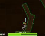
- This game is one of the best games submitted to the jam. However in saying that I think some core areas are letting you down here. The map and the controls. I get what you are trying to do with the map but the judges and anyone I showed this game to all either didn't like the map or didn't think the gameflow matched. I think if you adjusted this to be like a side on platformer a little more and limited the edges to either blockers (vertical 90*) or 30-45* slopes. Instantly this will fix your pickup and play potential. As a developer I get it but the thing is we need to ensure players understand and get it. I also think doing this will allow you to style the levels more effectively this giving you the final point in the game design. Game design wise some of the UI could slightly be improved but honestly If the platforming stuff and controls were adjusted this is just nit picking. One thing to note here the rotation of the sword seemed off to some people who played it. I would love to see this adjusted and fixed more to push behind you when you move or mainly sit behind you on the lower side between 0-30* the bottom and animate only within that area until you dash when it pushes forward. The next area is the controls LMB and RMB don't work well on a laptop so instantly anyone i showed this game to on a laptop didn't like it so there needs to be a rethink of things here. Why not the simple arrows or wasd and a couple of action buttons along with click to shoot? Lastly a bug fixing and balancing pass with focus on the difficulty curve. I think it could be adjusted to give the player a more natural progression in the game. All of this aside this is a really great game and these improvements i suggest will really bring it to the next level. I understand alot of this stuff gets missed in a game jam in saying that i need to rate things to the state given not the expected or future state. I think you should keep working on this and show us the improved version. Please do flick us a message on discord around the future of your game or if you need advice or support.
Leave a comment
Log in with itch.io to leave a comment.


Comments
nice ui design and gameplay