Play game
You see not real's itch.io pageResults
| Criteria | Rank | Score* | Raw Score |
| Audio | #1033 | 2.121 | 3.000 |
| Game Design | #1041 | 2.323 | 3.286 |
| Graphics | #1071 | 2.323 | 3.286 |
| Fun | #1155 | 2.121 | 3.000 |
| Overall | #1171 | 2.088 | 2.952 |
| Innovation | #1177 | 2.020 | 2.857 |
| Theme | #1467 | 1.616 | 2.286 |
Ranked from 7 ratings. Score is adjusted from raw score by the median number of ratings per game in the jam.
How does you game fit the theme?
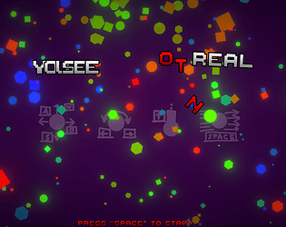
It changes visuals so what you see is not always real/what you think it is.
Did you write all the code and made all the assets from scratch?
Only thing i've gotten from the internet is the background music. Everything else i made myself.
Leave a comment
Log in with itch.io to leave a comment.


Comments
Cool game! Rotation was a bit too fast and I couldn't hit the enemies but it's a nice game!
If character rotation was tied to the mouse, it would be great. Overall fun and challenging
Hey there! First of all, congrats for finishing the game!
The gameplay was nice overall with great audio and visuals. It's not very clear to me how it fits the theme but other than that, a solid game. I also had some lag when shooting and I can't really tell if that's the game or not because I don't have the greatest PC, maybe you can tell me.
Nonetheless, a game that shows the amount of effort you put into it and I'm sure that with few updates it will get even better. Great work!
It fits the theme by changing either the shapes/colors/particles of the enemies with each wave and as you get further into the game it gets more confusing. For example the green circle with shield particles might be a red hexagon with bow particles by wave3 which makes you think its not the enemy it really is.
As for shooting issues i believe it should be fine cuz everyone that i've seen play it hasn't had any and also it doesnt seem like anyone else from the comments has had shooting issues, but also i doubt it's your pc bcs the game doesn't really need a powerfull pc to run it. It's something i would have to look into, as well as balance the game a little better
Thanks for the feedback! And also i really enjoyed the devlog! Keep up the great work!
Oh, now I understand the theme, that's really cool.
Thanks!
Nice graphics :)
So colorful!
nice idea, but the UI is so bad
anyway, keep it up