Play game
Unholy Shrine II's itch.io pageResults
| Criteria | Rank | Score* | Raw Score |
| Entertainment | #3 | 1.000 | 1.000 |
| Playability | #3 | 1.000 | 1.000 |
| Relevance to the theme | #3 | 3.000 | 3.000 |
| Overall | #3 | 1.667 | 1.667 |
Ranked from 1 rating. Score is adjusted from raw score by the median number of ratings per game in the jam.
Judge feedback
Judge feedback is anonymous.
- Ill be real my dude There was no fun in playing this and it was uncomfortable to play aswell as unclear I appreciate the submission, and every game made is experience towards something better.
Leave a comment
Log in with itch.io to leave a comment.


Comments
Pros:
Cons:
Final words:
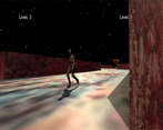
With this being made in only 7 days it's fine for a beginner (I guess you are). It's a clear concept which is very nice. Now you have 14 days, so you are expected to use all of them. So having a lot of crashes and bad level design really isn't anything you can blame on time pressure but on you being lazy. Also, I understand as a beginner you do use a lot of assets, but when you use them at least make them look like they match instead of these half-ass stretched pixel art wall textures mixed with high-quality zombie. I think you made an okay game, but you could have made it way better if you just spent a bit more time on it.
Would you please review our game too?