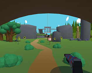
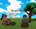
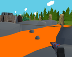
Play game
Time To Go Home's itch.io pageResults
| Criteria | Rank | Score* | Raw Score |
| Overall Rating | #11 | 2.789 | 2.789 |
| Innovation | #12 | 2.579 | 2.579 |
| Theme Implementation | #12 | 2.632 | 2.632 |
| Artistic Quality (Visual / Audio) | #14 | 2.842 | 2.842 |
Ranked from 19 ratings. Score is adjusted from raw score by the median number of ratings per game in the jam.
Discord tag (Name#1234)
TediousRhombus#8754
Discord tags of team members
TediousHexagon#4908
Leave a comment
Log in with itch.io to leave a comment.


Comments
It's a very simple but satisfying game that I had fun with killing time for a few minutes
Glad you liked it! It was our first experience in making a game!
This one actually got me to laugh. I haven't been able to finish it thus far, but I did enjoy playing XD The graphics and sound design really go hand in hand on this one, well done!
You need to think outside the cage...oops I mean box. You might also want to seek shelter in that home. The porcupines are mean!
I did finally figure it out! I had uh, kinda forgotten that I could jump XD Definitely one of my favorite entries, it's so silly but it's also a neat puzzle to figure out
So glad to hear that man! We definitely need to put the controls in-game in some instructions or something, totally forgot that haha Thanks so much for playing!
its charming, for sure, but... i dunno, the theme is kinda barely there. i get it! i do! but... well.
extremely short, too. plus the textures seemed really buggy and flashed a lot. i liked the faces on the hedgehogs at least.
Hmm that's odd! I've never had the flashing textures before! Do you recall which objects were flashing?
Thanks for the feedback man! Do you have any suggestions for the theme implementation? I agree that there's probably more interesting ways to do it!
it was mostly towards the end on the rocks that i got flashing. it wasn't intense or anything, but very noticeable, if that makes sense. i can get how its hard to implement a theme on a simple game like this - and i really, really don't mean simple as an insult. i think its a good thing and adds to its charm - so i think the best way to do so would to make it just a bit more obvious. by that i mean just more feedback to know that my shooting is getting less effective instead of a number count at the bottom. 'cause i'll be honest, it took me a minute to notice that there and i had no idea what was supposed to be happening.
That's interesting, I'm going to have to take a closer look at the rocks, definitely appreciate the catch!
I get ya! maybe some recoil that decreased with the damage or something would be nice, thanks a lot!
You'll be glad to know I have fixed the flashing objects! I can't update it right now, but I found the issue! Thanks for pointing that out!
edit: our near clipping planes were too close, setting them from .01 to .2 fixed the issue, in case anyone else runs into this!
i don't think i've found the secret yet, i've gotta look more. this was honestly the most frightening and immersive experience i've had playing submissions for this game jam - i've never seen a real porcupine before and i can only assume this is an extremely accurate and detailed depiction of them. the guitar when i finally got home was pretty wicked, too
Thanks so much man! Porcupines definitely look exactly like this, size is accurate too haha!
The secret "feature" is off to the left near the start, if you're interested.
i found the feature! i tripped me out at first i thought i was going crazy hahahah
also the lava pokes me - is it actually hundreds of orange porcupines?
Haha! Yeah I was too when I accidentally coded that, but it ended up turning into the elevator so it worked out!
lmao oops! forgot a lava death screen! That's what we're gonna go with now that you mention it! Thanks so much for playing through!
I forgot to put an instructions tab!
W A S D to move
Space to jump
Left-click to shoot
And your bullets do less damage every few shots. So be creative to conserve ammo!
Also, let us know if you find the secret...