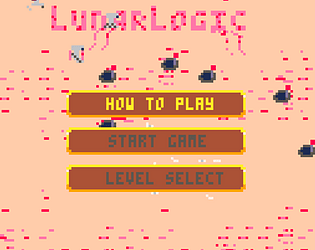
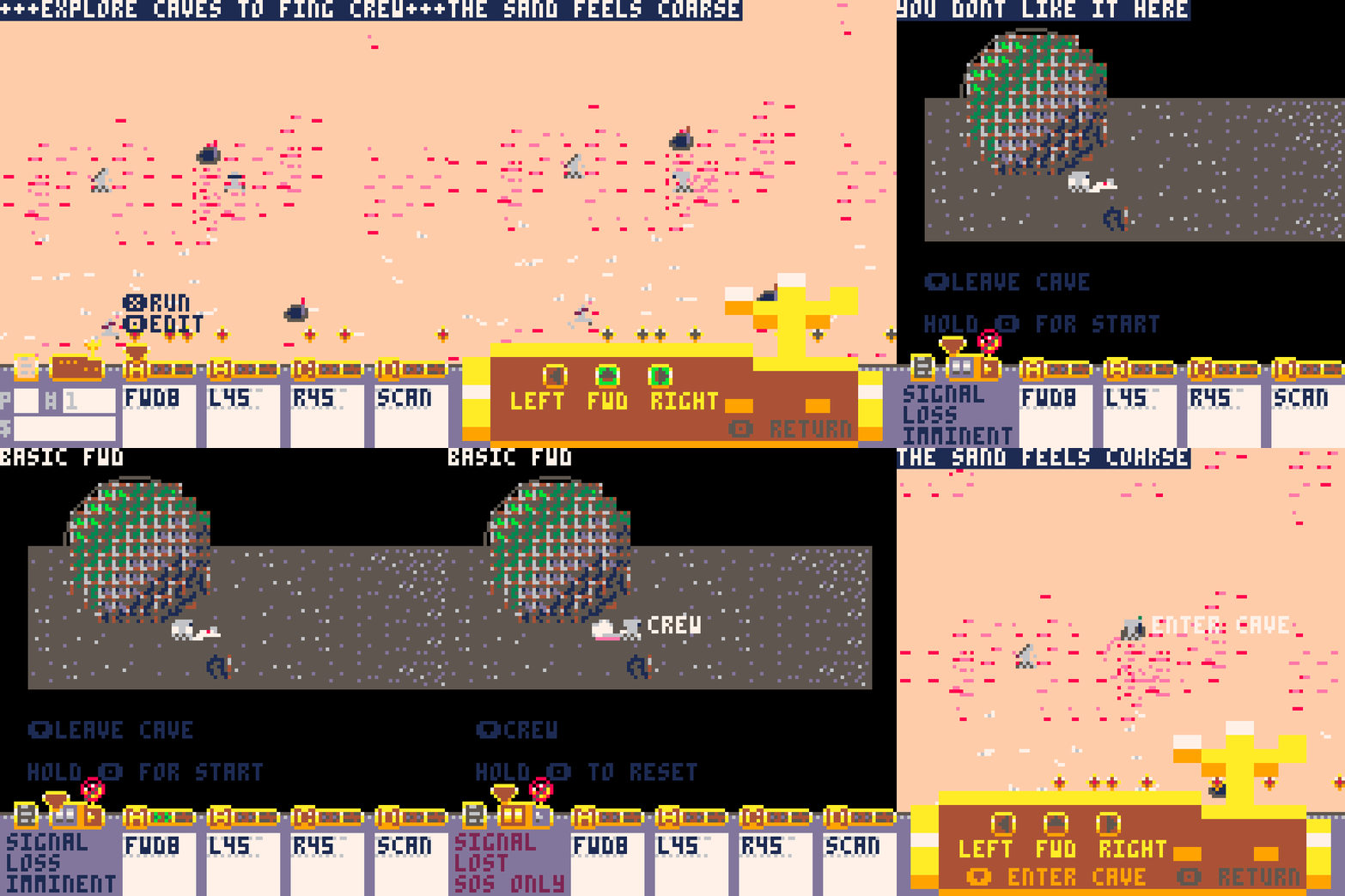
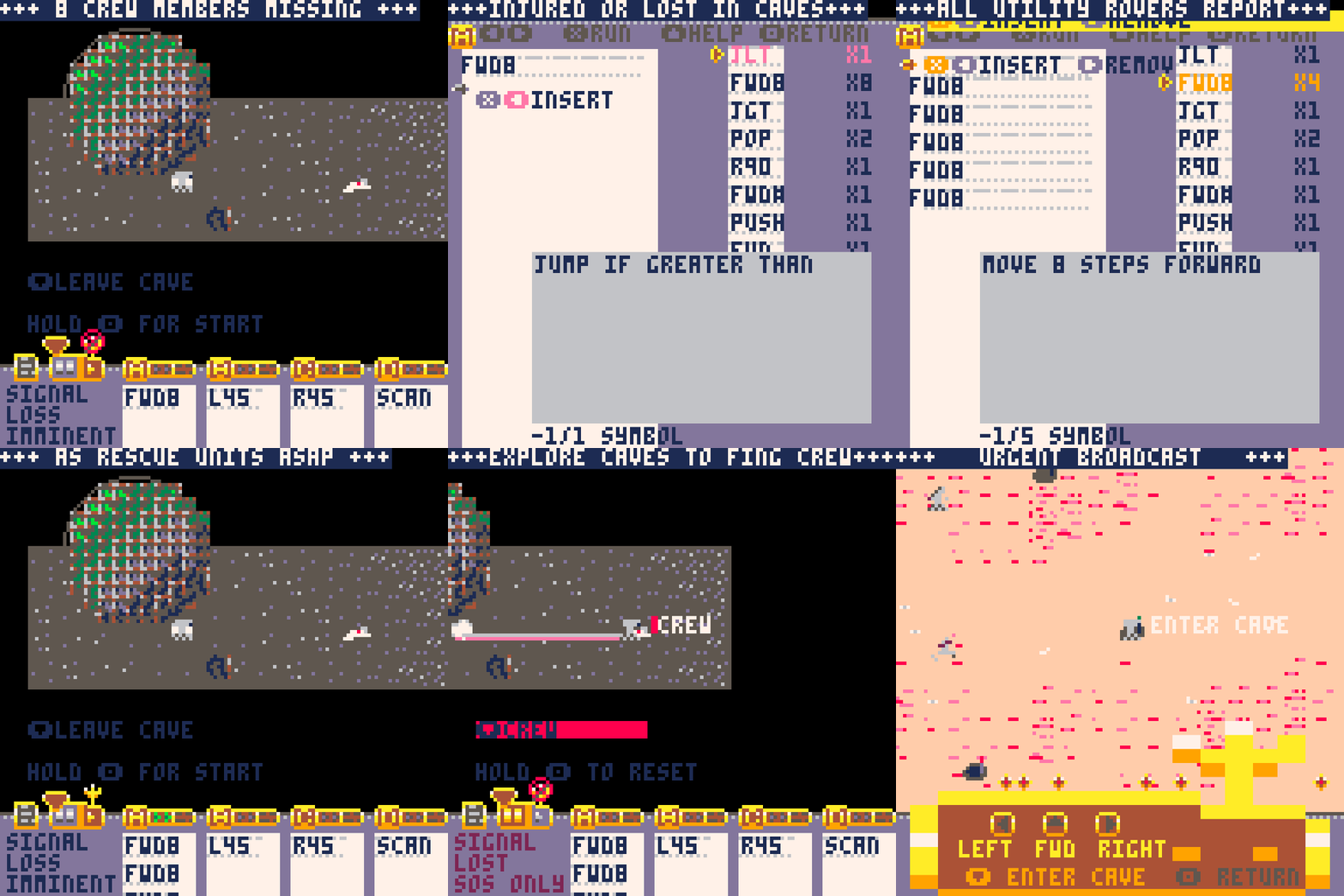
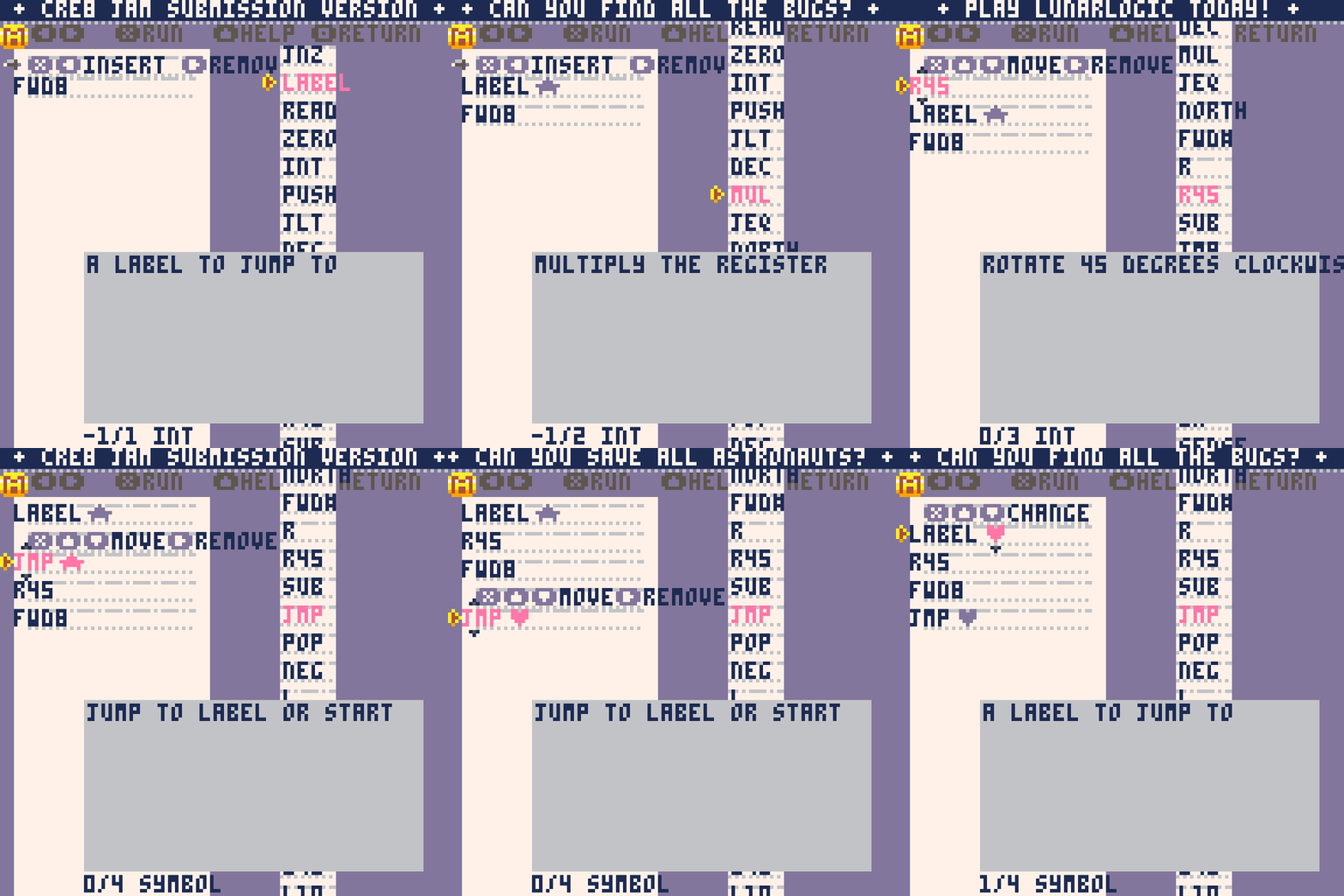
I really like the title screen, the way the game logo blew away like sand, well let's just say it *blew me away*. I love the setting/lore of the game, very original idea. The idea of programming the robots for when they are in the caves is in intriguing. I imagine that an awesome amount of work went into the UI, there were so many different screens and menus, it must have been a nightmare to code. I found the game absolutely impenetrable, fortunately I had someone in chat to hold my hand through the tutorial and the first couple of caves. The amount of information to take in as a new player is completely overwhelming. The early levels really weren't all that difficult, but it was a real challenge to create programs because of the awkwardness of the UI. I really hope this doesn't come across as negative because the overall presentation is really good. I loved all the graphical details like the paper items blowing in the wind and the little tyre trails that the rovers left. It looks from your Itch page like this is your first Pico-8 game. Absolute awesome achievement for a first project! Kudos! Big respect for pulling this off, it just a went a little bit over my head! :)
Play game
Lunar Logic's itch.io pageResults
| Criteria | Rank | Score* | Raw Score |
| Adherence to Theme and Creativity | #1 | 5.000 | 5.000 |
| Technical Execution and Presentation | #6 | 3.714 | 3.714 |
| Overall | #6 | 4.000 | 4.000 |
| Gameplay Innovation and Enjoyment | #12 | 3.286 | 3.286 |
Ranked from 7 ratings. Score is adjusted from raw score by the median number of ratings per game in the jam.
Judge feedback
Judge feedback is anonymous and shown in a random order.
- Incredibly in theme and has a great lead into the game with the tutorial sequence. I liked exploring the caves, but the programming language has a bit of a learning curve to get accustomed to. I generally like the feel of this and enjoy the idea that each cave is kind of a programming challenge. I will be playing this more in the near future!
- This was an ambitious game for the jam! My main hurdle for learning to play and enjoying that process was the aesthetics of the screen and navigation with the limited buttons was difficult. But the core of the game is very impressive and I hope to see it polished further.
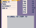
- Adherence to Theme and Creativity: 5 Another game where you use a custom programming language to make a robot do things. Is it fully original? No, is it impressive and on theme? Yes. Gameplay Innovation and Enjoyment: 4 Once again Creating a custom programming language is a a feat in itself, even more with combining systems and registers. The complexity is amazing, but kinda the drawback of the game as well as I think it could use a bit more tutorial on chaining and helping programs communicate with each other. Technical Execution and Presentation: 4 You know a programer made UI when you see it. The programing UI is messy, not fully clear enough I feel and there are parts which are totally undreadable. Spritework could use a little lift as I feel it is hard to know first hand what is what, but the technical feat of the game bring things up for me. It is an amazing skill to push so much into the tiny space of pico-8, fully respect the architevture and the complexity. Really well done. I just feel a bit cleaner UI in the code editor would help non-programmers enjoy it as well.
- I must admit I didn't make it trough the tutorial. The ask was too great and the UI was too obtuse. But admirable ambition and scope nonetheless.
- There is something really special going on here , but sadly even after reading the guide- I couldn't seem to figure out how to get it working . I know it's not simple , but some mouse + keyboard support would have really helped me out I think . That being said , everything about this oozes charm and style . I *wish* I could have figured it out . I love the inclusion of the tutorial , but I felt a bit left for dead when the caves were introduced ! Also the wind blowing away the logo in the menu , omg <3 Lovely job you've done here !


Leave a comment
Log in with itch.io to leave a comment.