Play game
Combo-Nation's itch.io pageResults
| Criteria | Rank | Score* | Raw Score |
| Overall | #9 | 3.043 | 3.600 |
| Innovation | #9 | 2.874 | 3.400 |
| Graphics | #11 | 2.874 | 3.400 |
| Theme | #12 | 3.043 | 3.600 |
| Fun | #12 | 2.535 | 3.000 |
| Audio | #14 | 2.535 | 3.000 |
| Humor | #14 | 1.352 | 1.600 |
| Mood | #16 | 2.028 | 2.400 |
Ranked from 5 ratings. Score is adjusted from raw score by the median number of ratings per game in the jam.
Leave a comment
Log in with itch.io to leave a comment.


Comments
Interesting concept, I like it!
As a geography enthusiast, it was more fun for me to identify the flags than to actually match them lol
Definitely the game could be a bit more intuitive, without requiring so much explanation, or at least explain it in-game
Here's the VOD: https://www.twitch.tv/videos/1547568248
Good game.
Positives:
Things that could be improved:
Overall: This is a really cool concept! I think the tutorial should be somewhere in the game, and not just on the downloads page though. speaking of the download, why is it an installer? It's a unity game, you could just upload a .zip to the page.
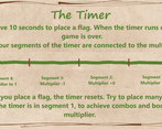
Fun: I definitely enjoyed trying to go as fast as possible in the name of keeping a high combo. The timer was absolutely a great addition, and the game wouldn't be as exciting as it is without making the player go as fast as they can.
Innovation: Yeah, I'd say this is trying some new things. It's like assembling a puzzle, but there's multiple solutions, and you're looking for the solution worth the most points. I like it.
Theme: It absolutely fits the theme. The moves you are making are specifically centered around the combos of adjacent flags. the gameplay matches the theme very well.
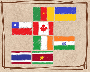
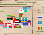
Graphics: I think it's really cool that it looks like every flag was drawn yourself. You definitely could've taken the lazy approach of downloading all the flags from the internet, but you took the time to make your own assets, and i have a lot of respect for that.
Mood: The scribbles on paper drawings of flags make it feel carefree and fun. I don't have much else to add here.
Audio: I think this is the category where it falls the flattest. the music is pretty generic, and the sound effects are a bit bland. That said, it's not really the genre of game where sounds and music are critically important, but they get very repetitive, very fast. I think slowing down the tempo, adding a few more measures, and perhaps some light reverb would make the music sound better. Maybe a subtle beat?
Humor: Not applicable.
Final Thoughts: It's a pretty good game. The method for getting combos is a bit unintuitive, and it could use a built-in tutorial, but once you figure it out it's a lot of fun! Great work.
Such a cool idea!
It looks quite neat, I was amazed to see that you actually drew the individual flags, and I think it really adds to the overall looks of the game. It was nice looking at the full picture once I finished, especially since the flags sometimes end up being somewhat classified by color zones.
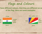
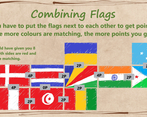
The system was a bit confusing in the beginning, like understanding what mattered (color, shape, position, etc.), but the little tutorial pages were enough, and the idea is overall very cool. I pretty much didn't use the whole flag stock however, and only picked from one or two slots (but probably did not play very optimally!).
The audio ended up a bit too repetitive for me (and the "combo" sounds were a bit too loud for me).
Congrats on this game!
????????????????????????
Honestly, just tried it still have no idea how to play this or what you are meant to do in this game
Thanks, we added some images to explain the game better.
Thanks, will have another go later on,