Play game
Journey to the Top's itch.io pageTheme
Cyclic platformer in which the player tries to beat the level for the best possible time
Extra Credit Challenges
Extra Public Domain
Extra Crossover
Extra Time
Sensory information
N/A
Content warnings
N/A
Leave a comment
Log in with itch.io to leave a comment.


Comments
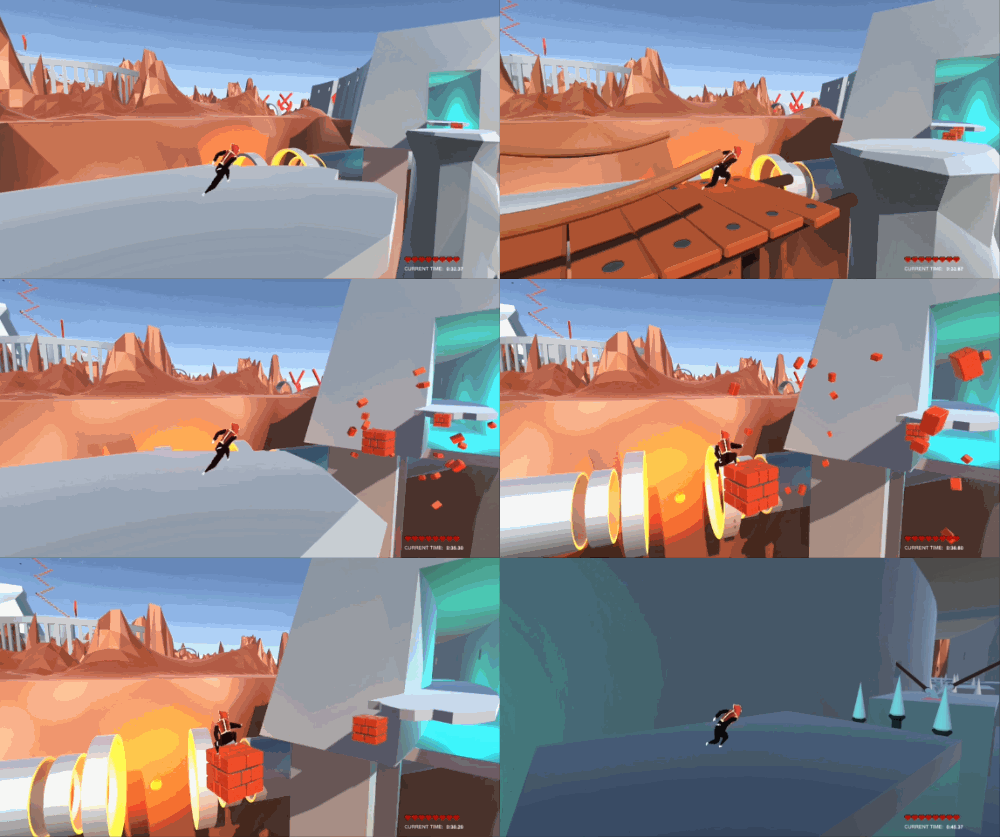
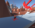
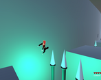
The art style is impressive. The bridge generation effect is awesome, I would put it at the start of the game so every player sees it. As others suggested, the jumps are too tight and the view adds difficulty sometimes to see if the platform that is ahead is in the same Z plane as you or not (i'm talking about the floating white platforms)
Also, the first section seems too crowded (after the tutorial, the section with flames,spikes horizontally and vertically right next to each other) and I think is too much for the start of the game, after that, the pacing is much more better in my opinion.
Good job, and as I read that this is your first game, Congratulations!!!
Thank you very much for your kind words, we are already working on the next game and will put all of this feedback to use !
You really put some effort into this! Appreciate the amount and quality of content. How many hours and how many people worked on this? :D
Now the cold hard facts, which I see in many games:
Why would you make the jump distances so tight?? I tested it over and over again, and the conclusion was the same: even if jumping from the maximum edge of the platform, the gap is so large, that I need to jump + dash with 80% accuracy, no more room left for error, and thus, 2/3 of my jumps failed.
I learned from previous games, that I should never make the jumps this tight, only if the game is super short, and all it takes is 3-5 jumps. If you have an amazing and complex game, such as yours here, then you need to make those jumps more accessible for everyone. I know what it feels like from the dev standpoint... You own the control mechanics, and you almost everytime make 100% accurate jumps, but the rest of us, who barely started playing it, and notice those strict jump rules, are kinda left feeling powerless. I'm really sorry, but that's the truth. Your jump gaps are way too tight.
Otherwise I would have played it till the very end! :D Reminds me of the 90s when we used to play Prince of Persia on the school's MsDos computers.
Hey, thank you for the feedback, it's very very welcome to receive it !
We are 2 developers, an artist and a programmer. I am the artist, this is my first ever video game and also game jam, there are things to improve in many places, yes i agree wholeheartedly ! But as my first go at a video game, I am really happy with the result and thanks to feedback such as yours and many others that play our game i will make the next one a much better experience for all of us.
Please do share any other feedback you might have, we read through every comment and hope to get your support in our indie game endeavours.
Thanks !
Glad to hear you're open minded and receptive to improvement! It's also neat that you combined your forces to dev a game more easily! Until now, I always worked alone, like a maniac, on level design, gameplay mechanics, programming, art creation, sound, and it can get very time consuming, if you play-test 30% of the entire time-frame...
When making a platformer I think the most important thing to keep an eye out for is the margin of error of each platform's landing zone. 70% of the players will play it less-professionally than you, the devs... And especially, in the beginning of the game, until you make sure the player familiarizes with the controls, and has a firm understanding of them, especially then, in the beginning, you need to be very careful you leave them enough margin of error to learn.
Hope you guys continue to release or improve your existing games! Cheers!
Nice idea and great art!
Very cool art style! Collision feels a bit awkward at times and some sound feedback would do great when being hit.
Need to spend more time unit I finish the circuit!
EDIT: Apparently there is sound, my mistake for missing on it!