Play game
Countdown To Earth's itch.io pageTheme inspiration
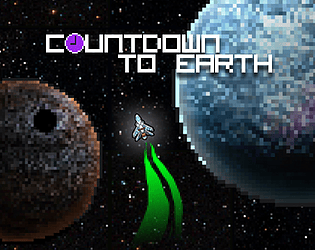
The space game where passage of time is the main rival! The game plays with the concept of distortion of spacetime due to high speeds & gravity.
Sensory info
N/A
Content info
N/A
Extra Credit Challenges
Extra Zoey
Leave a comment
Log in with itch.io to leave a comment.


Comments
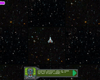
Hey Geotsak (and team), I just finished your game and really enjoyed it! I love the tricky balance of keeping an eye on your time gauge, scanning the minimap for incoming obstacles, and carefully weaving around planets to keep one boost chaining into another.
Regarding the art style, nice work all around. There's a good variety of planets and obstacles to keep things interesting as you play and replay the game. I also like the variety of dangerous objects like orbiting moons and black holes.
The music and sound effects compliment the frenzied and fun gameplay nicely. Very well done.
In terms of gameplay improvements, one thing I didn't grasp right away was what speed I should be traveling at. I did a few "perfect" runs at 100%, 75%, 50%, and I couldn't make it back to Earth in time even when getting every possible boost. When I dropped down to about 25% speed on my next few runs, I was eventually able to get back to Earth safely.
Overall, this is a really solid jam game and a fun mechanic that hopefully you will expand on later. Very cool stuff!
Thank you for your analytic review! We are glad to hear such nice words for both the majority of game mechanics, art and music/SFX! The speed mechanic definitely needs some work. We are considering making it not affect the passage of time, with the inherent difficulty of having to dodge objects when going at very high speeds taking its place. For that purpose, we will also probably increase the amount of obstacles.
Thank you for the game!
I really liked the presentation style and level of polish, and also how well game mechanics are explained. Music especially was of the highest quality! I was amazed to realize that music changes from one retry to the other, and that you probably have more then one music track for the main game mode. This is very impressive, considering how people (me included) often postpone music production to the last moment and go with the bare minimum. Cudos for the great work!
I found balancing acceleration/deceleration thrilling and exciting, since it provoked interesting dynamic when you oscillate between careful skirting and bursts of high speed action. But the decision to make time decrease faster as you increase speed felt questionable to me. This really discouraged taking high risks with high speed and instead encouraged slow and meticulous movement (I've completed the game twice: once on high speed with very little time left, and other time on very slow speed with more then 2/3 time left at the end). I think making time decrease slower as you increase speed would have make the skirting/action dynamic really shine.
Thanks for playing and for your positive feedback! Really glad you enjoyed the game.
Removing the acceleration of time passage when in high speed is something we are going to consider, since it does feel too punishing at times. Turning it into deceleration though is unlikely since we were initially inspired by the fact that IRL, when you are going with speeds near to that of light, time DOES pass slower for you than for everyone else. So we probably won't turn that upside down in our game.
Lastly, as the music producer, thanks for the positive comments, I'm really happy that you enjoyed the music!
I really like the idea and I think with a little more work this could be a really fun game. More indication of when Im too close too things and how much time is passing would be nice. I often found that time was passing even when I thought I was far enough away from things. It seems like as long as an object is on screen it's killing time. Also with no indication of where the galaxies or whatever those are you can slam into two or three before you even realize it at decent speeds. I really liked the slingshot mechanic although the planets often overlapped with killer objects which made me begin to avoid them when I could. The other problem I had was that my speed bar didn't always line up with how fast I felt like I was going. Sometimes I'd be clipping along and then my actual speed would dive sharply but my speed bar stayed up. I'd slingshot around a planet but my speed would stay where it was. Also having the speed bar contribute to my time bar was confusing given that they were on opposite corners of the screen. Basically I felt like I always needed to be watching the corners of the screen (minimap, time bar, and speed bar) more than I needed to watch the middle of the screen where the game ostensibly is supposed to be played. If you could build those HUD elements into the main screen it would play a lot smoother. I hope that you keep working on the game because it really was fun.
Thanks for the feedback, we are glad you enjoyed the game! We are definitely going to keep working on it, so any feedback we get is precious.
Having to constantly be aware of the HUD more than the actual gameplay was a problem I too noticed while play testing and we might work out a way to fix that.
"I often found that time was passing even when I thought I was far enough away from things. It seems like as long as an object is on sxreen it's killing time": Objects only kill time when you orbit them, you could be going with very high speeds and therefore be losing time. There is no indication of your actual speed though, on that you are correct. The speed bar represents only the speed that the ship's booster provides, not the one that the orbital acceleration provides. That is likely something that needs tweaking.
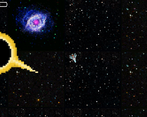
"Also with no indication of where the galaxies or whatever those are you can slam into two or three before you even realize it at decent speeds.": Do you mean the pink/purple galaxies in the background? Those are purely decorative, they are supposed to be very far away and don't cost any time ;). You commenting that however does tell me that someone could consider these as large objects to be avoided, which is not something we want. We were planning to redesign the background anyway, so that's another excuse to do that.