Play game
The Secret of the Soulforce : Heroes of the Abyss's itch.io pageResults
| Criteria | Rank | Score* | Raw Score |
| Sound/Music | #23 | 3.000 | 3.000 |
| Art | #24 | 3.250 | 3.250 |
| Overall Fun | #24 | 2.750 | 2.750 |
| UI | #25 | 2.750 | 2.750 |
Ranked from 4 ratings. Score is adjusted from raw score by the median number of ratings per game in the jam.
Leave a comment
Log in with itch.io to leave a comment.


Comments
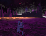
This game is looking promising! I know you're quick to explain that the visuals are in an early state, and most textures are plain for now, but what's done so far is done well! The models have pleasing shapes and an appropriate level of detail, and the lighting for each area sets the mood. The music sounds great, too; compliments to your composer.
The first few minutes of play are vital to a first impression; I feel that this game could do well to give the player some action or at least some visuals sooner. I walked through several dark scenes, reading backstory that I hadn't yet seen a world or other characters to contextualize. Once I woke up into the world, an NPC gave me a large menu of information to read up on, but when I saw the battle in front of me, I wanted to know what button I could use to fight, to join one of the many skirmishes I saw to help my side, but I couldn't find that in the menu. I eventually gave up and walked on. (My guess, looking back, is that no battle opportunity for the player is intended here. But I didn't know that at the time.)
To be honest, with all the walking I'd done, and all the information I had access to, I still didn't know what sort of battle format to expect: whether this was an action RPG with on-map battles, or a turn-based RPG with a separate battle scene, or something else. Once the with an Archdemon started, that answered that question for me. Though there were many menu options, they were easy to navigate, and the tooltips explaining the various skills helped me understand exactly what I'd get from using them. The Archdemon's challenge level was appropriate: there was room to make mistakes without being wiped out by them, and enough time that I could see the effects of buffs the characters cast, try different skills' effectiveness, etc. The battles are solid.
I have a few nitpicks on out-of-battle UI aesthetics:
Thanks for letting me try out your game. Though I've barely scratched the surface, I can tell the game offers rich gameplay and story. I hope my feedback will help you see it from the eyes of a player who's just getting started, so that you can make the best first impression possible.
Thank you for this very well written feedback, which indeed allows me to understand the feelings of a player. So know that indeed I had a lot of remarks on the font, in particular that it is hard to read so this will be changed for sure.
As for the UI in general for the non-combat menus (excluding dialogues), although it seems satisfactory from the feedback I have, I will redesign it for better ergonomics, in particular for the character sheets and the bestiaries which afterwards I do not find optimized or even pleasant.
As for the beginning, which disturbed you because there was no combat, the part completely in the dark is an introduction to what happened before arriving on the battlefield. Once on the battlefield, I could indeed guide the player more on the fact that his goal is to reach the abyss as quickly as possible and slip 1 or 2 fights along the way which will be the tutorial, the arch demon remaining the Boss;)
When you talk about the npc I assume it is the instructor who is indeed not mandatory but gives a lot of information in one block. In view of your feedback on this subject, I will present it in the long term probably differently, notably with images a bit like some MMOs which explain the skills in this way =)
In any case, a lot of updates are planned during this month, you can follow them from the community tab of the game in which I post the updates made + short-term road maps;)