Play game
Jeebo & Jerbo vs. Life's itch.io pageResults
| Criteria | Rank | Score* | Raw Score |
| UI | #20 | 1.565 | 1.750 |
| Overall Fun | #21 | 1.565 | 1.750 |
| Sound/Music | #22 | 1.565 | 1.750 |
| Art | #25 | 1.342 | 1.500 |
Ranked from 4 ratings. Score is adjusted from raw score by the median number of ratings per game in the jam.
Leave a comment
Log in with itch.io to leave a comment.


Comments
Got the chance to check this game out, this game is super goofy in the best way!
A few notes I took:
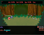
There's a lot of tiny things that could be polished up, like menus not having any SFX when you highlight different options or accept an option, the abrupt cut from the end of the battle to the platformer gameplay without a quick transition, etc.
When in the shop, you could have the item display it's stats when you select it instead of having to select the item, then go to Stats, then read it.
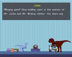
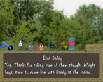
I like how strange the characters are in the world. I think it would be cool if in their strange conversations they drop subtle info about the world, so you get both a silly conversation and a few hints about the game's strange universe.
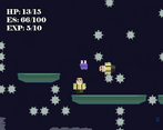
I got stuck at the part where after you meet up with Jerbo you need to cross the dug up area with the spinning spikes. I didn't know what I was supposed to do after crossing the first spike that wasn't moving, and the arrows that point down at the moving ones were kinda confusing.
It's definitely got the that likable weirdness to it, keep it, up!!
Thanks so much for the feedback!
It never even crossed my mind that menus should have SFX haha that's a super easy fix though, and for the battle endings, I really like the transitions being super quick so you don't have to wait for the transition to end, but I could add a very quick transition out of battles to replace the fade out, that doesn't seem too hard.
That's a good idea about the item stats, I could add a little box on the side that has the basics then maybe the description will have all the additional flavor text.
There's a lot more lore in the characters' dialogue and item descriptions than you probably realize at first, but I will say that a few of the characters right there at the beginning are just little jokes. Which I'm fine with, but I could probably add 1 or 2 small things to a couple of them.
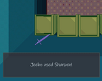
When you are trying to cross those spinning spikes, Jerbo subtly hints at what you're supposed to do, but there's also a CeraTip(TM) sign that explains it in depth right next to the first non-spinning saw. What you're supposed to do is press DOWN in the air (Or RTrigger I believe on controller) as Jerbo above the saws. Jerbo will turn into a spike and if you time it correctly he will bounce off of the spike allowing you to bounce across the gap. Did you not see the sign that explains it or did you not understand what it was saying? That was the part that many of the beta testers got stuck on too, but after I added that sign it seemed to fix it for them, but it may still not be as clear as it could be.
Thanks so much again for all the feedback! I'll try to implement these changes asap! (and let me know about the sign by the saws so I can fix accordingly)
Hey np!!
For the transition from the battles to the platformer gameplay what you could do is skip any kind of fade to black transition and instead start with a fade in from white (actually a light grey usually) so it's even faster than waiting for fade out -> waiting for fade back in. I also like it being really quick so this transition (I imagine being like 0.15 sec long), could make it feel polished while keeping it quick too.
Ahh that's what I was supposed to do with the spikes okay! I think I totally just missed the sign, maybe you could add a shimmer effect + something that makes it grab your attention FX-wise when it first appears will do the trick.
Excited to see what's next!!
Bruh i only have a mac to test the game. Could you upload a version for browser? It is much easier for people to play in a browser without the need for installations. Anyway i saw the trailer, it looks very nice.
Unfortunately I can't... It was made on GameMaker Studio 2 and I would have to purchase the web game license to do so which is quite expensive...
Oopsie, trying to run the game only gave me an error message saying that it couldn't find the executable file.
Looks like it's trying to find the wrong file, the .exe that's in the folder is called "Jeebo Demo.exe"
Ahhh I accidentally changed the name of the exe when I did the latest update, I changed the settings in Steam to launch the correct one haha, thanks so much for letting me know!!
Hey np!! I'll give the game a try when I get the chance very soon! 😁