Play game
Inize Warrior's itch.io pageResults
| Criteria | Rank | Score* | Raw Score |
| Overall Fun | #19 | 4.226 | 5.000 |
| Controls / UI | #19 | 4.226 | 5.000 |
| Sound/Music | #25 | 3.888 | 4.600 |
| Art / Graphics | #41 | 3.550 | 4.200 |
Ranked from 5 ratings. Score is adjusted from raw score by the median number of ratings per game in the jam.
Leave a comment
Log in with itch.io to leave a comment.


Comments
I am going through all submissions to make all developers aware of an important Google form I've made.
I'm joining the IQ folks to help organize smaller events in between the main FQ event in order to help prevent us from getting too many games in main events. Right now, I have a planned structure for these events but I would like to hear from everyone who was in this event in order to tune things better. The survey is a bit long, but it covers as much as I could think of. If you can take the time to do the survey by June 1st, I would immensely appreciate it!
You can find the form here: https://forms.gle/P9LPYwERhJtpZzteA
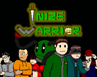
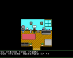
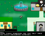
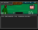
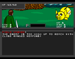
Don't take it the wrong way and, this sounds weird but, the graphics/presentation of this game are so "bad" that they are good. Almost everything looks really nice, stylish and like it belongs together. The combat is fun, the humor is on point and it all has some sort of Earthbound/Undertale vibe to it.
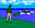
Graphically, I might say the grass on the overworlds look a bit out of place? Can't help but wonder if the grass was less detailed and more cellshaded like the rest of the graphics? I couldn't figure out how to beat the monster you chase after the exam.
Other than that, this game has great potential and I would gladly play it again.
I love it, the animations are so fluid and the art style fits perfectly the tone its going for, with a really fun story and comical characters. The sound design and music are satisfactory too. Also, is it inspired a little by ONE? (author of Mob Psycho and OPM) cause it gave me that vibe (especially with some of the humor feeling like it could be done by reigen from mob psycho and many of the story parts of the OPM Webcomic.
Thank you so much for trying it out, it's not inspired by ONE but you're not the first to ask that lol
Hello from tonight's stream! When I was first looking at the screenshots, I had no idea what I was in for. I actually thought this wouldn't be a fun experience purely from looking at the art style. However, I was proven immensely wrong.
This game ended up hitting so many notes of other games that are quite popular within certain communities that it just felt like it belonged in that set. I got heavy Undertale vibes mixed with Paper Mario, Super Mario RPG, some Pokemon and Earthbound! This with the material in the story itself makes this such an amazing experience. For me, it felt like a child's super hero fantasy story would be like, based on them watching shows like Naruto or Bleach or Dragon Ball, where there's an ever growing level structure for the hero to overcome. There were "Beginners," the bottom of this pole, and the "Seniors," who are the second highest rank in the Warriors. Even the names lend to this simplicity. And just like those shows, the child's story would immediately introduce a bunch of characters as their friends and outright explain their personalities and why they're friends.
It takes this all and then makes it very serious. Throughout the intro of the game (not counting the super intro before you get into the game's intro), we're shown everything in a light-hearted matter. Then as you're made to do the run all the way back... a tentacle just pops out of the ground and grabs someone! It crushes them before pulling them underground. You learn that a monster is making all the various sinkholes that have been going on, and you just watched a person die at the same time. Holy shit.
And this isn't even me getting into the Undertale-esque intro with that dude talking to you and then causing a windows pop-up to come up on my screen with my name on it! It's wild!
Combat is easy to understand, the music fits in what the vibe is at the moment, everything else works amazing.
But there is one thing, and I mentioned it earlier. Unless the style is intentional, I would suggest overhauling the look of the game. If it's intentional, no, hey, I get that too. I'm just saying I'm not trying to insult you in any way, shape or form. I find so much of this game amazing and I do think the graphics should try to fit there as well. But again, if intentional then I understand and it works well.
Hello, thank you so much for giving this game a try and streaming it, I won't hide the fact I've been watching the VOD with a big smile through the entire section with my game lol.
I see what you mean with the art style, it was (and probably still kinda is?) the best i could do, but this is only the beginning and i know i'll keep improving with time, still, I'm glad you found the rest of the game amazing.
Thank you once again
Honestly, given how this game hit those nostalgic notes for me so often, I'm excited for the full game.
As for the art, for how much you have to do (and how big this game already seems to be), it's still good.
Also, was I right about the Undertale vibes? If so, can I suggest doing some fun stuff with the names if people put in Undertale names?
Yes, you were absolutely right about the Undertale vibes, it was my main inspiration after all, and about name easter eggs, i actually did that already with a few of my characters (with more to come in the future actually because i forgot some of them + more characters being added with new chapters), i wasn't really planning to add Undertale names as easter eggs since those characters have nothing to do with my game, but i could consider adding references for fun
I could see some Undertale names as easter eggs in the form of like "Frisk. You think you're funny, don't you? Not happening" or something like that. XD