Play game
Arken (Extended Demo)'s itch.io pageResults
| Criteria | Rank | Score* | Raw Score |
| Art / Graphics | #8 | 4.625 | 4.625 |
| Controls / UI | #9 | 4.375 | 4.375 |
| Sound/Music | #20 | 4.125 | 4.125 |
| Overall Fun | #28 | 3.875 | 3.875 |
Ranked from 8 ratings. Score is adjusted from raw score by the median number of ratings per game in the jam.
Leave a comment
Log in with itch.io to leave a comment.




Comments
I have returned. And yes, I'm streaming it.
This... was so much better than what I had experienced before, to the point where I was so blown away. That original demo is nothing compared to this polished piece. Anything I said before is just wrong now. You are doing an AMAZING job. Like, I'm done covering your game now and could end my stream, but I'm gonna keep playin' it to the end of the demo. I adore this and anything I can do to help you guys get this out there, just ask.
Thank you very much! I'm glad you gave it a second go! Sorry for the stupid mistake, I just recently made this new page and had to re-upload everything and lost track of my builds somehow.
I'll let you know when the full version is ready and if you like, you can have a free copy for streaming then!
Nah, no need for a free copy. I will gladly pay for it. :)
It's great, I liked the inclusion of the roll like ocarina of time. I can't remember if that's in 2d Zelda games. I played up to the dungeon in the ruins. I couldn't figure out how to cross the gap though after I got the item. My only criticism is that it after I got the item I missed the text box telling me exactly how to use and then I couldn't find any information on what it was. I was able to roll with it but I couldn't figure out how to cross the gap, unless that's not the answer and I should be throwing something in there. I will continue playing to see if I can figure it out. Overall though it's a great game and anyone who likes 2d Zeldas will enjoy it
Thank you!
Yes, you have to roll over the ramps with the item you found in order to cross the gaps.
Hope you'll like the rest of the demo!
I am going through all submissions to make all developers aware of an important Google form I've made.
I'm joining the IQ folks to help organize smaller events in between the main FQ event in order to help prevent us from getting too many games in main events. Right now, I have a planned structure for these events but I would like to hear from everyone who was in this event in order to tune things better. The survey is a bit long, but it covers as much as I could think of. If you can take the time to do the survey by June 1st, I would immensely appreciate it!
You can find the form here: https://forms.gle/P9LPYwERhJtpZzteA
I played this game a while ago and it's still as much fun as I remember! Very GB Zelda, so if you're a fan you'll feel right at home here. Looking forward to the full release!
Thank you so much! :)
Hi! There was a mistake made with uploading the game.
The version you have played was one of the earliest builds done.
I would appreciate it if you could play the actual game again!
Thank you!
Hello from tonight's stream!
When I started this up and realized it was a Oracles-inspired game, I was excited! I'm a massive Zelda fan and this got me revved up! The way things controlled was so great. It really did feel like playing a GBC Zelda.
However, I also found it ran into many issues: points where it misses the mark for Zelda inspired, let alone Oracles inspired. To quote someone from the stream "It definitely feels like this captured the GBC-era Zelda aesthetic and mimicked some gameplay concepts but didn't really understand a big part of the formula."
As such, I wish to cover all of this with you to try and solve as many as possible. Now before it's said that this is a demo, I believe this demo is meant to be a current live build. In other words, this demo as it is is intended to be the full game, just with features missing. My basis is how blacksmiths and another shop make note of only being available in the full version despite existing there. If this was a demo but wasn't connected to the final build, it wouldn't include those yet.
First, the map layout. Every area is a 4x4 grid. Every screen within that 4x4 grid can connect to any squares directly beside them. but only have one way out to the next area. This design gets very repetitive and dull. It offers no variety or even world building at the basic level. I would highly recommend making the areas not work like this. Make some areas big and some small. Make there be specific paths to take within a single area. There's such a thing as too open.
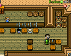
Second, houses and identical dialogue. Every area has multiple houses. One is always a shop of some kind, sometimes two, and the rest are residences. Most of the dialogue used in the game is just copied over and over. If something names a location or item, that's the only change between other versions. This is just not a good idea. Instead, you would be better off consolidating most of the houses AND shops to a single area as a town. You can then put occasional shops around as well as occasional residences. This way, you don't need multiple people saying the same thing; it can now be just one in the town.
Third, enemies. In the field and in caves, it's either tons of enemies or no enemies. This becomes very repetitive and time consuming. While on my search for the first dungeon, I went across so much of the field and into so many caves that I had seen more than enough action for the entire length of a game like this yet I had made NO progress. The way dungeons are done is far more accurate, and I would recommend doing that more often in caves and on the field. It's okay to sometimes do lots of enemies, but it shouldn't be all the time. Also, enemies should sometimes be on screens where houses exist! It's all about making each area its own unique challenge rather than the same thing over and over.
Fourth, identical looking caves. Honestly, this would likely be dealt with mostly by the enemies fix. That said, the caves all just look and feel the same. This is because they also play very similarly; about the same length, the same number of "puzzles" and similar design in screens. The caves need more randomization if the look isn't going to change. At minimum, you can at least change the colours to give more variety,
Fifth, music. This could be a demo thing, I know. Needs more variety in music. This would also help with a lot of the "sameiness" that this game exhibits.
These are what I think need to be done first. If you want, I'd be happy to test your development further and provide feedback (but without streaming, so things don't get spoiled). I want to see this succeed.
Hi! oh man. I am so stupid. The game you played was one of the earliest versions of the game. I uploaded a wrong build, when I made this page. I didn't notice until your post. Thank you for the detailed feedback!
I will upload the current version later today. Until then the game is unavailable. It would be great If you would then try Arken again. Thank you!
I'd be happy to do so. I will have to save it for towards the end of the event, though, since I do want to ensure I get through every game.
that's fair! I don't expect another rating, I just wanted to make sure you know that the game is much different now :)
Hi, I have uploaded the real actual game now.
I'm sorry for the inconvenience!
Overall, I enjoyed your game. I'm not a huge fan of old-school NES games (like Zelda and classic RPGs), but considering I tend to not play games like this... I did have fun with yours :-)
Overall Fun:
Kind of like I said above... not usually my kind of game. I'm not a fan of just wandering around map-to-map with no clear indication of an objective (but that's my opinion-many do love this). The only real gripe I have is enemy combat/AI. They don't attack much, so I didn't find myself getting hit a lot. Plus receiving health is very forgiving. Also... the red goblin/kobold monsters barely attacked with their throwing axe... and many times, they were just walking in place against a wall, bush... and not even approaching me. Other than that... it was a really fun game!
Sound/Music:
Very fitting and loved the retro tone of the music. Good sound effects, as well. Times perfectly with attacks and they all fit the scenario.
Art/Graphics:
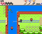
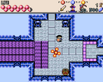
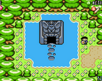
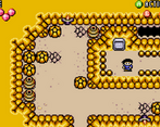
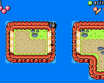
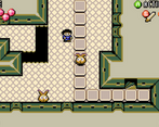
Looks amazing for what you were going for. Love the pixel sprites and tilesets! Monster artwork looked great!
Controls/UI:
Controls were smooth and responsive. Attacks connected, you moved in all directions, and nothing felt clunky, broken, or bugged. Very well done here!
Thank you very much for your detailed feedback! :)
Going to spend some time on better balancing/difficulty in the full version!
Hey there, Just a quick Info:
Due to my lack of attention I uploaded a wrong version of Arken.
This is now fixed and this version represents the final product.
Sorry for the inconvenience!
It delivers on everything that it promises to deliver. It's too bad my PS4 controller wouldn't work without using JoytoKey but, the keyboard controls were just fine and intuitive. I'll have to spend more time with this one.
Thank you very much for your feedback! :)
I will look into the PS4 controller issue!
Hey there, Just a quick Info:
Due to my lack of attention I uploaded a wrong version of Arken.
This is now fixed and this version represents the final product.
Sorry for the inconvenience!
Thanks, you're da bomb!
A real gem, a great love letter to Zelda with tight controls and a nice overworld.
Thank you so much! :)
Hey there, Just a quick Info:
Due to my lack of attention I uploaded a wrong version of Arken.
This is now fixed and this version represents the final product.
Sorry for the inconvenience!
Your game is quite polished. You really wear the inspiration in a way that make it your own. Great work!
Thank you very much! :)
Hey there, Just a quick Info:
Due to my lack of attention I uploaded a wrong version of Arken.
This is now fixed and this version represents the final product.
Sorry for the inconvenience!
Hi!
Uploading this demo because after a longer break I started working on it again. Feedback is greatly appreciated!