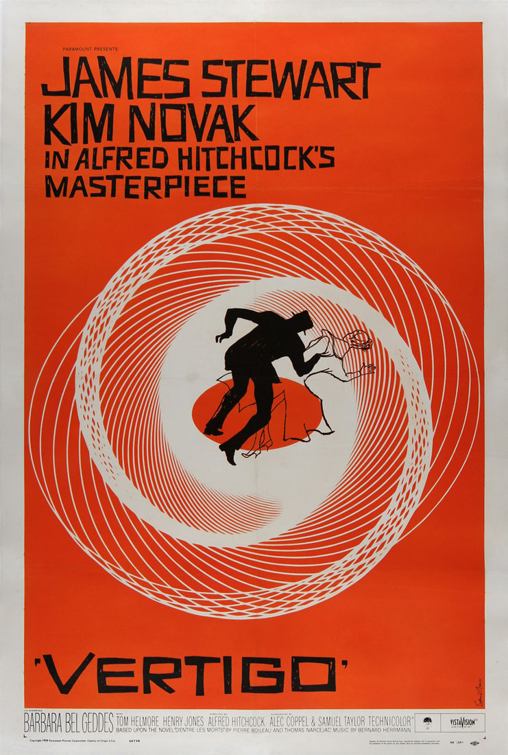
If you have ever read the original Fiasco core book, or perused the many custom playsets, something that you will have seen almost everywhere is an graphic art style with loud, bold (and usually warm) colors and black and white silhouettes that have a boxy style that makes them look cut out from paper. This art style is an homage to the late Saul Bass, whose career spans over 40 years in which he worked with massive names in Hollywood like Alfred Hitchcock, Otto Preminger, Billy Wilder, Stanley Kubrick and Martin Scorsese. You can find a listicle of some of his most iconic works here.

The movie poster for Vertigo (1958) is arguably one of his most well-known works and features a lot of his iconic art choices from color to font to blocky silhouettes. I'll go a bit more in depth of this in my post "Makeover Montage", but one of the fonts commonly used in Fiasco playsets is called Vertigon, a reference to the font of the movie title on this poster.
The biggest points to remember about emulation of Saul Bass' style are as follows
Color: Bass almost exclusively used warm colors (reds, pinks, oranges, and yellows) but if you feel draw to cooler colors (blues, purples, greens) the important thing to focus on is a high saturation with a high value (very little black added to the base color)
Shape: His shapes both in text and in silhouettes often feels like shapes cut out of paper with a straight blade like scissors. If you are attempting to recreate this style, I would recommend finding a portrait of someone you want to spoof and roughly tracing around the shape of the body. Don't follow too closely, but also don't be afraid to include special details like the man's hat in the Vertigo poster, or the bits missing from his leg which add some dimension to him.
Negative Space: Bass' style relied heavily on a bright saturated color taking up a lot of "empty" or negative space around the subjects of his art. Sometimes he would use this negative space to actually build other "hidden" images. One great example is the Girl Scouts logo in which three faces appear even though only one face is actually drawn using color. Especially if you're a new designer, negative space can be daunting and it feels as if you are leaving a piece unfinished, but I would encourage you to live in that negative space and enjoy the extra room.
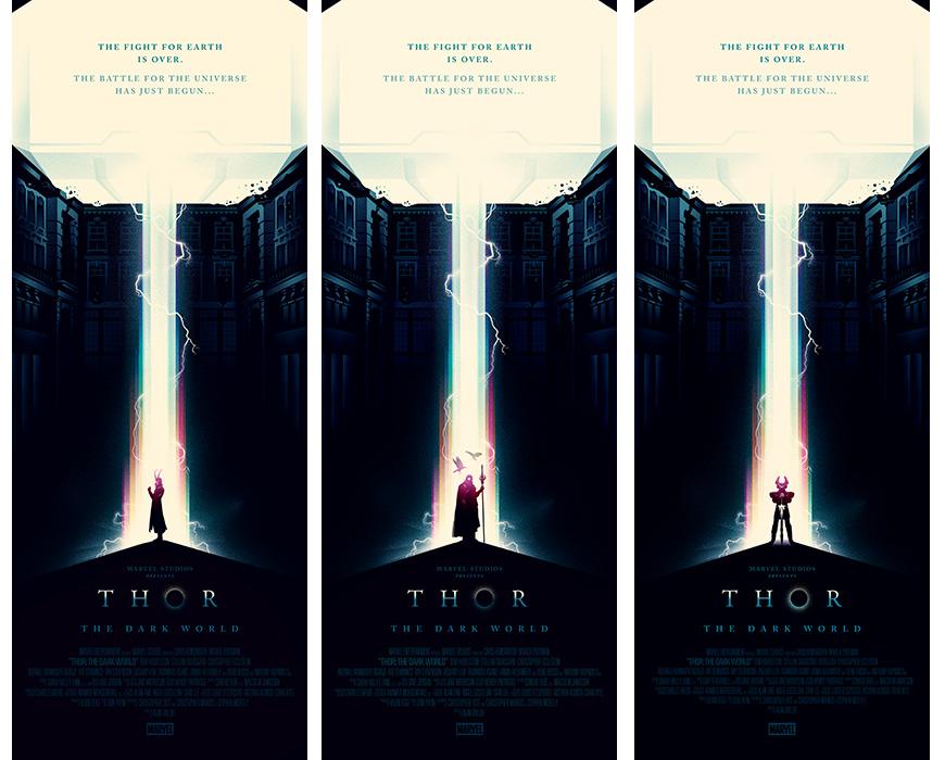
Aside from Saul Bass' own work, if you google his name you will find hundreds of spoofs of his style, all of these are great starting points to get a better visual reference of what his style looked like. If you are looking for something a little more challenging art-wise, I might suggest you look up one of Saul's successors who is still putting out work today, Olly Moss. He has very similar design tendencies but turns Bass' style on it's head and uses silhouettes as a place to hide more little details, it's really quite a fun and intriguing style.


