Play game
Red vs. Blue's itch.io pageResults
| Criteria | Rank | Score* | Raw Score |
| Idea/Innovation | #37 | 2.021 | 2.333 |
| Music/Sounds | #38 | 1.732 | 2.000 |
| Overall | #44 | 1.732 | 2.000 |
| Mood/Atmosphere | #45 | 1.732 | 2.000 |
| Overall/Gameplay | #46 | 1.732 | 2.000 |
| Graphics/Design | #47 | 1.443 | 1.667 |
Ranked from 3 ratings. Score is adjusted from raw score by the median number of ratings per game in the jam.
How long have this project been going?
Around 48 hours. (Spread out through the course of a month.)
Leave a comment
Log in with itch.io to leave a comment.


Comments
Neat start. I included it in my Finally Finish Something Jam compilation video series, if you'd like to take a look. :)
It was quite an ambitious thing for a first finished game, so you aimed high! It seems to work mechanically as well, once you've figured out the camera pans.
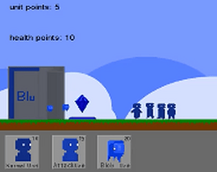
There were choice to make, in terms of the units to spawn, but I couldn't see much difference between the different types - they all just seemed to explode when hitting an enemy, perhaps if the more expensive ones could take 2 or 3 hits that would have helped. It was tough to win, once the red guys got to the centre and started shooting then you could never catch up as your blue guys just died and there was no tactic to get out of that. Well done for finishing though and keep working on it if you want to make improvements
Not bad for first game! I think you must make scrolling more obvious, or show both bases on the same screen (smaller bases). Otherwise people will not understand where blue guys are going.
Is this intended? Blue guys spawn, walk "somewhere", make an noise and then... nothing?
No full screen or something? Did I miss something?