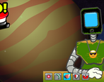
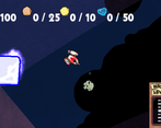
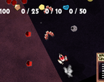
This is fun and addicting. I like the graphics style (especially the stylized way you represent space). I see you are trying to make this game as language independent as possible with the use of icons - mostly it works well, but I was confused for a moment when the upgrades maxed out. Overall, great job.
Play game
GEOS: Golden Edge of the Sun's itch.io pageResults
| Criteria | Rank | Score* | Raw Score |
| Fun Factor | #10 | 3.462 | 3.462 |
| Polish | #15 | 3.308 | 3.308 |
| Theme Relevance | #17 | 3.538 | 3.538 |
| Originality | #19 | 3.385 | 3.385 |
Ranked from 13 ratings. Score is adjusted from raw score by the median number of ratings per game in the jam.
Comments
I clicked the shop items too many times I guess and then they just stopped working, one click past the golden ones and it seems like they turned back to the original sprites but I guess I had upgrades on. So that was a bug (or a misunderstanding which means the UI needs more work). I guess the game is very far from what you planned and right now I didn't know what exactly I'm supposed to do. Still, it was fun and the main mechanics felt pretty good. Nice work!
In fact it's working as intended. It's supposed to indicate that the upgrade is no longer available for purchase. However if I were to have had more time I'd have used a different mechanic for indicating this. We tried to get as much visual feedback into the game as possible, rather than using text.
Well if it stopped at the golden background ones that would make total sense, but pressing the one that looks the most badass with the gold background will take it to a next level which looks exactly like the first level (the icon returns to the first basic one and the background turns grey) I was surprised at the first place that there was an upgrade after the one that kinda looked like it's indicating MAX LEVEL. Visual feedback is always better than text and you had some really great visual feedback in the gameplay but the shop, it looked weird.
The shop was supposed to written by Clyffe, but he was evacuated by the hurricanes and wasn't able to complete most of the code. The idea was that there would be a greyed out icon to indicate you hadn't boughten the upgrade yet, and the gold icon be the final one. As it was we ended up an icon short.
Hey - this is pretty cool! I can't say I inherently understand the mechanics, but I like the idea of collecting resources and shopping up with them. This is one of those games that could be a success with a TON of shop purchases, which gives you incentive to keep flying around. I couldn't seem to lose, though. Great for a nice casual play-through!
Unfortunately we ran up against the time crunch, due to hurricane evacuation delay we weren't able to program everything that we desired into the game. :(
Namely all the game mechanics are there, but the shop wasn't fleshed out in time, and that's where the win/lose functions are carried out. Plus the fact that I accidentally left the player with 100000000 credits for buying doesn't help. :)


Leave a comment
Log in with itch.io to leave a comment.