Play game
aloNe's itch.io pageResults
| Criteria | Rank | Score* | Raw Score |
| Originality | #2 | 4.214 | 4.214 |
| Audio | #2 | 4.286 | 4.286 |
| Overall | #3 | 3.667 | 3.667 |
| Gameplay | #4 | 3.714 | 3.714 |
| Ingredients | #4 | 3.571 | 3.571 |
| Graphics | #5 | 3.000 | 3.000 |
| Fun | #7 | 3.214 | 3.214 |
Ranked from 14 ratings. Score is adjusted from raw score by the median number of ratings per game in the jam.
Judge feedback
Judge feedback is anonymous and shown in a random order.
- Great game with an interesting story. I really loved seeing the progress made on this game throughout the gamejam + being explained the story and the ideas behind the game. The audio of this game is also really well-made. The graphics are suitable, but for me personally... the game wasn't as enjoyable as some of the others. Nevertheless, your team did an amazing job! The game conveys its grim atmosphere really really well. Thank you very much for your participation and such a great game.
- A game with atmosphere. You are alone, scared... and when you go into darkness, your fear rises until the panic overtakes your will. Nice, little, closed atmospheric game with great sound and readable graphics. It could have more levels, and have them more challenging. Also, when tried on my father... he would like to know where to go; it is not obvious that you have to go to the right.
Leave a comment
Log in with itch.io to leave a comment.


Comments
aloNE is a mysterious game not only by its gameplay, but also with its name.
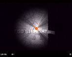
The game makes the most of the liminal spaces ingredient. The player, alone and in the dark, ventures into strange, empty underground spaces that do no good for his psyche.
Fortunately, he can meet other people who can improve his mental health (which, paradoxically, is a slightly opposite approach for some students :-) ). And if it doesn't work - there will be panic attack.
The game has an idea that it communicates nicely. Her visuals are dark but nice - the bright yellow and green colors and auras are really cool!
Plus - the authors put a lot of care into the logo itself!
What the authors do not communicate, but I can happily say here, is that the voices of the "crowd" in the game are the voices of the participants, often juries debating some "very importnant" topic.
The game, in addition to having an idea, is refined and polished (except for the ambient light shader, as discused in other comments). That wasalso seen at GameJam as the fact that the sound of guitar, improvised drums and sounding cans emanated from the team room :)
+ the text in the scene is nice and I like it. The only minus is that it is sometimes across multiple screens, but it ok, as its matter of seconds.
+ as stated above - the sounds are great. speaking, mumbling, ambient, all.
+ the panic effect is great!
+ i like the slight movement of NPC
+ I don't know how the sounds are mixed, but one guy speaks clearly like me! :D
- in the last map, I ran away completely in a panic and cycled for quite a "long" time (about minute) on the edge of the map
- heck, it could be longer!
This is very well made game that feels most complete of all the games in this game jam. It has atmosphere, greatly supported by lighting and awesome sounds, it has fitting visuals and great mechanics making it interesting experience for the player. The only thing this game needs is more levels.
There is not much to be added upon previous comments. But my father would add one thing - it is not obvious for player where to go. There should be something that leads player to the right (or from the left).
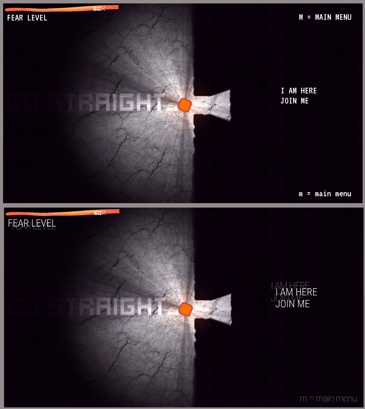
This game is all about atmosphere. The contrast between the safe and the unfamiliar is emphasized by the sound effects and ambient music which all contribute to this eerie “liminal” feel of the game. The gameplay is well polished, going through walls feels awesome and the core mechanic and controls are intuitive and well explained throughout the game. It consists of 5 levels that do a nice job of demonstrating the gameplay, although maybe something a little more challenging would be nice in my opinion. Performance vise, I experienced some lag probably caused by the light shader, though nothing major. As for the visual style, I have to say I’m not exactly a fan of some of the choices. I really like how the walls extend out from the 2D plane of the world. Nonetheless, the rest of the graphics seem to be kind of inconsistent – minimalistic vector characters, realistic floor and light texture, pixel font... I think keeping the visual style simple, sticking to basic shapes in the style of the walls and characters would make the game look more unified. Overall a fun experience!
Thank you very much for your comprehensive and detailed review. We are very pleased that you enjoyed the game. Thank you for pointing out a small performance issue with the light shader. We noticed it before submitting, debugged some control issues, and also reduced the number of yellow companions to improve performance. Seems not enough.
In terms of visual style. We had a colleague who happened to join us online for the jam, but he gave up on Saturday. So we ended up using less polished placeholder visuals. Personally, I like the contrast the visuals create. The cold reality (light, shadow and texture) contrasted with the warm and colourful geometric abstraction of the characters. It just happened in a natural way, like a jam in music, when some of the jam participants are brought together. But I definitely agree with your comment. I look forward to designing visuals for the further development of this game. I like your suggestion to keep the visual style simple. We had the game "Thomas Was Alone" as a visual inspiration in our moodboard :) and I think we want to continue that way.
Thanks again for your review and also for your great game!
Hi, based on your comments I researched better matching fonts. So far I found this. I just wanted to share it with you and thank you again for your feedback.