Play game
Cthulhu Wants Me!'s itch.io pageResults
| Criteria | Rank | Score* | Raw Score |
| Gameplay | #3 | 3.929 | 3.929 |
| Sound | #5 | 3.714 | 3.714 |
| Overall | #5 | 3.757 | 3.757 |
| Visuals | #5 | 4.286 | 4.286 |
| Fun | #6 | 3.786 | 3.786 |
| Story/lore | #7 | 3.071 | 3.071 |
Ranked from 14 ratings. Score is adjusted from raw score by the median number of ratings per game in the jam.
Leave a comment
Log in with itch.io to leave a comment.


Comments
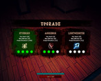
Great visual style and fun to play! Not sure I managed to use any of the right-click fight options (I upgraded the skills but they didn't seem to work or maybe I did something wrong). A little manual for controls in the settings wouldn't hurt. But overall a great experience!
I like combat, and promotion menu, and monsters.
I miss the environment, surroundings, something that would tell me more about the character, and why Cthulhu wants him.
Also it would be nice to have some control instruction at the start.
Anyway, I had fan playing! Waiting for updates.
Movement is a bit weird, I felt like I wasn't moving "up and down", but instead a bit angled.
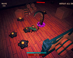
Overall combat is good, the indicators are nice since they also show the type of enemy, but I got bored at like wave 4-5, it feels just.. undesirable, no motivation to go for the next wave. Could also use an indicator on where to go next.
Also some weird tooltips on upgrades? Says something like "Mouse 2 to use" but when I get them I can't use anything, only attack.
Thank you for the feedback!
We will look into improving the quality experience and address the best we can in future patches.
Regarding the game feeling undesirable and lacking motivation to go to the next wave. Can you provide any suggestions that you believe would improve the engagement experience?
In terms of user experience, I think it’s alright, but it lacks something like a minimap, or a “path indicator”, after finishing waves I got lost a good number of times, and didn’t understand where to go. As for gameplay, maybe rename waves into some kind of parts? like 3 level parts consisting of 3 waves each. And maybe each level part could give an upgrade. Also you could look into game design difficulty curves, where not exactly each wave should be harder, and, for example, getting an upgrade right before “easing” level of difficulty could lead to getting more powerful feeling and enjoyment overall.
Good graphics, needs some improvements in case of shadows.
Something wrong with picking of the weapon. Maybe better pick it up with a mouse click.
Good ambient music.
Hitting need some improvement or feedback - it missing clicks and player does not know why hits so slow.
Movement needs some twicking. It feels like a bit uncomfortable using WASD, but clicking with a mouse it rotates and moves player softer.
Game seems like a casual, so it needs some steps into casual style of UX of controls.
Great job!
Thank you for the feedback!
We will look into improving the quality experience and address the best we can in future patches. We plan to add more quality-life improvements that give more options to play the game they prefer.