Play game
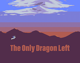
The Only Dragon Left's itch.io pageResults
| Criteria | Rank | Score* | Raw Score |
| Design | #1105 | 2.955 | 2.955 |
| Overall | #1547 | 2.727 | 2.727 |
| Adherence to the Theme | #1621 | 2.727 | 2.727 |
| Originality | #1747 | 2.500 | 2.500 |
Ranked from 22 ratings. Score is adjusted from raw score by the median number of ratings per game in the jam.
Leave a comment
Log in with itch.io to leave a comment.


Comments
It's so small that it looked like it should be played full-screen, but the text was not readable in full-screen, so I had no idea what it was supposed to say (i.e., my health, airship health). I used my special first because I forgot which button it was, and then used my normal attack once, and the airship disappeared, and the game never ended.
Trying again with it at mini size, I could read the text. Some of the animation timings were a little disorienting (they 'linger' a little after you've stopped doing what is being animated), but at least the enemy didn't disappear. Though, the special didn't do a whole lot. Maybe it does more damage if you have a higher score? Anyway, it was cute.
I was so close! I spent most of my time on the upper left corner, but it wasn't such a safe spot after all. When the ship started flipping out I was like WHAT?
Check our game! https://cerosware.itch.io/one-stick-shooter
Is the airship supposed to self destruct when you touch it? Because it does, and leaves you flying in midair with nothing to do. Other than that, fantastic boss fight.
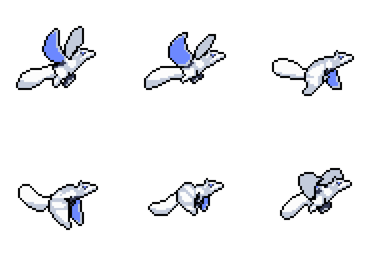
Gamewise it feels good and has some nice feedback, the control are swift enough and you really get the feeling you're controlling a flying agile dragon. The art is also quite good, with clear cut shape easy to distinguish, if only the background wasn't a textured mess... orange and blue clash too much when you texture with them, try orange and purple then purple and blue to get a less aggressive color gradient.
As a sidenote : on fullscreen the UI is too small and unreadable.
Saddly I don't think you did much gameplaywise with the theme; Ididn't really feel compelled to use the special attack and just hid in the top and spam the normal attack.
I tried to play your game in the browser but it didn't register anything I pressed. :( I do love your art, though!
Fun game